

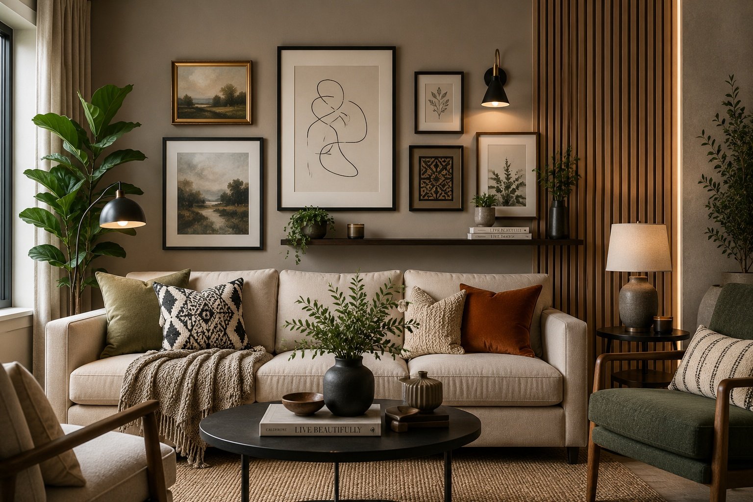
Most people treat wall decor for living room spaces like a five-minute errand — grab a print, nail it up, move on with your life. It’s rarely that simple once you actually live with the result. Ask anyone who’s repainted the same wall three times in a year because the first two attempts felt “off” — walls are the one surface in a house everyone stares at without noticing they’re staring.
Good wall decor for living room spaces isn’t about copying a Pinterest board line by line, it’s knowing what actually holds attention in a room you sit in daily. Some of it’s texture, some is color layering, and honestly a chunk of it is just restraint — knowing when to stop.
Why the living room wall gets ignored until it can’t be
Bedrooms get curtains. Kitchens get backsplashes. The living room wall just sits there, blank, until a guest asks “have you thought about doing something with that wall?” and suddenly you have.
Here’s the thing nobody tells you — the living room wall carries more visual weight than any other surface in the house, simply because it’s the backdrop to every conversation, every movie night, every awkward first meeting of someone’s new partner. It’s doing work whether you decorate it or not.
What actually counts as wall decor (it’s broader than art)
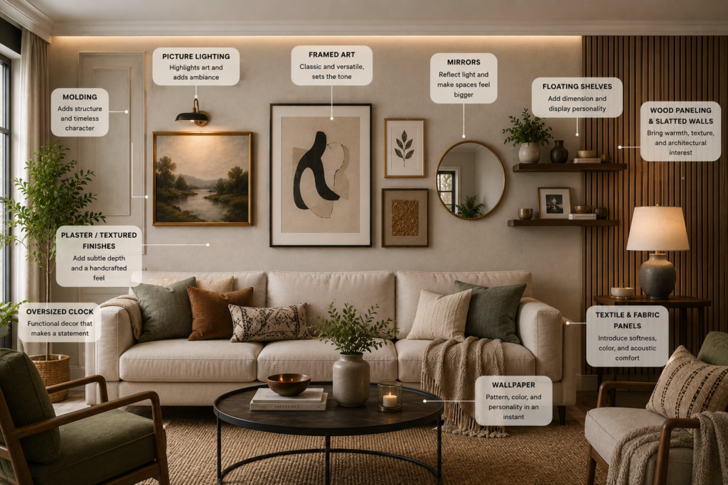
People hear “wall decor” and picture a framed print. Honestly, that covers barely a slice of what’s possible.
Think wider than wallpaper or a mirror — molding, floating shelves, plaster texture, fabric panels, even one oversized clock if the proportions work. Most people trip up right here, assuming decorating a wall always means bolting something new onto it. Sometimes it means changing the surface itself before anything even goes up.
Pick a direction before you buy anything
This is the part everyone skips, and it’s the part that saves the most money. Walking into a store without a direction for your wall decor for living room space means you’ll buy three things that don’t talk to each other.
| Style Direction | Best For | Typical Cost Range |
| Minimal / one statement piece | Small living rooms, renters | Low |
| Gallery wall (mixed frames) | Collectors, eclectic homes | Low–Medium |
| Wallpaper accent | Anyone wanting drama without full commitment | Medium |
| Textured plaster or molding | Older or higher-ceiling homes | Medium–High |
| Full mural or large-format art | Statement-focused, open-plan spaces | High |
Once you know which row you’re in, everything downstream — color, spacing, budget — gets easier to decide.
Accent walls without the regret
Nothing shifts a room’s whole mood faster than one accent wall, and the other three don’t need to change at all. Where people go wrong isn’t the pattern they pick — it’s the wall itself. Trust whichever surface your eyes hit first walking in, not the default TV wall everyone picks out of habit. This is one of the simplest forms of wall decor for living room spaces to get right on the first attempt.
If you’re weighing pattern versus paint for that one wall, this breakdown of layered accent wall tricks walks through which rooms actually benefit from the contrast and which ones just look busy.
Color comes before art, not after
Most people buy the art first and then panic about what color goes behind it. Flip that order. Once your base wall color is locked, art selection basically solves itself because you’re no longer fighting the wall for attention.
A lot of living rooms actually look worse with “safe” colors than with something slightly bolder, because safe often just reads as unfinished. If undecided, living room color pairing logic is worth reading before you commit to a swatch.
Wallpaper is decor now, not a phase from 2015
There was a stretch where wallpaper felt like something your aunt did in 2004 and never updated. That phase is dead. Peel-and-stick and semi-permanent options changed the math entirely — you can go bold on one wall without signing up for a decade-long commitment.
Scale is where people trip up, not taste. A tiny busy print on a huge wall just vanishes into noise, and a giant bold pattern in a cramped room starts feeling like the wallpaper is winning and you’re losing. I’ve seen rooms where swapping nothing but the print size — same colors, same wall — completely changed whether the space felt curated or chaotic.
Gallery walls, and the height mistake almost everyone makes
Gallery walls forgive a lot of sins — mismatched frames, random spacing, weird proportions. Height isn’t one of them. Go too high with the arrangement and people won’t clock why, but something about the room will feel subtly wrong to them.
There’s a rough formula floating around design circles — frame height minus hook distance, landed against a baseline somewhere around 57 to 60 inches — and it works better than eyeballing it ever does. Nail that number and even a completely mismatched set of frames somehow reads as deliberate. If you want the exact math version instead of the “trust your gut” version, correct picture hanging height breaks it down properly. Either way — measure before you drill, because patching drywall holes is nobody’s Saturday plan.
Beige and warm neutrals, done properly
Beige gets a bad reputation it doesn’t fully deserve. Done poorly it’s flat and forgettable — done properly, with the right undertone and enough texture nearby, it’s one of the more sophisticated backgrounds a living room can have.
The failure point is usually undertone mismatch — a beige with pink undertones fighting a beige with yellow undertones two feet away. For anyone genuinely torn, this warm neutral tone guide breaks down which undertones actually pair without clashing.
Mixing textures instead of just adding more frames
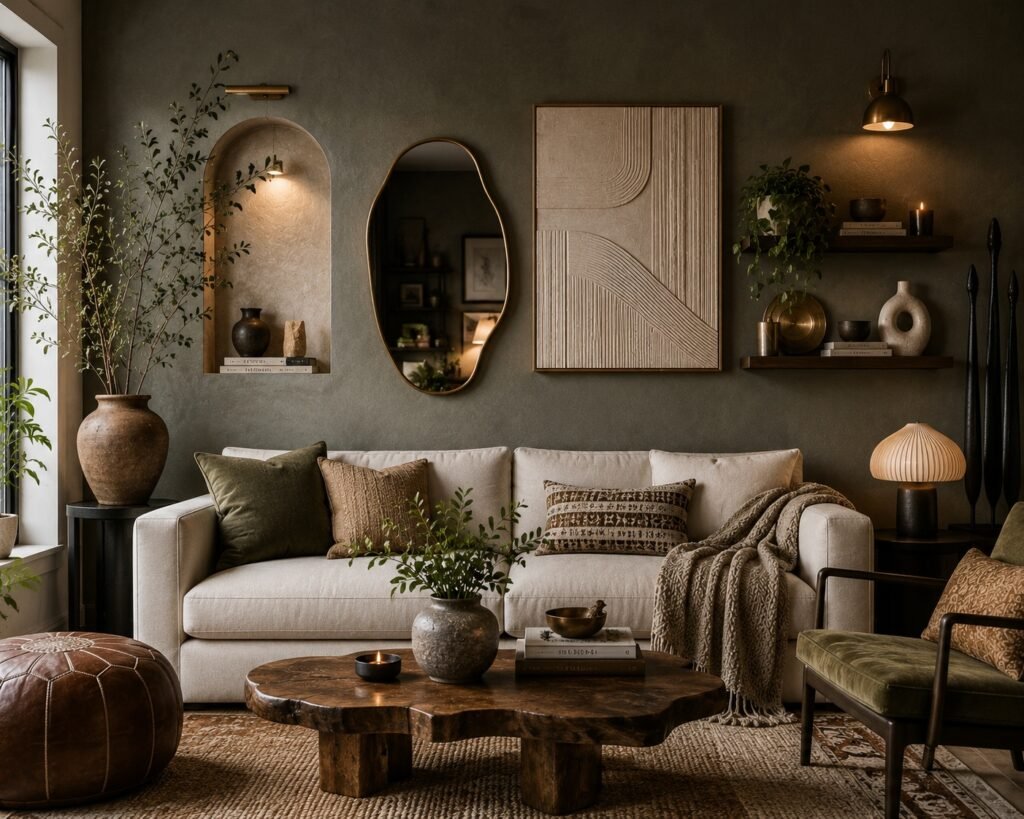
Once the walls have color and maybe one pattern element, resist the urge to keep stacking frames. A woven wall hanging, a small shelf with three objects instead of ten, a mirror angled slightly — these do more for the room than a fourth print ever will.
People sleep on texture way more than they should. Line up ten identical black frames and sure, it’s neat — but it’s also the kind of wall you forget by the next morning, unlike one mixing wood, brass, and a scrap of fabric art thrown in.
When “elevated” starts looking forced instead
There’s a specific failure mode where a living room tries so hard to look “elevated” that it ends up feeling like a showroom nobody actually lives in. The fix is almost always addition by subtraction — pull one piece, leave a little more breathing room.
If pattern choice is where you’re stuck, these elevated pattern selection ideas lean toward options that read sophisticated without tipping into sterile.
Mistakes people keep making, in no particular order
Hanging art too high is the biggest one, but it’s not the only repeat offender. Buying decor before deciding on wall color is a close second — it locks you into working around a piece instead of with a room.
Ignoring scale is another. A tiny print on a wide wall just looks lost, no matter how nice the print actually is on its own. Most bad wall decor for living room walls traces back to one of these three habits.
Actually narrowing it down
With this many directions — wallpaper, paint, gallery walls, texture — decision fatigue is real. Ruling things out beats hunting for some mythical “best” choice from the jump.
Begin with your room’s actual limits — the light it gets, how tall the ceilings run — and let that quietly cross options off the list before you even start comparing. Narrowing down your options this way beats staring at fifty Pinterest tabs trying to rank them.
A rough budget breakdown
Budgeting for wall decor for living room projects gets easier once you know roughly where the money actually goes.
| Project Type | DIY Cost | Professional Cost |
| Single statement art piece | $30–$150 | N/A |
| Gallery wall (6–8 pieces) | $80–$300 | $200–$500 (installed) |
| Accent wall wallpaper | $60–$200 (materials) | $300–$700 (installed) |
| Full-room molding or plaster texture | $200–$500 | $800–$2,500+ |
Numbers shift by region and materials, obviously, but this gives a rough sense of where the jump in cost actually happens — it’s usually the labor, not the material.
FAQs
What’s the least expensive way to refresh wall decor for living room spaces?
Reusing frames you already own in a small cluster, or committing to just one well-proportioned art piece, keeps cost near zero. Sometimes simply rehanging what’s already in the house does more than a shopping trip would.
Is wallpaper still practical in a small living room?
It can work fine — the scale of the print matters more than the room size itself. Go small and light for a compact space; oversized bold prints tend to shrink a room rather than open it up.
How do I check whether art is hung at a decent height?
Aim the piece’s center near eye level, somewhere close to 57–60 inches off the floor as a rough anchor. Over a sofa or console, leave roughly 6–10 inches of gap above the furniture instead of measuring from the ground.
Should wall color echo the furniture or push against it?
Going too matchy flattens a room, but too much contrast can feel jarring instead of intentional. A subtle shift within the same color family — same tone, different depth — usually lands best.
Can painted walls and wallpaper coexist in one living room?
Definitely, and plenty of current living rooms do exactly that. One patterned accent wall against three solid, complementary walls often reads more curated than wallpapering the whole room.
What’s a reasonable number of pieces for a gallery wall?
Five to nine generally hits the sweet spot between full and cluttered. Drop below five and the arrangement can start looking sparse unless each piece is unusually large.
Has beige fallen out of style for 2026 living rooms?
Not really — flat, cool-toned beige is what’s aging out, not beige itself. Warmer, textured neutral tones are still holding strong in current design work.
What’s the biggest mistake people make with wall decor for living room spaces?
Buying pieces before settling on wall color or a clear style direction. It leads to a room full of things that individually look fine but collectively feel disconnected.
Conclusion
Wall decor for living room spaces isn’t really about following a checklist — it’s closer to a series of small decisions that either support each other or fight each other. Color first, then pattern, then the actual art or objects. Skip that order and you end up buying things twice, which is the most expensive way to decorate a room.
The honest truth is most living rooms don’t need more decor, they need better-placed decor. A wall with three thoughtfully chosen elements at the right height and scale will always beat a wall crammed with ten pieces bought on separate impulse trips. That’s not a rule anyone likes hearing, because buying things is more fun than editing them out, but it holds up every single time.
If there’s one thing worth taking from all of this, it’s to slow down at the color and style-direction stage. Everything downstream — whether that’s wallpaper, gallery frames, texture, or a single oversized piece — gets easier once that foundation is locked in. Good wall decor for living room spaces gets lived in every day, which means the walls deserve more than a rushed decision made on a random Saturday afternoon at a home goods store.
Start with one wall. See how it feels for a week before adding to it. Wall decor for living room spaces, done slowly and with actual intention, tends to age a lot better than anything decided in a single weekend rush.