

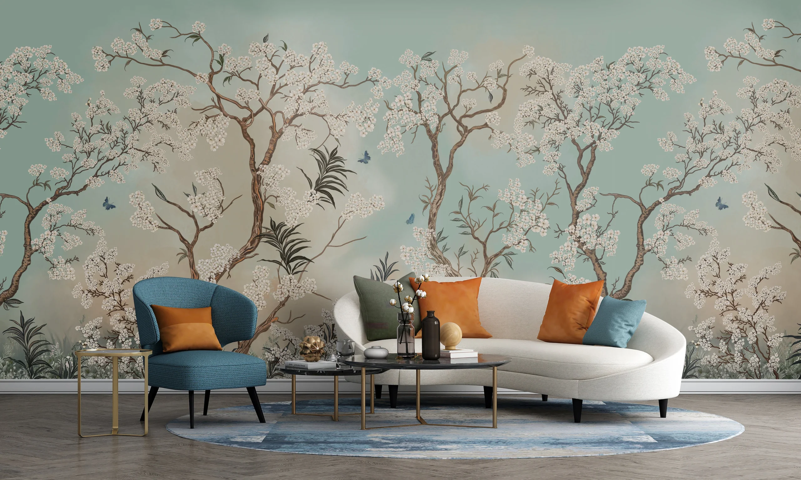
A curated look at classy wallpaper designs for living room walls — where texture, restraint, and color combine for a genuinely polished result.
A living room forms an impression before anyone even says a word. Good or bad, that impression forms fast — often within the first few seconds, long before anyone sits down. Classy wallpaper designs for living room walls play a bigger part in that first read than most people give them credit for. The designs that age well share a few common threads: a tight color range, real texture, and a print sized sensibly for the room it’s going in. There’s nothing showy about the goal here. It’s simply a wall that looks like someone made a decision about it.
What Separates a Refined Print From an Overwhelming One
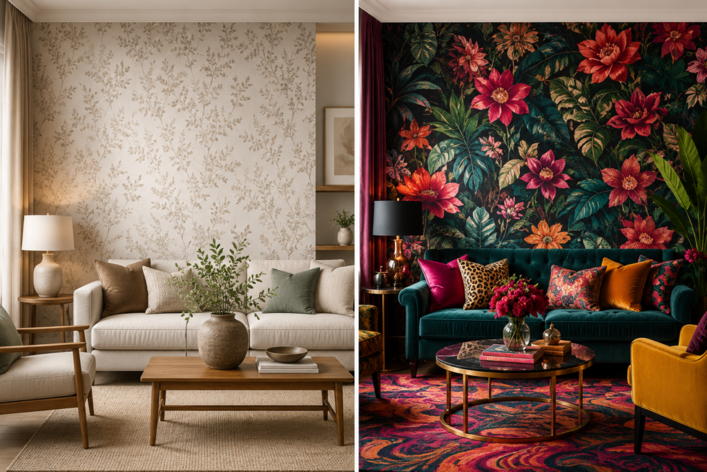
Boldness isn’t really what makes a wallpaper feel elegant. Proportion does more of that work, along with material quality and a disciplined color palette. According to research on pattern scale in interior spaces, the relationship between a print’s size and the room it sits in has a measurable effect on how the whole space reads. Get that ratio wrong with an oversized, high-contrast pattern, and a living room can start feeling cramped fast. Get it right with something smaller and tonal, and the depth builds slowly, on its own terms.
Nine Classy Wallpaper Designs for Living Room Walls, at a Glance
| Design | Works Well In | Overall Feel |
| Grasscloth | Understated, minimalist spaces | Calm, textural warmth |
| Muted damask | Formal or traditional spaces | Understated elegance |
| Beige with fine line detail | Nearly any furniture style | Flexible, easy backdrop |
| Earthy botanical prints | Organic, nature-inspired rooms | Grounded sophistication |
| Marble-effect finish | Polished, modern spaces | Gallery-like refinement |
| Tonal geometric patterns | Structured, contemporary rooms | Interest without clutter |
| Fine stripes | Classic or transitional interiors | Timeless, height-boosting |
| Plaster or concrete texture | Minimalist, architectural spaces | Grounded, deliberate |
| Softened chinoiserie | Detail-lovers wanting restraint | Calm, intricate, refined |
1. Grasscloth
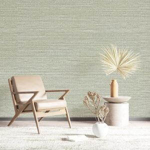
Texture is the whole appeal here. Grasscloth doesn’t add pattern or introduce a competing color — it just gives a plain wall something to catch light with. The woven surface shifts subtly through the day as sunlight moves across it, and that alone does more for a room than paint ever could.
2. Muted Damask
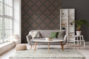
Damask has a formal history, and used well, it still reads that way — just without the heaviness people associate with older interpretations. Stick to close, muted tones. Reserve it for a single wall. Handled like that, it looks like a decision rather than a default. More on how one wall can carry a whole room shows up in this accent wall design guide.
3. Beige, With a Twist of Texture
Beige gets picked so often because almost nothing clashes with it — mid-century furniture, traditional pieces, whatever’s already in the room. Add a fine line or subtle geometric texture, though, and it stops being a placeholder color and starts doing actual work in the space, without stealing focus from anything on the walls or shelves. This beige wallpaper styling guide breaks down that balance in more depth.
4. Botanical Prints, Toned Down
People assume botanical wallpaper has to be loud. It doesn’t. Sage, dusty olive, soft terracotta — muted earth tones pull the same leafy motifs down into something calmer, especially set against natural wood or linen.
5. Marble-Effect
This one’s about illusion, in a good way. A marble print gives a room the visual weight of an expensive material without the actual cost or the actual stone. One wall, behind a sofa or a media unit, is usually enough to shift the whole room toward something more polished.
6. Tonal Geometrics
Geometric prints can go either way — chaotic or composed — and color is what decides it. Keeping the colors within one tonal family — charcoal next to soft gray, say, or navy beside pale blue — turns a pattern that might otherwise feel busy into something that reads as intentional, even inside a smaller footprint.
7. Fine Stripes
Stripes rarely go out of style, particularly in two closely related tones rather than high contrast. There’s a practical upside too: studies looking at ceiling height and how large a room feels have found that taller-seeming ceilings genuinely change how spacious a room reads. A vertical stripe is one of the easiest ways to fake a bit of that height on a standard 8-foot ceiling.
8. Plaster or Concrete Texture
A print that mimics plaster or raw concrete leans architectural, giving a room an edge that feels more industrial than decorative. It suits spaces with sleek, contemporary pieces and decor that keeps things simple.
9. Chinoiserie, Dialed Back
The classic chinoiserie motif can carry a lot of detail without carrying a lot of intensity, as long as the color stays soft. Pale blue, ivory, blush — the intricacy stays, the drama doesn’t.
Fitting Classy Wallpaper Designs for Living Room Layouts of Any Size
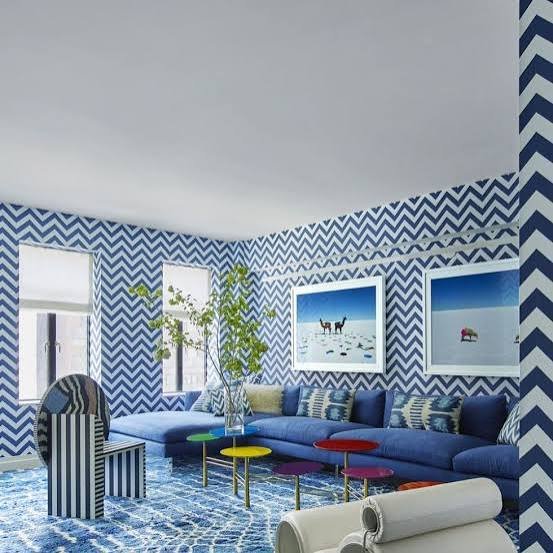
The room’s dimensions carry more weight in this decision than people usually assume. Ceiling height, the furniture already in place, and overall floor area all shape which design actually works. Smaller rooms generally do better with lighter, lower-contrast wallpaper — heavy or dark prints tend to shrink a space rather than fill it out. Bigger rooms have more room to experiment, especially with bolder botanicals or geometrics kept to one wall. This living room wallpaper overview walks through options for a wider range of room sizes.
What Sits Around the Wallpaper Matters Too
A wallpaper choice never operates in a vacuum. Whatever’s nearby — the furniture, the light fixtures, the trim — needs to point in the same direction as the wall rather than against it. Rooms with wood-toned or neutral furniture generally let a detailed print take the spotlight, while a bolder pattern tends to read better beside plain, solid-colored pieces that don’t compete for attention. Trim finishes play a role too — matte or satin tends to sit better against a textured wall than a glossy version would.
Where People Go Wrong
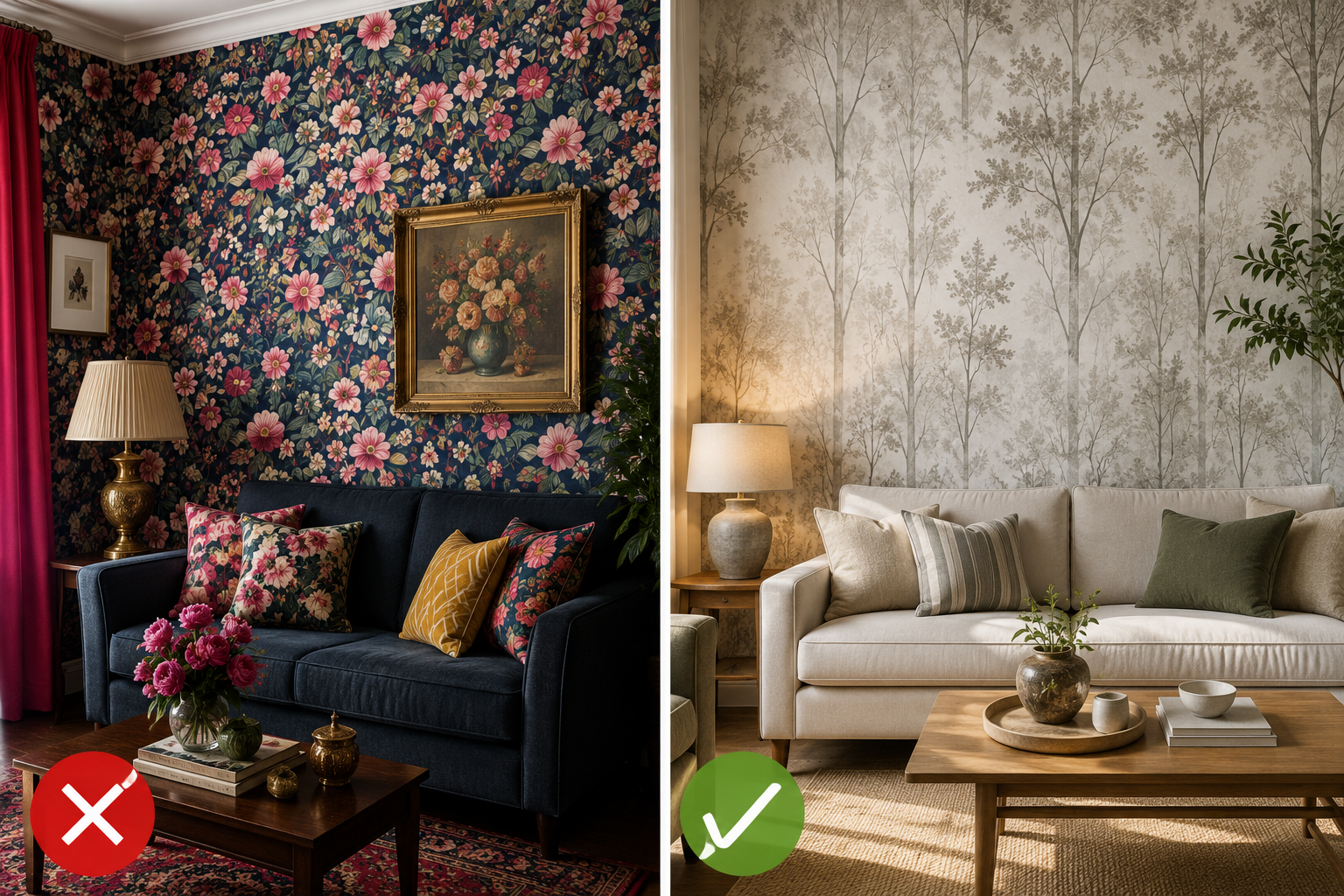
Judging a design purely from a small thumbnail is where most disappointment starts, since screens rarely render scale or true color with any accuracy. A near-equal mistake is wrapping an entire room in a loud, high-contrast print rather than confining it to a single wall — that shift alone can push a room from bold to chaotic. Skipping an actual sample before purchase trips people up too, given how rarely showroom or catalog lighting matches the light a wall gets at home.
Final Word
Classy wallpaper designs for living room spaces all circle back to the same idea: hold back where it counts, and spend where it matters. Grasscloth, a muted botanical, a fine stripe — whichever one gets picked, the results hold up best when the design fits the room’s actual proportions and lets the furniture do some of the talking too. Done well, it’s a choice that still looks right five years from now, not just this season.