

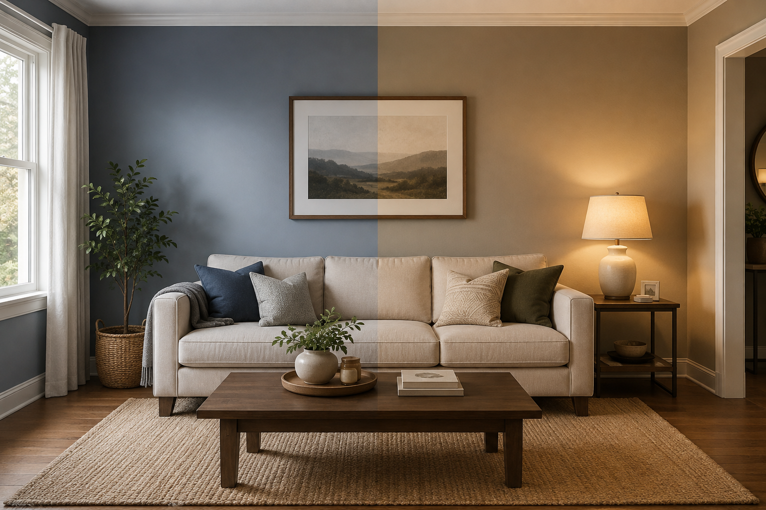
I painted my own living room three times in two years before I got it right. Every time, I thought I’d nailed the living room wall colors design on the first try — chip in hand, confident, done. Nope. Living room wall colors design goes way beyond grabbing a shade you liked at the store — it’s really about how that color reads once it’s spread across your actual walls, under your actual light, sitting next to your actual furniture.
Most people trip up on living room wall colors design in a pretty predictable set of ways. Below is exactly where things go sideways, and how to pull them back.
Why the Paint Chip Lies to You
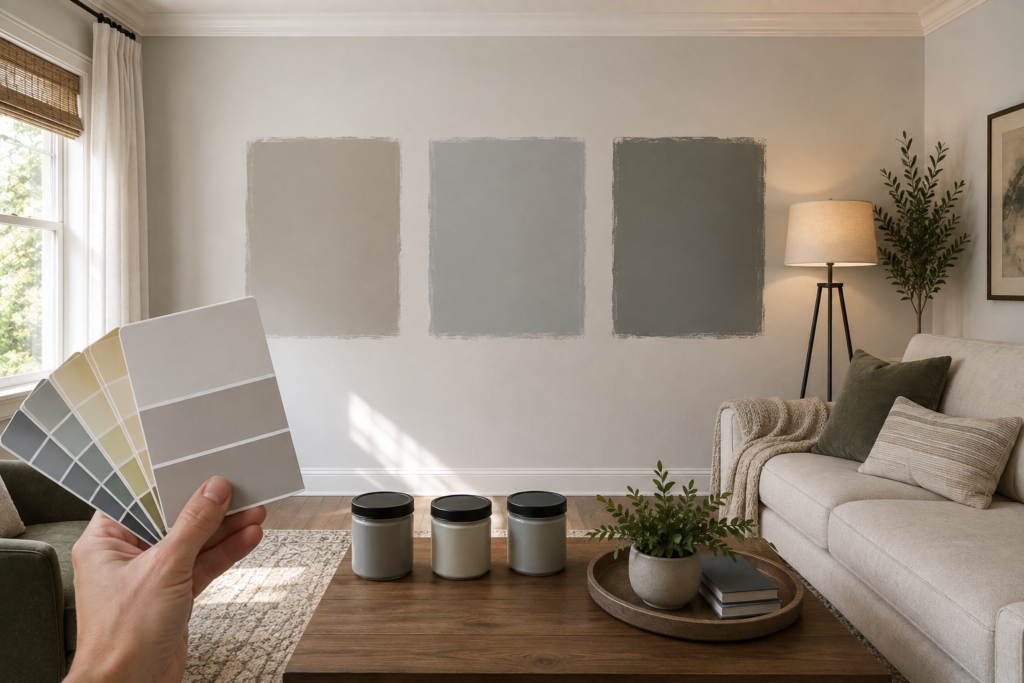
That little cardboard swatch in the store? It’s lit by fluorescent bulbs, sitting two feet from a hundred other colors competing for your attention. It has nothing to do with your living room at 4pm in October.
Colors shift depending on light temperature, wall size, and even the sheen you pick. A soft gray on a 2×2 inch chip can turn cold and almost blue once it covers 400 square feet of wall. So the first mistake isn’t picking a “bad” color — it’s trusting a tiny sample to represent a massive room.
The fix: Buy actual sample pots and paint 2×2 foot swatches directly on your wall — not on poster board taped up temporarily. Look at them morning, afternoon, and evening before deciding anything.
Skipping the Undertone Check
Here’s something nobody explains well enough: every neutral has an undertone. Beige can lean pink, yellow, or green. Gray, weirdly enough, can tilt toward blue or even purple. Miss that shift before the roller ever touches the wall, and you end up with a clash against your flooring or trim that’s tough to name but even tougher to unsee.
There was a “warm white” I fell for once — turned out it carried a faint green undertone that fought my oak floors constantly. Not dirty exactly, just… wrong somehow. It took a solid few weeks before I even figured out what was bothering me.
The fix: Press your sample right up against the flooring, trim, and any big furniture pieces, and do it in actual daylight. A vague “something’s off” feeling almost always means the undertone is clashing with what’s already in the room.
Reading Your Room’s Light Before Choosing a Shade
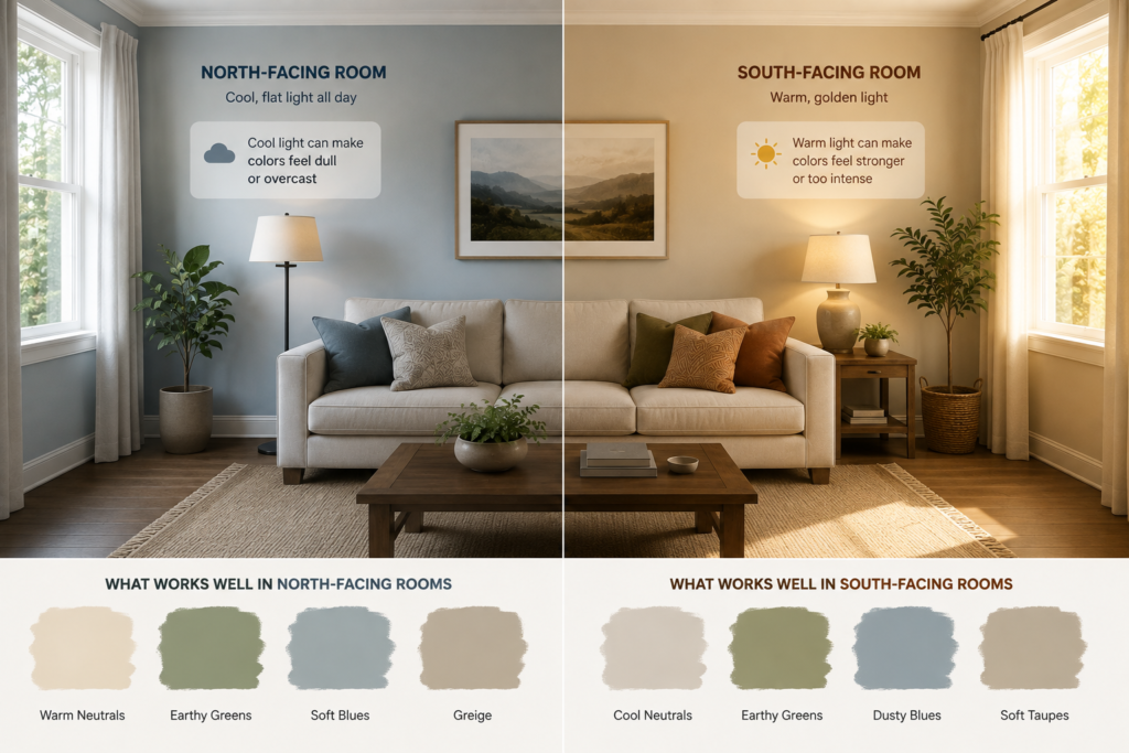
Rooms facing north sit under cool, flat light basically all day. Rooms facing south swing warm and golden, especially as evening comes in. Ignoring that single detail is behind most living room wall colors design regrets.
Go with a cool blue-gray in a north-facing room and it’ll feel overcast even at noon, sun or no sun. Push a bold warm tone into a sun-drenched south-facing room and by late afternoon it can feel like it’s shouting a little too loud.
According to Sherwin-Williams, warm neutrals, earthy greens, and soothing blues currently dominate living room color trends, but the brand’s own expert-curated paint palette still stresses testing against your specific light before committing — trend or not. Homestyler
One Flat Color, Zero Depth
This one’s sneaky. A single flat color across every wall isn’t “wrong,” exactly, but it often reads as unfinished. Living rooms with some texture or tonal variation — even subtle — tend to feel more intentional and lived-in.
None of this means covering four walls in a dramatic mural. Sometimes the fix is smaller than that — a darker trim line, a patterned panel on one wall, or simply letting a single wall hold more visual weight than the rest.
Skip the full repaint and let a textured accent wall option carry that extra depth instead. Same payoff, way less commitment.
Matching the Sofa Instead of Reading the Room
Matching your wall color exactly to your sofa fabric feels safe. Turns out it backfires more often than not. Once every surface sits at the same tone, contrast disappears — and contrast is exactly what tells the eye a room was actually designed, not just assembled.
Better move: let your furniture play one part in the room, not carry the entire tune by itself.
Choosing colors in isolation — without checking against flooring, fabrics, and natural light — is one of the most common mistakes people make, according to interior designers who’ve written extensively on this exact problem. It’s not really about matching. It’s about relationships between colors. Natalieholden
When Paint Isn’t the Only Fix
Plenty of people burn through five or six paint colors chasing a feeling that flat color was never going to deliver in the first place — because what’s missing is texture, not hue.
Still feels off no matter which shade goes up? At that point, color probably isn’t the actual culprit. That’s where wallpaper earns its place — not as decoration, but as an actual fix for rooms that paint alone can’t solve.
For rooms leaning neutral, a soft neutral pattern choice adds warmth without introducing a whole new color story. And if you’re still not sure what direction to go, a proper pattern selection walkthrough walks through the decision in more depth than a paint aisle ever will.
A Quick Comparison: Common Mistakes vs. Fixes
| Mistake | Why It Happens | Simple Fix |
| Trusting the tiny paint chip | Store lighting misleads the eye | Paint large swatches directly on the wall |
| Ignoring undertones | Neutrals aren’t neutral | Compare samples against flooring/trim in daylight |
| Wrong tone for light direction | Room orientation ignored | Test color at multiple times of day |
| Flat, single-tone walls | No depth or texture | Add trim contrast or a textured wall |
| Matching sofa exactly | Feels “safe” but kills contrast | Let walls complement, not mirror, furniture |
How Designers Actually Test Colors Before Committing
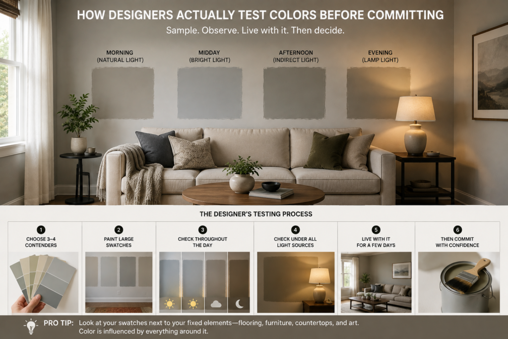
Professionals don’t guess. They sample, live with it for days, and check the color under every light source the room actually gets — including lamps at night, since warm bulbs shift a cool color noticeably.
A color’s effect changes depending on whether the room is meant for unwinding or for something more energizing, and that intention should come before the shade, not after — something worth sitting with before you open a single can of paint. Worth pausing on this — a color psychology deep dive can help settle the debate if you’re stuck between something calming and something with more punch. Livingetc
People skip the testing phase constantly, mostly because it feels like a waste of a weekend. It isn’t. It’s the single clearest signal for whether you’ll still like this color come month six.
Small Rooms Play by Slightly Different Rules
Shrink the square footage and color mistakes get louder, not quieter. A too-dark saturated tone can make walls feel like they’re closing in, and the wrong cool shade can turn cozy into clinical fast.
Warm, lighter neutrals tend to hold up better in tighter spaces — not because darker colors are off-limits, but because they lean hard on square footage and natural light, neither of which a small room usually has to spare. Working with a dim, compact space? Sort that lighting reality out before picking a single swatch.
FAQs
What’s the biggest mistake in living room wall colors design?
Trusting a small paint chip over a full-wall sample. Chips are lit artificially and represent almost nothing about how a color behaves across an entire room, especially once natural light shifts through the day.
How do I know if my chosen color has the wrong undertone?
Hold the sample against your flooring and trim in natural daylight. If it feels subtly “off” without an obvious reason, an undertone clash is usually the cause — not the color itself.
Should north-facing and south-facing living rooms use different colors?
Warmer shades tend to counter the flat, cool light north-facing rooms get. South-facing rooms already run warm from sunlight, so they can carry cooler or bolder tones without feeling harsh.
Can wallpaper actually solve a wall color problem?
Frequently, yes. If paint keeps missing the mark no matter what shade goes up, the real gap is usually texture — something flat color simply can’t fake.
Are small living rooms stuck with light colors only?
Not exactly, but warm, lighter neutrals usually perform better where space and light are both limited. Darker, saturated shades need more of both to avoid feeling boxed-in.
How many wall colors should one living room have?
Most rooms work best with one dominant tone plus subtle variation — trim, an accent wall, or texture — rather than multiple competing colors fighting for attention.
Should wall color match the sofa exactly?
No. Exact matching removes contrast and can make a room feel flat. Complementary tones create more visual interest than an identical match ever will.
How long should I test a paint sample before committing?
At least three to five days, checked in morning, afternoon, and evening light, including how it looks under your lamps at night — not just daylight alone.
Conclusion
Every single mistake above shares one root cause: a shortcut that seemed harmless in the moment and ended up costing an entire extra weekend of repainting later. Living room wall colors design mistakes rarely come from bad taste — they come from skipping steps that feel unnecessary at the time, like testing in real light or checking undertones before the roller ever touches the wall.
And here’s the reassuring part — fixing any of this isn’t actually complicated. Paint real swatches. Check undertones in daylight. Respect which direction your windows face. Add texture where flat color isn’t cutting it. Don’t be afraid to let wallpaper do some of the work paint simply can’t.
Living room wall colors design, done properly, isn’t about chasing trends or copying whatever looks good on Pinterest. It’s about understanding your specific room — its light, its materials, its actual proportions — and choosing accordingly. Get that part right, and the color decision becomes almost easy. Skip it, and you’ll likely be back at the paint store in six months, chip in hand, starting over again.
If there’s one thing worth remembering from all of this, it’s that the room will always tell you when something’s wrong. You just have to actually look at it in the light it lives in — not the light you wish it had.