

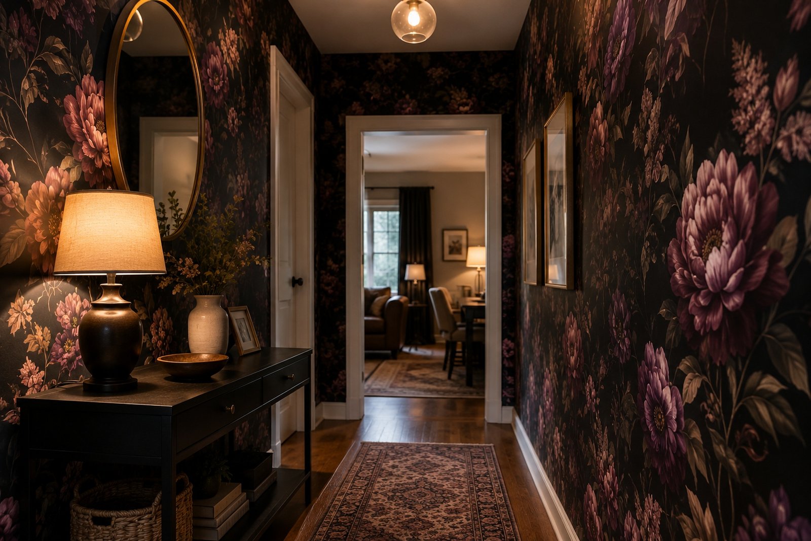
Four repaints in, my aunt threw in the towel on paint entirely and hung wallpaper instead — cream, then sage, then a “warm greige” that was somehow just cream again. What finally stuck was dark floral wallpaper, deep plum blooms against an almost-black ground, and she texted me at eleven that night saying the hallway finally looked like someone actually lived there. Pale neutrals tend to hedge their bets.
A moody wallpaper doesn’t — and once you’ve watched dark floral wallpaper land right in a room, bare walls stop reading as “finished” and start reading as “not done yet.” That’s the part nobody mentions about dark floral wallpaper going in: it’s less about the flowers and more about the nerve of the background behind them.
What actually counts as dark floral wallpaper
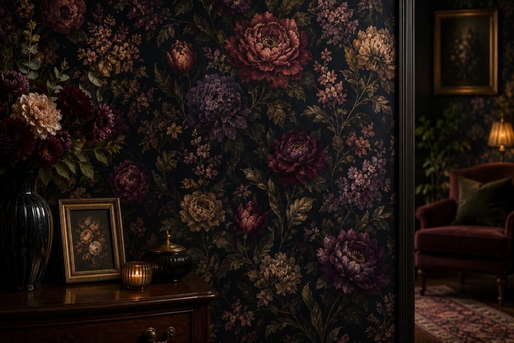
The term gets tossed around loosely, so here’s a tighter definition. Picture the color wheel’s basement — black, charcoal, aubergine, bottle green, midnight blue — that’s the ground this wallpaper starts from, with blooms either lighter on top or rendered in jewel shades that seem to glow against all that dark. This has nothing to do with the airy little sprig prints from someone’s grandmother’s sunroom. Think tapestry, not wallpaper roll — dense, a bit theatrical, unapologetically heavy.
You’ll find it filed under a dozen different labels — vintage floral, dark academia wallpaper, William Morris-style prints, jewel-tone botanicals. Different names, same underlying idea, really. Before locking into one look, it genuinely pays to scroll slowly through a real floral wallpaper collection instead of judging the whole category off three thumbnails on some shopping app.
Why it wins people over harder than expected
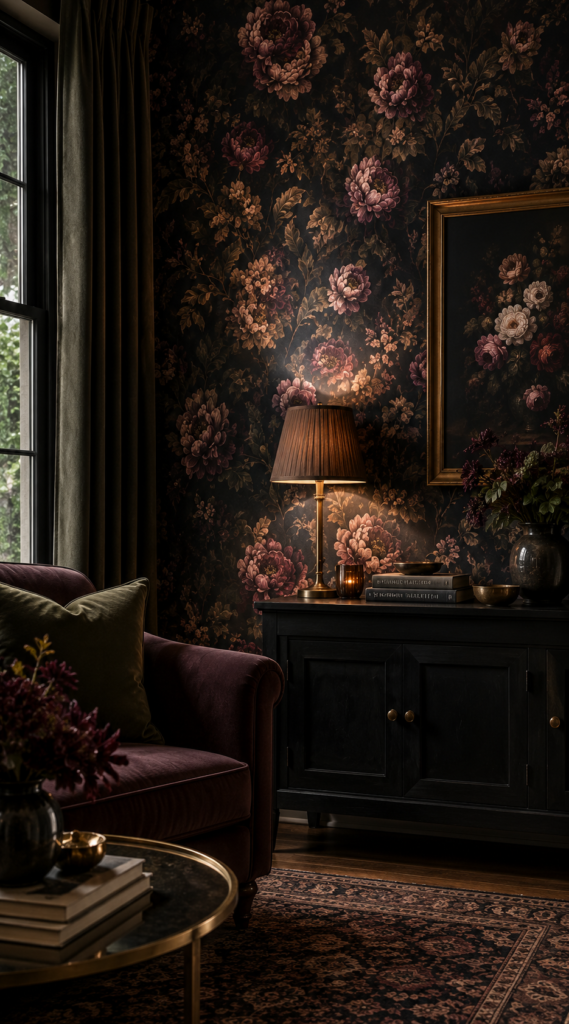
Mild opinion, disagree if you want: light florals are fine, pretty even — but dark ones are what people actually remember when they walk into someone’s house. A pale print blends into “nice and forgettable.” A dark one gets a reaction, and guests genuinely pause mid-sentence over it. That’s not a small thing.
Some of that is pure optics. Dark backgrounds recede in a way white walls never manage, counterintuitive as that sounds. A wall dense with charcoal florals can make a boxy room feel less like a box, since the eye loses track of where the wall stops and the corner begins. A leading design publication notes that deep, dark wallcoverings suit period homes especially well, precisely because the darkness lets the pattern lead the room instead of fighting everything else in it for attention.
There’s a mood piece too, and it has less to do with design theory than with how a room actually feels at 9 p.m., lamps on, nobody else around. This isn’t just a vibe — researchers have studied it, and documented color psychology research on darker, cooler shades keeps landing on “calmer and more grounded,” not the gloom most people brace for. A bedroom wrapped in dark florals doesn’t read as a cave. It reads like a room that’s finally quit trying so hard to please everyone.
The main styles, and how differently they behave
Gothic florals lean into drama on purpose — burgundy roses, thorny vines, backgrounds edging toward pure black — and they suit rooms built for short, intense visits: a dining room, a library, a powder room craving one loud personality moment. Swap the black for emerald or sapphire and you land on jewel-tone botanicals instead, glamorous rather than broody, a better match for a primary bedroom or a statement powder room chasing richness without funeral undertones.
Then there’s the old-botany-textbook look: muted, not saturated, oddly well-suited to a home office or reading nook precisely because it never demands constant attention the way the louder prints do.
| Style | Ground Color | Mood It Creates | Rooms It Suits Best |
| Gothic floral | Near-black, deep burgundy | Dramatic, romantic | Dining room, powder room |
| Jewel-tone botanical | Emerald, sapphire, plum | Glamorous, rich | Primary bedroom, entryway |
| Vintage illustration | Muted charcoal, ink blue | Calm, studious | Home office, reading nook |
| Maximalist mural | Black with metallic accents | Bold, statement-making | Living room feature wall |
If none of that quite matches what’s in your head, look through a wider spread before deciding — a proper flower pattern designs here page shows the range far better than any paragraph can.
Lighting changes everything — I mean everything
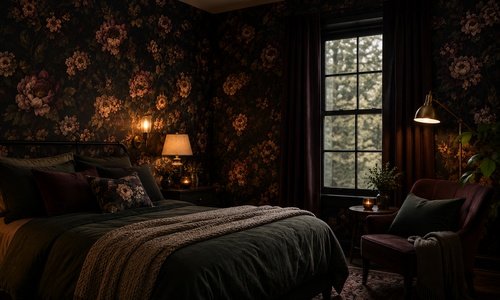
Learned this one the hard way helping a friend pick paper for her guest room, which has exactly one small north-facing window. The inky floral we picked looked incredible under her kitchen’s bright overheads. In the actual guest room, 4 p.m. in winter, it went nearly black and swallowed the space whole. Nothing ruined, exactly — just moodier than she’d signed up for, enough that two extra lamps became non-negotiable.
Rooms with real daylight, especially south-facing ones, can take denser, darker florals without ever feeling boxed in — sunlight keeps slicing through and pulling the pattern back into view. Rooms short on natural light do better with a print that leaves some lighter negative space, or with warm artificial light doing the heavy lifting — sconces, never a single flat overhead bulb. Most product pages skip this entirely, yet it’s probably the single biggest factor in whether someone ends up thrilled with their dark floral wallpaper or quietly regretting it by February.
Where it actually earns its place in a home
Powder rooms are the easy yes — small, used briefly, door usually shut. Lowest-risk spot to go full drama, which is exactly why so many people start there. Bedrooms come second, though restraint helps: one accent wall behind the headboard tends to age better than wrapping all four, unless the room’s light genuinely supports the full treatment.
Dining rooms work because most dining happens in evening light anyway, which is precisely the condition dark florals were built for. Living rooms can work too, especially as a single wall behind a sofa or fireplace — wrapping a heavily-used family space entirely in it, though, tends to feel heavier than most households want on a random Tuesday.
A straightforward way to pick yours
- Walk the room at three different times of day. Morning, midday, evening — track how much daylight it actually gets, not how much you assume.
- Order physical samples, not screen swatches. Screens shift saturated color more than people expect.
- Stick the sample on your dimmest wall, then your brightest one. Judge it in both spots before committing to a full order.
- Decide accent wall versus full room upfront. Full coverage needs more light tolerance; a single wall forgives almost anything.
- Plan the lighting alongside the paper, not as an afterthought once it’s already up.
A real example, seams and all
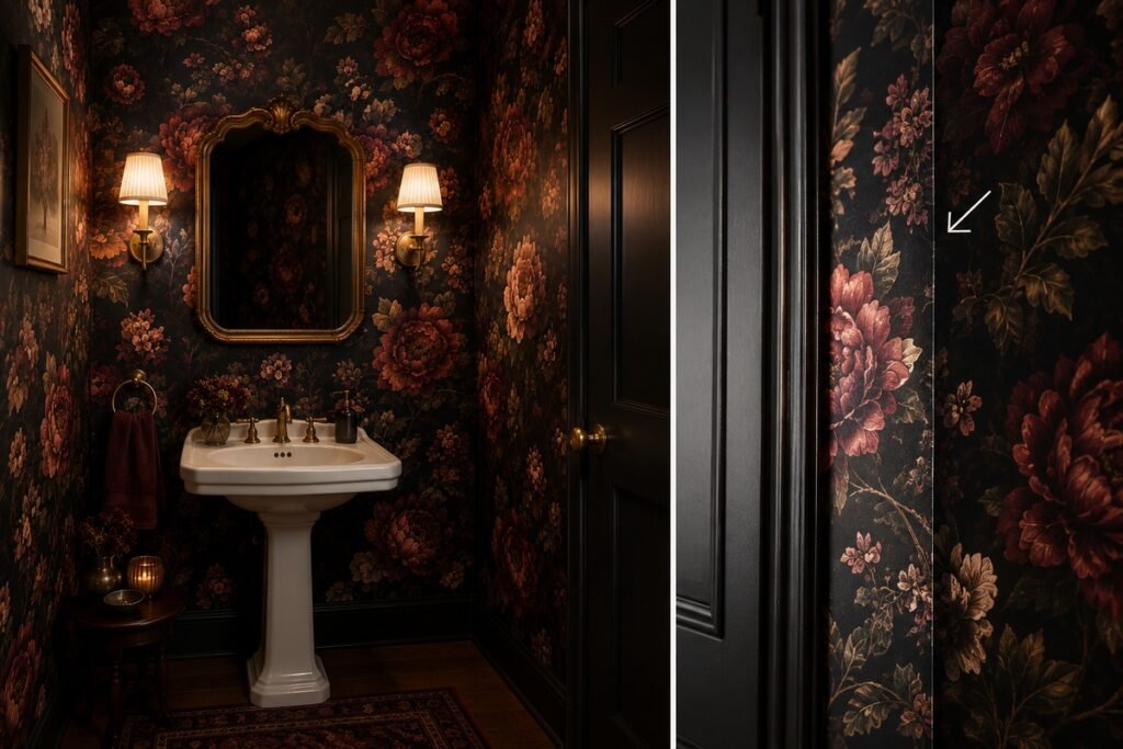
A designer I follow online wallpapered a client’s whole downstairs powder room in near-black floral with deep red blooms. Every photo of it looks stunning. What none of the photos catch: near the door frame, where two panels meet, you can just make out a seam, because that section of wall was never quite flat to start with — careful hanging doesn’t erase that under direct light. Six months on, the client says it stopped bothering her, but it’s worth knowing upfront rather than discovering it later. Dense, busy patterns hide seams better than a flat solid color ever could — though “hides better” and “invisible” are two different promises.
Tips from people who’ve actually hung this stuff
Order a bit more than the calculator suggests — pattern-matching on large florals eats more paper than a plain print does, and running short mid-project is its own particular headache. Peel-and-stick versions have come a long way, but in a room that sees daily heavy use, traditional paste-the-wall paper still tends to outlast it over years, not just months. Personally, I tell people to live with a taped-up sample for at least a week before ordering — something this saturated can look different by day seven than it did on day one.
Mistakes worth dodging
The most common one: choosing off a single, professionally lit photo and forgetting your room has no photography rig pointed at it. The second: going full dark-floral in a genuinely windowless room without adding real supplemental light — that combination reads gloomy, not moody. And third — piling on too many other loud patterns in the same room. Dark florals want to be the one loud thing on the wall; cram in equally busy rugs and curtains and the wallpaper ends up competing instead of leading. Keep the rest of the room quiet and let the paper carry it.
Matching pattern scale to room size
Small rooms don’t automatically need small florals — that’s an outdated rule at this point. A big, bold bloom in a cramped powder room can actually feel more intentional than a small print would, mostly because there’s no awkward half-repeat breaking up the pattern. Bigger rooms give more room to play, though covering every wall in an oversized mural can tip a large room into “stage set” territory rather than “place to unwind” — which is why plenty of people stick to just one wall even with square footage to spare.
Keeping it looking good over time
Ordinary wallpaper survives years of normal life just fine. What it won’t survive gracefully is constant direct sun — that fades deep, saturated color faster than it fades anything mid-toned, so a UV-filtering curtain in a sun-drenched room isn’t a luxury add-on, it’s basically maintenance. For upkeep, a dry microfiber cloth handles dust duty; skip hard scrubbing on textured or embossed prints, since that flattens the raised detail for good. Still narrowing things down? It’s worth one more pass to browse flower wallpaper options before locking in a roll count.
FAQs
Is dark floral wallpaper too much for a small room?
Not necessarily — small, low-traffic rooms like powder rooms often handle bold dark florals better than large open living spaces, since there’s less pattern for the eye to manage at once.
Will dark floral wallpaper make a room feel smaller?
Usually the opposite. Busy, dark patterns blur the line where one wall meets the next, and a boxy room loses its edges because of it — feels bigger, weirdly, not smaller.
What lighting works best with dark floral wallpaper?
Multiple warm, dimmable light sources beat one overhead bulb every time — a single flat light source makes dense dark prints feel heavier than they’re meant to.
Should I wallpaper the whole room or just one wall?
Mostly a light question: rooms flooded with daylight can usually take full coverage, while dimmer rooms tend to look better with just one wall doing the work.
Does dark floral wallpaper fade over time?
It does, particularly with steady direct sun. A UV-filtering curtain or blind in that kind of room slows things down noticeably, and it’s cheap relative to what it protects.
Is peel-and-stick dark floral wallpaper as durable as traditional paper?
It’s come a long way, but in rooms that see heavy daily use, traditional paste-the-wall paper still tends to outlast it — peel-and-stick just wins on convenience for a quick refresh.
What rooms suit dark floral wallpaper least?
Small rooms with no natural light and only a single overhead bulb tend to feel gloomy rather than moody in dark florals — fix the lighting plan first, or pick a lighter-ground print instead.
How do I know if a pattern is too busy for my space?
If the rest of the room is already loud — bold rugs, patterned curtains — a dark floral wall starts competing rather than leading. Simplify everything else and let the paper be the one statement.
Final thoughts
Dark floral wallpaper isn’t something you have to talk yourself into — either it matches the feeling you want a room to carry, or it doesn’t, and that’s usually obvious within thirty seconds of holding a real sample against the wall. What catches people off guard isn’t the print itself; it’s how much everything around it matters — the room’s actual light, when you’ll really be sitting in that space, whether it’s one wall or all four. Skip that thinking, and even a genuinely gorgeous roll of paper can end up feeling wrong for the room it lives in.
The honest version of this advice: dark floral wallpaper rewards patience. Order the sample. Tape it somewhere awkward, not just the brightest wall you’ve got. Sit with it through a grey afternoon and a lamp-lit evening before deciding anything. Rooms that get this right — a powder room with real presence, a dining room that finally looks grown-up, a bedroom that stops feeling like a hotel — tend to be the rooms people bring up unprompted, the way my aunt’s hallway gets brought up every single time someone new walks through her door.