

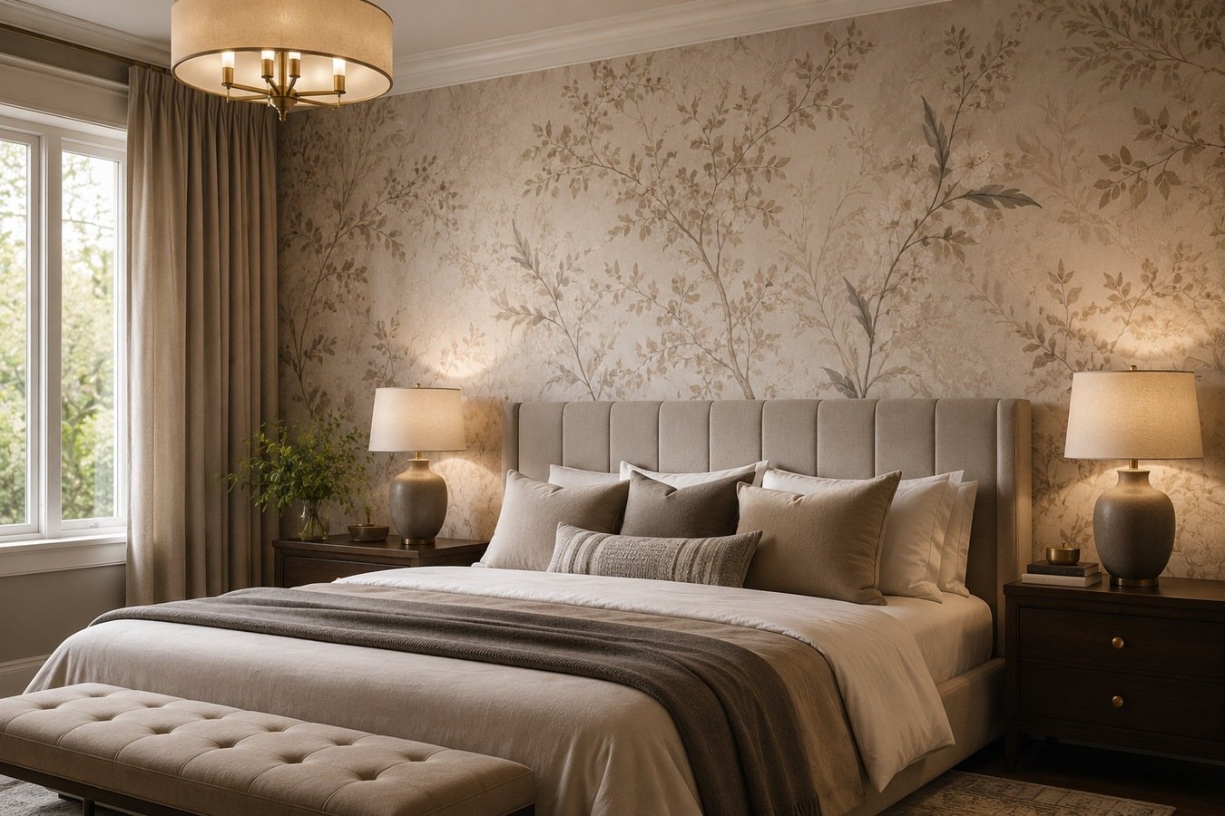
A client once handed me back three sample books and said none of them “felt like sleep.” Odd phrase, but I knew exactly what she meant — some patterns keep your eyes working instead of letting them rest.
That’s really the whole test behind classy bedroom wallpaper designs: does the wall calm the room down, or does it add one more thing to process before bed? Grasscloth, a faint stripe, a damask softened down a few shades — these tend to pass that test. This piece walks through the classy bedroom wallpaper designs that survive past year one, and the handful of choices that quietly age a room before its time, mostly tied to scale, texture, and finish.
Why a Client’s First Question Is Rarely About Color
Most people walk in ready to talk color swatches. The smarter opening question is actually “how long do I want to love this?” — because five-year wallpaper and fifteen-year wallpaper are picked completely differently.
Muted tones and textured, low-contrast patterns tend to outlast whatever’s trending on design accounts this month. Anything tied too tightly to a single viral moment usually shows its age fast. The classy bedroom wallpaper designs that still look right a decade later almost always came from this slower, less trend-chasing category.
Figure out which category you’re shopping in before opening a single sample book. It changes everything downstream.
Texture Carries More of the Room Than Color Does
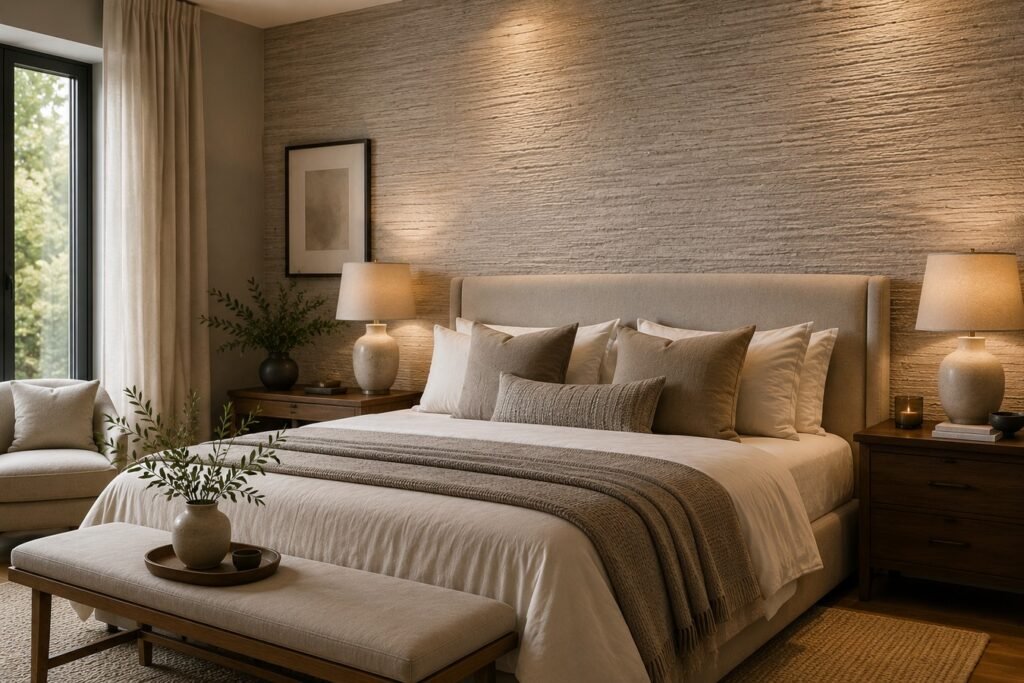
Color gets the attention, but texture is doing the heavier lifting once the wallpaper’s actually up. A flat, glossy print can start looking a bit like a poster after the initial excitement fades.
Woven grasscloth, linen-effect vinyl, subtle embossing — these shift under changing light throughout the day in a way flat prints simply can’t. People clock that flicker of movement as quality even when they couldn’t explain what tipped them off. It’s usually the first thing that separates classy bedroom wallpaper designs from ones that just look expensive in a photo.
When budget forces a pick between a louder print and a deeper texture, bedrooms almost always reward the texture choice instead.
Color Choices That Settle a Room Instead of Announcing It
Elegant here isn’t code for beige — it just means nothing on the wall is fighting the person trying to sleep in that room. Here’s a rough sense of how a handful of go-to directions hold up once they’re wrapped around all four walls, past the point of a tiny swatch card.
| Palette Direction | Mood It Creates | Pairs Naturally With |
| Charcoal with brass details | Grounded, moody | Walnut furniture, warm lighting |
| Sage with cream | Airy, calm | White linens, natural wood tones |
| Blush with antique gold | Soft, romantic | Velvet headboards, brass fixtures |
| Ink blue with linen white | Classic, steady | Navy bedding, black-and-white art |
| Terracotta with warm ivory | Cozy, earthy | Rattan pieces, ceramic accents |
No wrong answers here — just different moods for different rooms, and your actual window light will end up making half this decision for you anyway. Most classy bedroom wallpaper designs lean on two or three of these tones at most, rather than piling on more.
One Wall Or the Whole Room — How to Actually Decide
This is where indecision sets in, and honestly my own opinion on it has shifted over the years. A single wall behind the headboard is the lower-risk route — cheaper, less commitment, still enough drama to notice walking in.
Covering every wall, though, is starting to look like the pickier designer’s choice lately, a step up from the single-accent-wall habit that ruled the last several years. Rooms that pull in plenty of daylight usually take a full wrap fine without ever feeling boxed in. Before deciding either way, it’s worth weighing a single wall wallpaper option against full coverage on paper first — it’s a lot cheaper to change your mind at that stage than after installation. This is honestly the fork in the road where most classy bedroom wallpaper designs either succeed or start feeling like too much.
Smaller rooms generally lean toward the single-wall approach. Bigger primary suites can usually absorb more coverage without tipping into overwhelming.
Classy Bedroom Wallpaper Designs for Compact Rooms
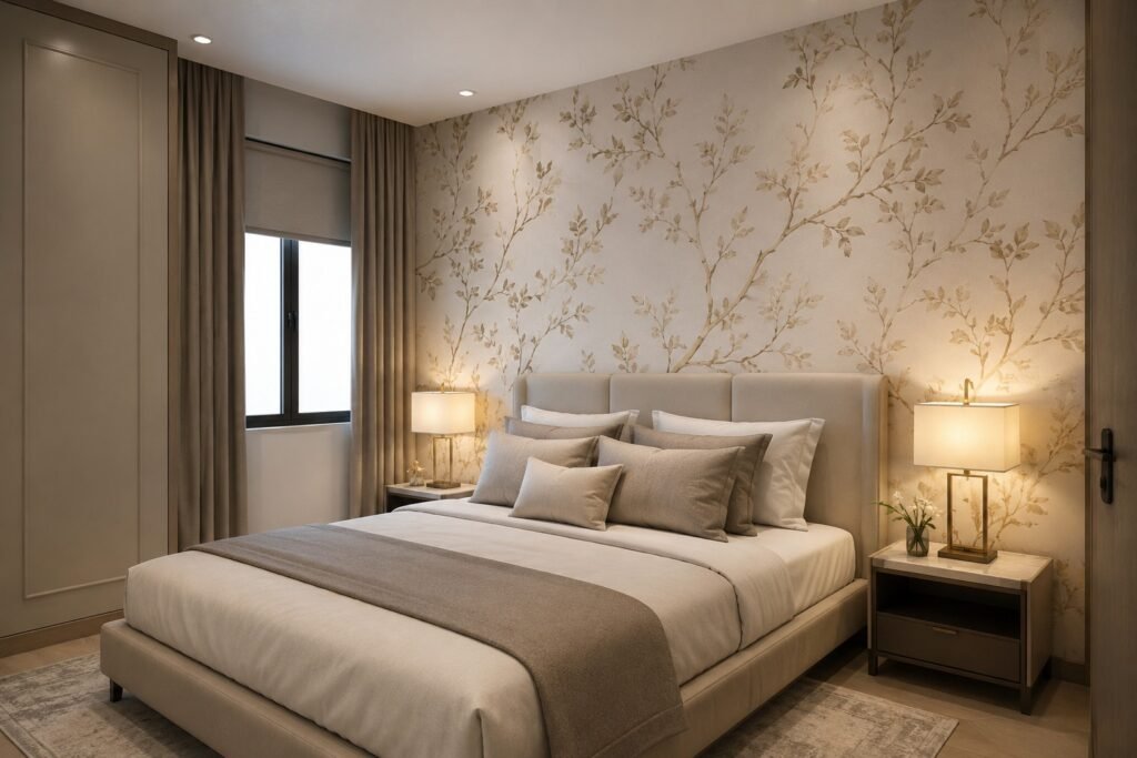
Small bedrooms get unfairly written off when it comes to wallpaper. Oversized prints do shrink a room visually, that part’s true — but small-scale or tonal patterns often make a tight space feel more finished, not smaller.
Vertical stripes, gentle texture, and lighter backgrounds all help here. What doesn’t help is heavy contrast running across the whole wall — it tends to press the room inward rather than open it up.
A trick worth trying: paper the ceiling instead of a wall, and leave the actual walls in a calm solid tone underneath.
Where Primary Bedrooms Justify a Bigger Wallpaper Budget
Bigger square footage and higher ceilings mean a primary suite can hold a stronger pattern without buckling under it. That extra scale is precisely why a costlier grasscloth or hand-painted mural actually pays for itself here.
Ceiling treatment and layered pattern work have both been showing up more in primary suites lately, treating the room as one continuous surface instead of four separate walls. It’s a bigger commitment, no doubt, but it tends to look far more deliberate than matching one accent wall to the duvet cover. Flipping through a few elevated master suite looks before finalizing anything is worth the time, since a pattern reads nothing like itself once it stretches across a fifteen-foot wall instead of a palm-sized sample. Some of the most convincing classy bedroom wallpaper designs I’ve seen actually started in rooms exactly this size.
Of every room in a house, this is the one where a bigger spend tends to feel justified afterward.
Fitting New Wallpaper Around Furniture You’re Keeping
Nobody wants to gut a whole bedroom just to add wallpaper. Pull one color already present in your bedding or rug and build the wallpaper choice around that instead of starting blank.
Wood undertones matter more than people expect walking in. Cool blues and grays tend to clash against warm walnut tones, whereas terracotta, cream, and deep green sit next to that same wood without friction. Getting this pairing right is half the reason classy bedroom wallpaper designs feel put-together instead of just expensive.
When the furniture is already doing the talking — an ornately carved headboard, for instance — a calmer, texture-driven wallpaper tends to outperform a second loud pattern fighting it for attention.
Materials, and What Each One Actually Gives You
Wallpaper materials don’t just differ in price — they change how “classy” the finished wall genuinely feels once it’s installed.
| Material | Feel | Durability | Works Best For |
| Grasscloth | Natural, tactile | Moderate, avoid damp rooms | Accent walls, dry climates |
| Vinyl-coated | Smooth, sturdy | High | Full coverage, busy households |
| Peel-and-stick | Casual, adjustable | Low to moderate | Rentals, quick changes |
| Traditional paste | Layered, rich | High | Long-term homes, statement rooms |
Grasscloth specifically keeps coming up in current design coverage, with several sources pointing to woven, natural textures as one of the year’s defining directions. A sophisticated color trend forecast published by one major wallpaper manufacturer backs this directly, noting a shift toward materials people want to touch, not just look at. Material choice alone is often what pushes classy bedroom wallpaper designs from good to genuinely memorable.
Small Choices That Quietly Cheapen a Good Wallpaper
Plenty of good wallpaper gets undercut by avoidable decisions. Trim that echoes or softly complements the paper tends to look more finished — bright white trim next to a deep, moody print can come across as something that just got missed.
Skipping pattern-matching at the seams is another common shortcut. Saving a little on installation sounds reasonable until visible seam mismatches turn classy bedroom wallpaper designs into something that looks slightly rushed.
Lighting gets overlooked constantly too. A pattern that looked rich under showroom spotlights can flatten out fast under one overhead bulb at home.
Accent Wall Moves Designers Keep Returning To
The one-accent-wall approach is still around, only the thinking about where to put it has moved on. Headboard walls used to be the automatic pick; now it’s just as likely to show up lining a reading nook, tucked into a recessed alcove, or hiding inside a closet as a small reveal.
Framing the paper with molding is another move that instantly elevates it — it stops reading as “a wall someone covered” and starts reading like an architectural choice. Worth checking a few clever accent styling tricks before committing to placement, since the wrong wall gets chosen more often than people admit. Placement mistakes like this are one of the fastest ways to undercut otherwise classy bedroom wallpaper designs.
Ceiling accents, handled carefully, remain one of the more surprising and effective options specifically in a primary bedroom.
How Lighting Quietly Rewrites a Pattern
Showroom spotlighting can make a print look moody and dimensional, then the same roll turns flat and dull once it’s hanging under your own bulbs at home. Warmer bulbs bring golds, browns, and reds forward; switch to cooler bulbs and blues, grays, and greens take over instead. Lighting alone can make or break how classy bedroom wallpaper designs actually read once they’re up.
A few recent design write-ups have also flagged pattern layering as the direction more experienced designers are pushing toward — running two prints that complement each other side by side, instead of asking one busy design to hold up the entire room by itself. Some are calling it a layered pattern design method, and it works better than it sounds once the colors are right.
Before committing to any roll, tape a sample directly to the wall and check it morning, afternoon, and night.
What You’re Really Paying For at Each Price Point
Budget and premium wallpaper don’t just differ in sticker price — they differ in print process, material thickness, and how forgiving each one is during installation.
Lower-cost rolls often use a flatter print method, which can look slightly synthetic up close. Pricier picks, grasscloth being the clearest example, cost more in part because the texture is woven into the material itself instead of sitting on the surface as ink.
On a tighter budget, concentrating funds on one strong accent wall generally beats stretching a cheaper roll across every wall in the room.
Quick Answers Before You Order Samples
Is wallpaper still a classy choice for bedrooms right now?
Yes, particularly textured or tonal options — designers keep citing them as more refined than bold, busy prints this year.
How much should I budget for a roll of classy bedroom wallpaper designs?
Anywhere from roughly $40 on the low end up past $200 a roll — grasscloth and hand-printed styles are usually what pushes that number toward the higher side.
Will wallpaper make a small bedroom look even smaller?
Not automatically — tonal or small-scale patterns often leave a tight room looking more pulled-together rather than smaller.
Is it okay to wallpaper only the ceiling and leave the walls plain?
Definitely — papering just the ceiling is actually a go-to move for adding some drama without eating into wall space in a smaller room.
What wallpaper material holds up longest in a bedroom?
Paste-applied and vinyl-coated versions tend to outlast peel-and-stick by a good margin, especially once humidity gets involved.
Should trim color match the wallpaper or contrast with it?
Leaning toward a match or complement usually works better than a hard contrast — see the trim note above.
Does peel-and-stick wallpaper work for a primary bedroom?
It’s a decent fit for renters or a temporary update, though it rarely matches the richness or the lifespan you get from traditional wallpaper.
What signs suggest a wallpaper pattern won’t age well?
Watch for prints locked into one very specific trend color or a motif that’s too literal — those tend to lose their appeal faster than something quieter and more textural.
Conclusion
With so many classy bedroom wallpaper designs floating around, narrowing the field doesn’t have to feel as daunting as flipping through those sample books suggests. The print itself is honestly the smaller decision in this whole process. Texture, lighting, and how the paper interacts with furniture already in the room end up mattering far more once everything’s installed and lived with daily.
Start by naming the mood you actually want — calm, moody, romantic, grounded — before browsing specific prints. A single accent wall is the safer entry point for anyone hesitant, while full-room coverage suits primary suites that get strong natural light and where there’s a bit more confidence behind the decision.
Material ends up mattering more than most people expect going in. Grasscloth and textured vinyl age better than flat prints and tend to photograph better too, which matters if resale ever crosses your mind. Don’t skip taping a sample to the actual wall either — lighting changes how a pattern reads more than almost any other factor once it’s really up.
Most mistakes are small and fixable before installation ever starts — mismatched trim, skipped seam alignment, a busy print picked for a poorly lit room. Spot those problems early and the room ends up looking planned rather than stumbled into.
At the end of the day, the best classy bedroom wallpaper designs don’t need a loud pattern to earn the word classy. More often than not, it’s the quieter, texture-forward choices still standing years down the line — both visually and in how restful the room actually feels at night.