

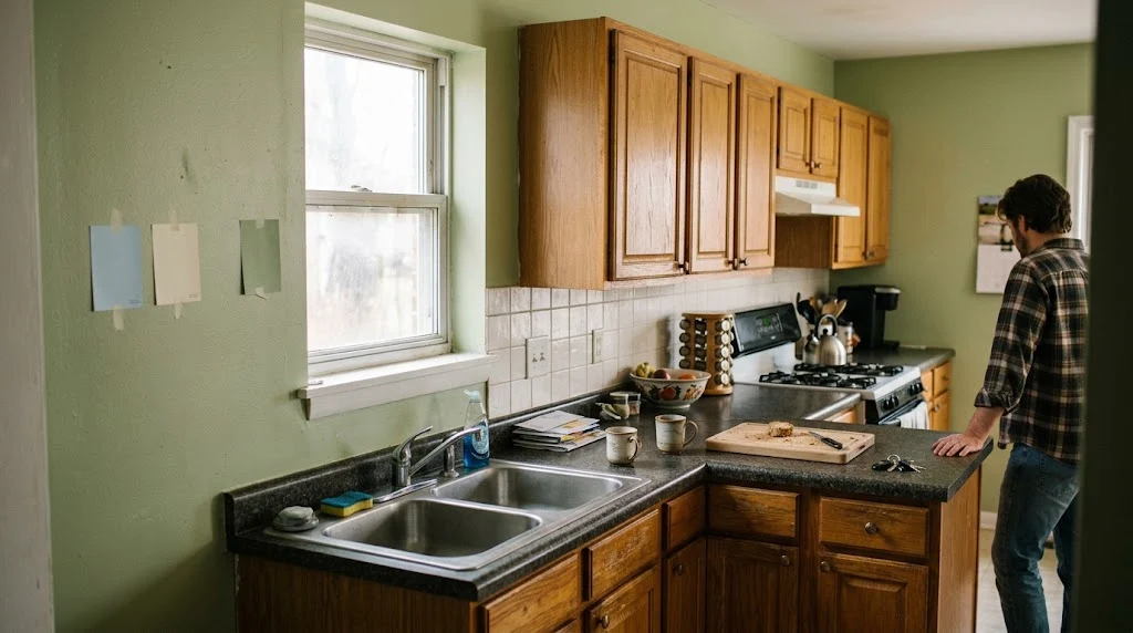
Three times. That’s how many times I repainted my kitchen before something finally clicked. And the weird part? The first two colors weren’t ugly. They just weren’t mine. Nobody warns you about that when you’re scrolling through kitchen wall color ideas at midnight — every photo you find lives in someone else’s sunlit loft, and then you slap the sample on your galley kitchen with its one stubborn window and suddenly you’re standing in a submarine.
No forty-swatch roundup here. I’ve made the mistakes, lived in them, painted over them. What follows is the stuff that actually holds up when you’re weighing kitchen wall color ideas against your own cabinets, your own light, your own budget.
Why Kitchen Wall Color Ideas Should Start With the Cabinets, Not the Wall
Cabinets call the shots. Always have. Paint isn’t sitting there alone — it’s reacting to whatever’s already dominating the room, and in most kitchens, that’s cabinetry eating up nearly half the visual space.
Warm cabinets — honey oak, cream shaker, anything leaning yellow or orange — will bicker endlessly with a cool gray wall. Found this out myself with a builder-grade oak kitchen and a “greige” some magazine swore matched everything. It didn’t. That oak went muddy within a week.
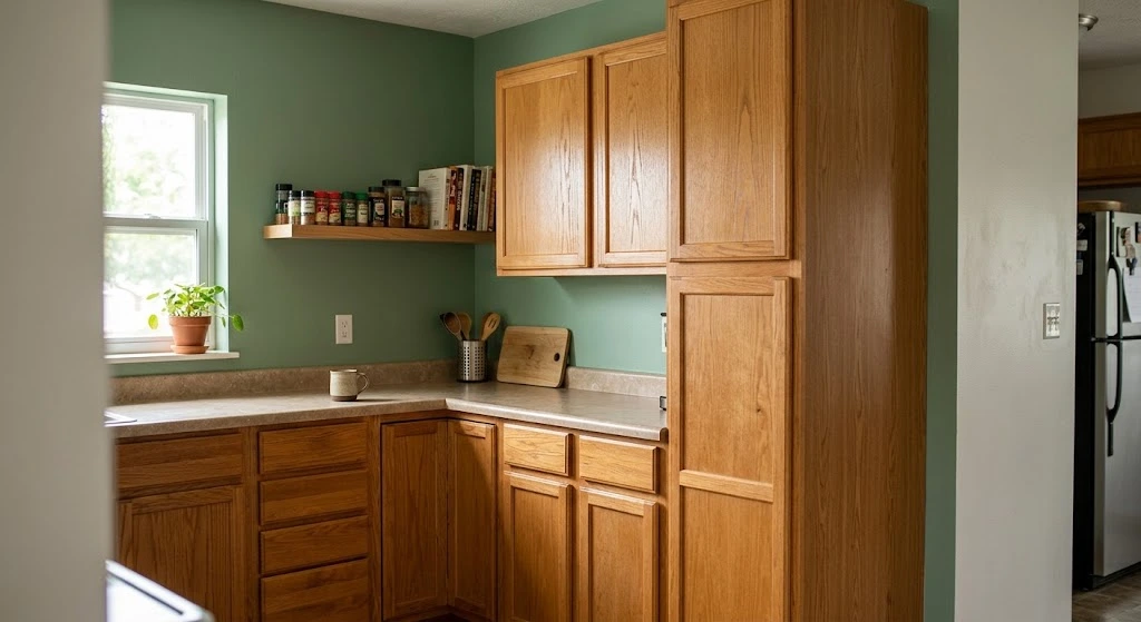
Cooler cabinets give more breathing room. True white, navy, sage — these already sit at a calmer temperature, so the wall behind them has more freedom. This is honestly where the smartest kitchen wall color ideas begin: cabinet first, wall second, never the reverse. Still deciding on cabinetry itself? Worth a look at kitchen wall cabinets before locking either choice down.
Got a Tiny Kitchen? Skip the White, Try This Instead
Pale white isn’t your friend in a small kitchen — a warm, muted neutral does far more work. Sounds backwards, I know. White gets marketed as the “safe, bright” default, but under LED strips or harsh overheads, flat white can look almost clinical. No depth for the eye to move through, so the room reads smaller, not bigger.
My mother-in-law’s kitchen — barely 80 square feet — turned around with a soft, warm putty. Somewhere between beige and gray, with just a whisper of yellow. Bounced the light without going sterile on us. This is one of those kitchen wall color ideas that photos never quite capture, because it’s about how the wall behaves at 7 a.m. versus 7 p.m., not how it looks in a single staged shot.
A handful of things genuinely stretch a small kitchen:
- Wall and trim in near-matching tones, which erases the visual seams
- Satin or eggshell over flat — enough shine to reflect light, not enough to glare
- Letting the color bleed into a connected hallway so there’s no hard visual stop
Speaking of that transition — if your kitchen spills into a hallway, keeping the palette consistent through that gap matters more than most people think. This piece on small hallway decorating ideas gets into carrying light and color through tight spaces without chopping the flow.
White Cabinets Aren’t the Safe Bet Everyone Thinks
Neutral wall, white cabinets — sounds foolproof, right? It isn’t. This is exactly where kitchen wall color ideas quietly fall apart. People assume any neutral works next to white cabinetry, and then the wall reads faintly pink, or faintly green, sitting beside that cabinet white, and nobody can quite name why the room feels a little off.
Here’s what’s actually happening: paint brands mix their whites differently. Some carry a warm base — yellow, red. Others lean cool — blue, green. Pair a warm cabinet white with a cool wall color, and your brain flags the mismatch even without knowing why. The color theory basics Sherwin-Williams outlines for undertone matching are a decent starting reference if you want the technical version of what I’m describing.
What worked for me, eventually, was pulling the wall shade from the same undertone family as the cabinet white — just a few notches darker or a touch more saturated. Sage. Warm taupe. Soft clay. All of them landed well across a few kitchens I’ve helped friends redo, and all three are recurring names on pretty much every serious list of kitchen wall color ideas I’ve come across.
Dark Walls: Statement Move or Slow-Burning Regret?
Depends entirely on your light. Dark kitchen walls sing in a room that already gets decent daylight — and collapse fast in a windowless or north-facing box. Watched this play out on the same street, two houses apart, identical floor plans.
One house had charcoal walls and a generous east window. Looked expensive. Moody in the good way. The other — same exact paint — had zero natural light, and by 4 p.m. in January it felt less like a kitchen, more like a cave with a stove in it. Of all the kitchen wall color ideas I’ve tested personally, dark charcoal was the one where light mattered more than the paint can itself.
If dark tones are calling to you, test first. Paint a two-foot square. Sit with it two full days. Check it at sunrise, midday, and under your actual evening bulbs — not the daylight bulb you use to inspect grout lines.
Dark walls also tend to want restraint on decor — a couple of strong pieces beat a busy gallery wall. Pale framed art has a way of vanishing against navy or charcoal. Worth browsing kitchen wall art that’s built to hold its own against a darker backdrop.
The Undertone Trap Nobody Explains Properly
Every “neutral” hides a second color inside it, and that hidden tint is the reason your painted wall looks nothing like the store swatch once it’s dry. Grays sneak toward purple, blue, sometimes green. Beiges drift pink, orange, yellow. You can’t spot it on a two-inch chip under fluorescent store lighting — it only shows up once it’s covering real wall space in your actual kitchen.
One trick saved me more grief than anything else: hold the paint chip against plain white paper. Not the store wall. Not your phone screen. White paper. The undertone jumps out almost instantly once there’s true white beside it for comparison. This one habit alone has quietly become the backbone of most of my kitchen wall color ideas over the years.
Warm-neutral kitchen wall colors have become the go-to for a reason — they mask undertone slip-ups better than cool grays, because warmth just reads as intentional, even when it drifts a bit. There’s a solid breakdown of specific shades in warm neutral kitchen wall colors if you want ones that behave predictably.
2026 Color Trends: Worth Following or Mostly Noise?
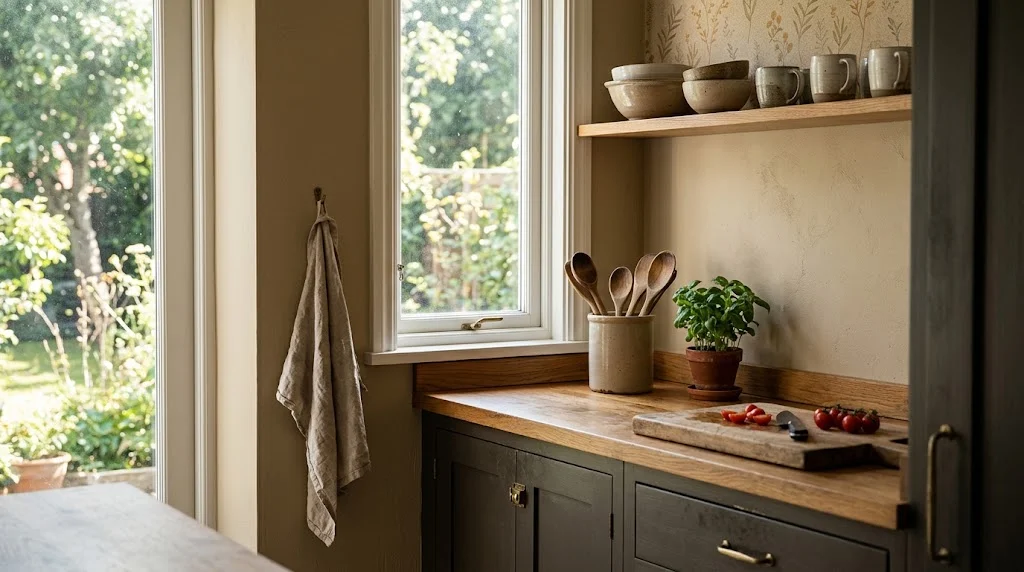
Warmer, earthier, a bit more saturated — that’s the general drift for 2026, a real shift away from the all-gray stretch we just crawled out of. Sherwin-Williams picked Universal Khaki SW 6150 as its 2026 Color of the Year, calling it a midtone neutral built around timeless function and nature-leaning warmth. Nothing loud about it. It’s the kind of color that just settles a kitchen down, which tracks after a decade of trend-hopping.
Benjamin Moore went somewhere entirely different. Their pick, Silhouette AF-655, blends burnt umber with charcoal undertones — a dark shade sitting right between warm and cool. According to ArchDaily’s roundup of the 2026 color-of-the-year selections, the broader industry pattern this year leans toward tonal depth and material honesty rather than flat, single-note neutrals. Tells you something about where things are heading: deeper, more grounded, less of the airy pastel everyone leaned on a few years back.
I’d take both forecasts with some skepticism for kitchen use specifically, though. A “color of the year” gets chosen for versatility across an entire house, not because it’s ideal for a room dealing with steam and grease. If you’re hunting for kitchen wall color ideas that’ll still look right in five years, treat these forecasts as a compass, not a shopping list — direction over the exact shade.
If wallpaper appeals more than a flat coat of paint, that same warm, textured mood is showing up there too — kitchen wallpaper has moved well past the busy florals people still associate with older homes.
What a Repaint Actually Costs and How Long It Takes
Somewhere between $300 and $800 if you’re hiring it out, closer to $80–$150 doing it solo with decent-quality paint. That range bounces around based on ceiling height, how much grease-prep the walls need near the stove, and whether you’re jumping from dark to light, which usually eats an extra coat. Budget matters just as much as taste when you’re narrowing down kitchen wall color ideas — the prettiest shade in the world doesn’t matter if it needs three coats you didn’t plan for.
Budget a full weekend if you’re doing it yourself — one day for cleaning, taping, priming; the second for two coats plus trim work. Grease film near the cooktop needs a proper degreasing wipe before primer touches it, or the paint won’t grip and you’ll watch it peel within a year. Skipped that step once myself. Paid for it within eight months.
One thing worth flagging if your kitchen’s in an older home: check for lead paint before you start sanding or scraping old layers. The EPA’s Renovation, Repair and Painting rule covers what testing and containment look like for homes built before 1978, and it’s not a step to skip just because you’re excited to get to the fun part of picking colors.
Rough cost breakdown for a standard 10×12 kitchen:
- Paint, two gallons, mid-grade — $60–$100
- Primer, if the walls need it — $25–$40
- Supplies: tape, brushes, drop cloths — $30–$50
- Professional labor, if you’re hiring — $250–$600
Matching Wall Color to Cabinet Tone
The table below is basically a cheat sheet for narrowing kitchen wall color ideas down fast, once you already know your cabinet finish.
| Cabinet Color | Recommended Wall Undertone | Colors to Avoid |
| Warm oak/honey wood | Warm putty, soft clay, muted olive | Cool gray, icy blue |
| White (warm-based) | Cream, warm greige, blush-adjacent taupe | Blue-gray, stark cool white |
| White (cool-based) | Soft blue-gray, sage, pale dove gray | Yellow-beige, warm cream |
| Navy or dark blue | Warm white, soft khaki, pale terracotta | Another saturated blue |
| Sage or muted green | Warm cream, oat, soft terracotta | Bright pastel pink |
| Black or charcoal | Warm white, sand, muted gold | Cool pale gray |
Once paint’s settled, everything else on the wall — shelving, tile, hardware — should follow that same temperature logic. Adding open shelving? Check how kitchen wall shelves read against your chosen tone before you install anything, since wood finishes can look strangely orange or oddly gray depending on what’s behind them.
Tile and Texture Are Doing Color Work Too

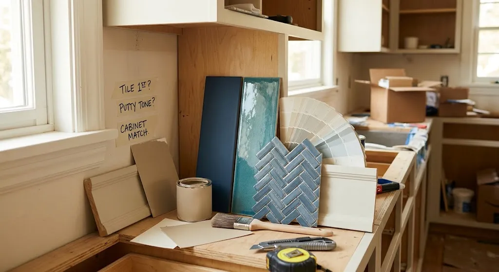
Paint isn’t the only thing carrying color on your walls — backsplash tile is in the conversation whether you planned for it or not. A cool blue subway tile next to a warm putty wall creates the same clash as mismatched cabinet and wall undertones, just at eye level where it’s harder to ignore.
If both are on the table at once, pick tile first — it’s the harder thing to change — then build paint around it. Tile is also a smart place to start if you’re short on kitchen wall color ideas and want the material itself to do most of the deciding for you. Kitchen wall tile has a useful rundown of finishes that shift color depending on the light hitting them.
Once the big three — paint, tile, cabinets — are settled, decor is what actually finishes the room. One strong piece beats six competing frames, every time. If you’re stuck there, wall decorating ideas for kitchen spaces has low-cost suggestions that don’t involve a shopping spree.
A Couple of Honest Opinions Before You Commit
Trend forecasts are good for direction. Bad for decisions. No 2026 palette knows your window placement, your cabinet finish, or what your specific overhead lighting does to a color at six in the evening in the dead of winter.
Test on your actual wall, in your actual room, for at least two full days before buying a gallon. A sample pot exists for exactly this reason, and skipping it is the single most common regret I hear about from people mid-renovation. Five inches of chip and forty square feet of wall can look like two entirely different colors — which is the whole reason kitchen wall color ideas from a screen never translate perfectly without testing them in your own space first.
FAQs
What’s the most forgiving kitchen wall color for resale value?
A light, warm neutral — soft greige or oat — tends to appeal broadly and photographs well, useful if selling ever crosses your mind.
Should the ceiling match the wall color in a kitchen?
Not required — a lighter version of the wall shade on the ceiling can lift a low-ceiling kitchen without a jarring contrast.
Does kitchen wall paint need a special finish?
Satin or eggshell over flat, ideally — kitchens deal with grease and frequent wiping, and flat paint doesn’t hold up well.
How do I test color without committing to a full gallon?
Sample pots exist for this exact reason — paint a large patch, not a tiny square, and check it morning and night before deciding.
What’s the quickest way to narrow down kitchen wall color ideas if I’m overwhelmed?
Start from your cabinet undertone, not a mood board — it instantly cuts the options down to a handful that’ll actually work in your space.
Final Thoughts
None of this is really about chasing whatever paint brand named its color of the year. It’s about knowing your light, your cabinets, and how much abuse that wall takes on a Tuesday night in the middle of dinner. Test before committing. Trust your undertones. Lean warmer than instinct tells you to.
Looking back at my own three repaints, the pattern’s obvious now — I kept choosing colors because they looked good somewhere else, not because I’d actually checked how they’d behave in my kitchen, under my lighting, next to my cabinets. That’s the mistake worth avoiding more than any specific shade. A color that photographs beautifully on someone else’s Pinterest board can fall apart completely once it’s on your own wall at 6 p.m. with the stove running and steam fogging up the window.
If there’s one thing I’d tell a friend starting from scratch, it’s this: don’t skip the sample stage, even if you’re impatient to just get it done. Two days with a test patch will save you the cost of a full repaint down the line, and it’ll tell you things a store swatch never can — how the color shifts under your bulbs, how it sits next to your specific cabinet finish, whether it actually calms the room down or just adds to the noise.
The best kitchen wall color ideas are never the flashiest ones — they’re the ones that still feel right long after the trend moved on, the ones you stop noticing because they just work. Give yourself permission to go slow on this one. It’s paint, not a life sentence, but it’s also the backdrop to a room you’ll stand in every single day, so it’s worth getting right the first time instead of the fourth.