

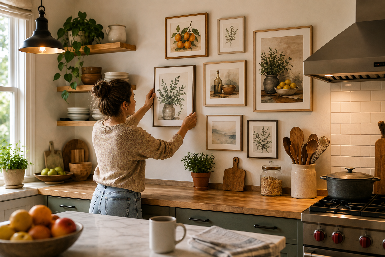
Ask ten homeowners what took them longest to pick for their kitchen, and cabinet color wins almost every time. Ask what’s hanging above the counter, and you’ll usually get a shrug. Kitchen wall art quietly gets skipped, and that’s a strange habit once you think about it. A room people spend hours in every single week deserves more than a leftover frame dragged out of a garage box.
Swap that neglected corner for something deliberate — a gallery wall, maybe, or one confident statement piece — and the whole room shifts. I’ve seen it happen over a single weekend, no exaggeration. What follows isn’t a mood board. It’s the practical side: moisture-resistant materials, heights that don’t look accidental, and enough kitchen wall art direction to skip whatever’s trending on Pinterest this month. Pour yourself something warm first.
Kitchen Walls Do More Work Than People Give Them Credit For
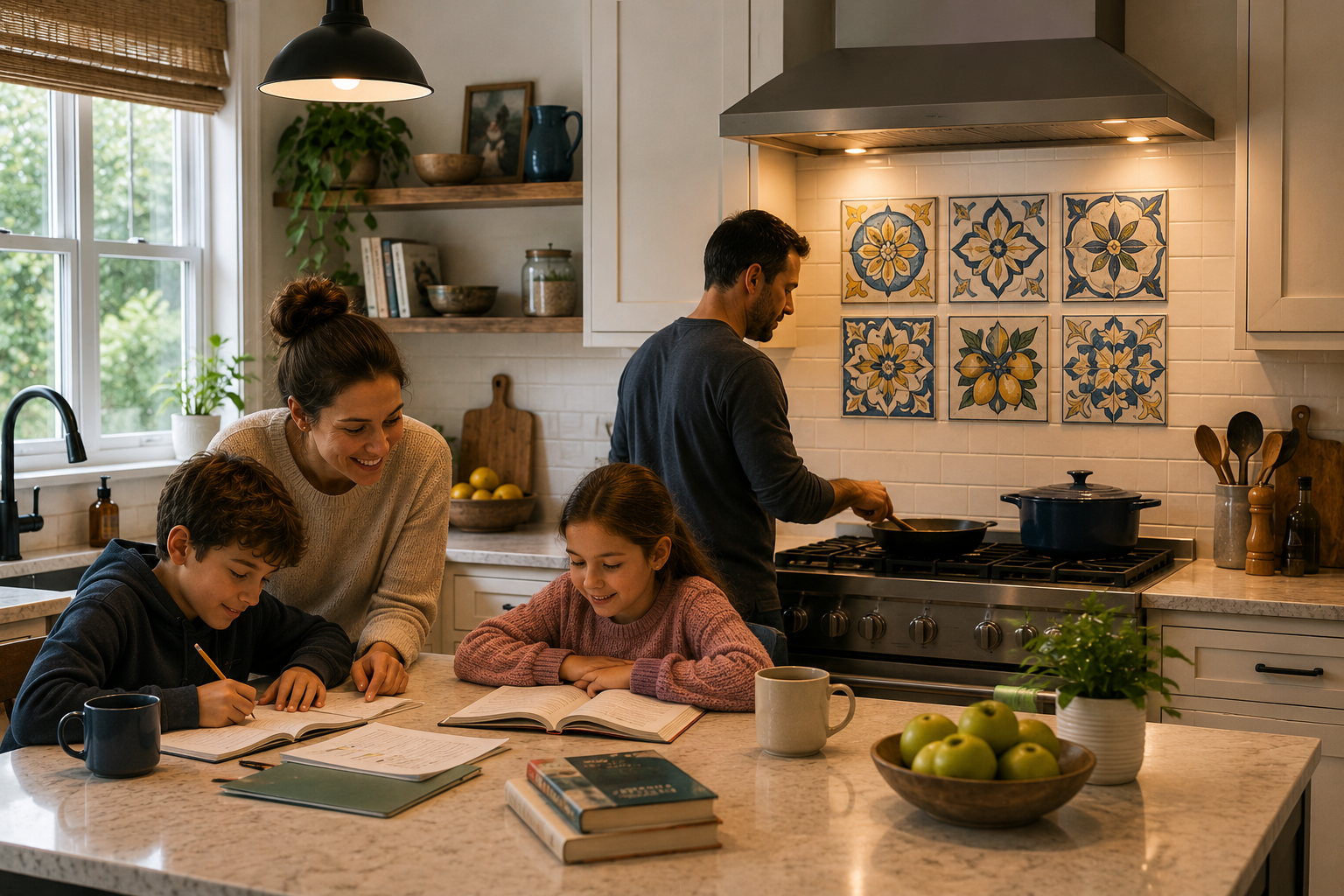
Nobody camps out in the formal living room anymore — that room’s basically decorative at this point. The kitchen is where actual life happens: homework at the counter, coffee at six a.m., three people talking over each other while dinner burns slightly.
Given how much time gets spent in there, the walls deserve better than an afterthought. Leave one bare above the stove and the whole space feels half-finished, cabinets or countertops notwithstanding.
Mosaic-style ceramic tile handles this differently than a framed print would. Group a handful together and it stops looking decorative — it starts looking built-in, almost architectural, and it wipes clean besides.
The Materials That Don’t Buckle Under Steam
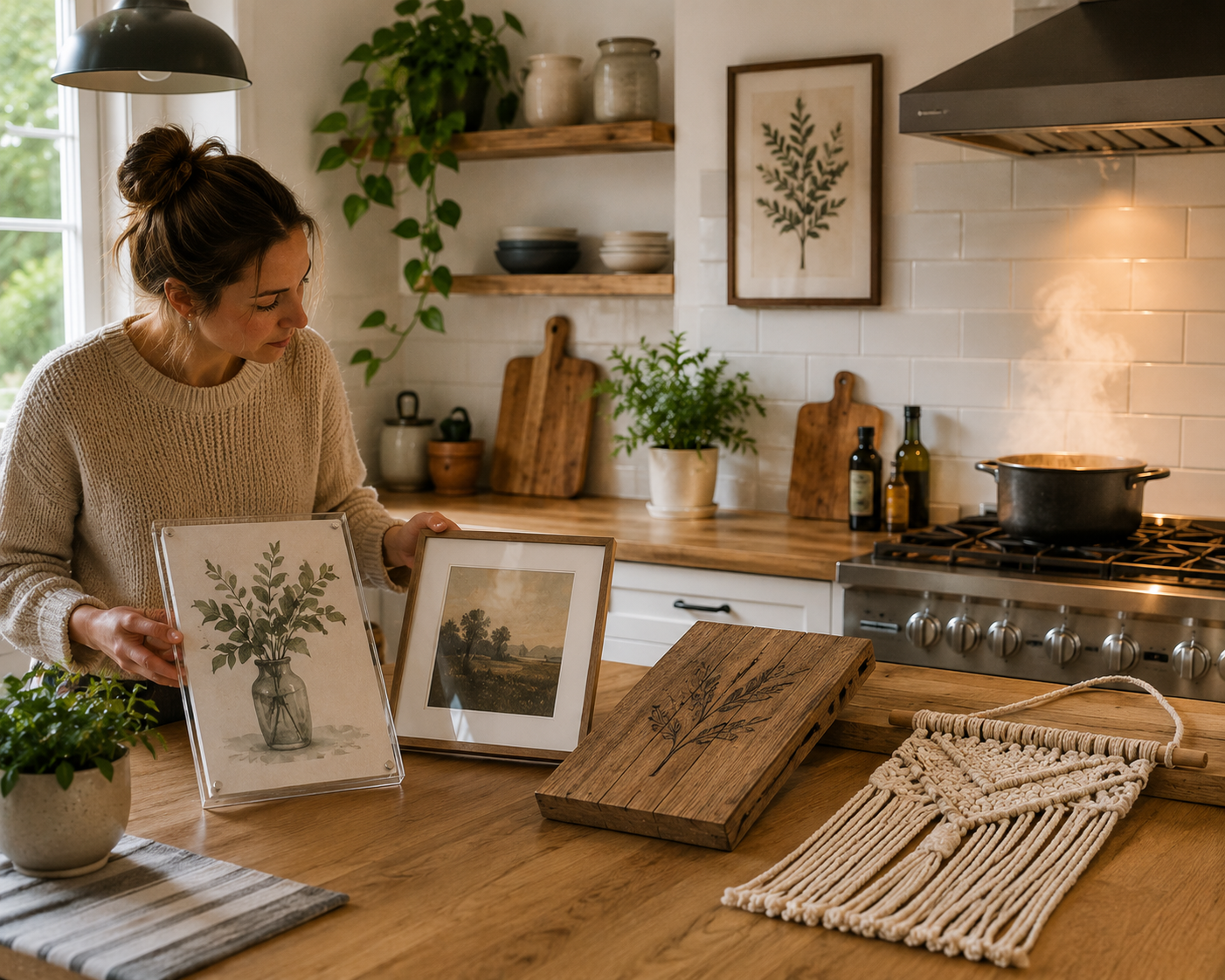
Grease finds every unsealed surface eventually. Acrylic-mounted prints dodge that problem because the coating seals the image shut — moisture just slides off rather than soaking through.
Open-edge canvas, no glazing at all, tends to age badly near a stove. Real glass or acrylic glazing solves that. Macramé, woven fiber pieces, anything with delicate texture — keep that stuff far from the cooking zone, or skip it in the kitchen entirely.
Wood-burned pieces and painted signage have picked up steam lately (no pun intended), and there’s a reason beyond trend-chasing. Sealed wood handles humidity shifts with almost no complaint, and it slots naturally into a farmhouse-leaning kitchen.
Want the fuller breakdown of what pairs with which kitchen style? The kitchen wall decor guide goes deeper into that than this section has room for.
Nail Placement: The Math Behind a Wall That Doesn’t Look Off
Standing height and eye-level height aren’t the same thing above a kitchen counter, and that trips people up constantly. Measure from the countertop, not the floor, once furniture enters the picture — that’s the sightline that actually gets used day to day.
A six-to-eight-inch gap between counter and frame bottom tends to land right, more often than not. Bare wall, nothing underneath? The usual 57-to-60-inch eye-level rule still applies fairly reliably there.
For the exact numbers, this proper hanging height guide covers the math better than a quick paragraph ever could.
Measure twice. Genuinely — a crooked frame in a kitchen announces itself louder than it would anywhere else in the house.
One Big Piece or a Whole Cluster? Depends on Your Wall
Narrow, awkward wall stretches call for a cluster rather than one large frame, which almost never fits that kind of space cleanly. A handful of smaller pieces, grouped with intention, fills the gap without looking crammed.
Vary the frame sizes. Throw in some texture, maybe a small shelf holding one plant. Perfect symmetry kills the effect — odd numbers of pieces (three works, five works better) tend to read as more natural than even ones.
Wide, uninterrupted walls flip the logic entirely. One oversized print — beside a pantry door, above a breakfast nook — carries more presence than five small ones scattered around trying to compete.
Not sure which camp your kitchen falls into? The kitchen wall decorating ideas roundup lays out both approaches against real rooms, which honestly clarified things faster than any design theory could.
What Color Choices Are Quietly Telling Your Kitchen
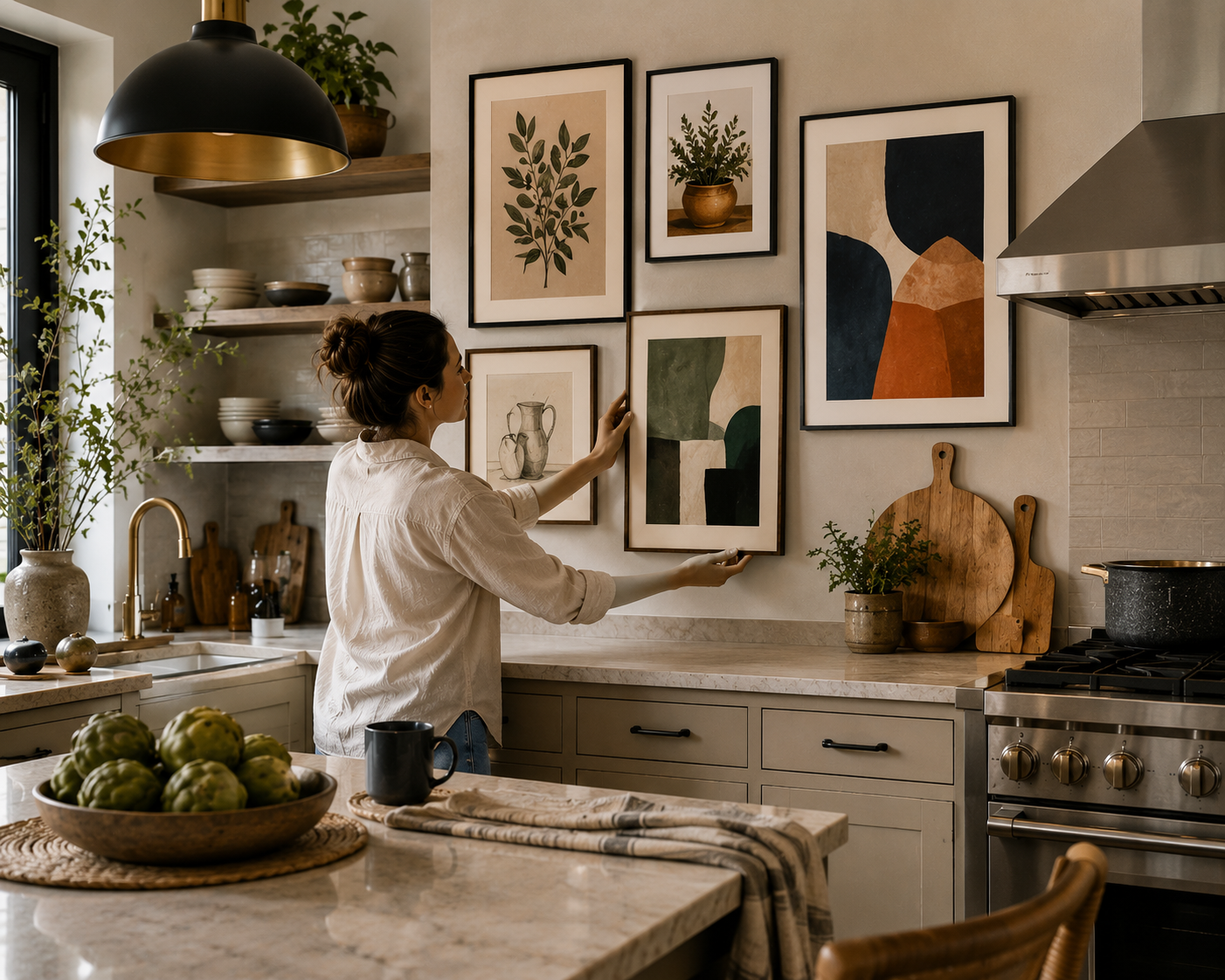
A kitchen loaded with stainless steel and hard edges needs softening, and muted, earthy artwork does exactly that. Flip it around — a flat, beige-heavy kitchen wakes up fast under something saturated and bold.
Everyone reaches for food-themed prints first, and sure, that works fine. But abstract shapes and botanical prints carry a different energy — one that skips the hotel-breakfast-room feeling entirely.
Real interiors coverage has replaced generic stock decor sites as the go-to reference for a lot of designers lately. The designer kitchen wall ideas feature captures that shift well — actual kitchens, actual working designers, none of the staged catalog polish.
One opinion, freely given: skip the literal kitchen puns. “Live Laugh Love” has its audience, but most kitchens can carry something with more visual weight than a cutesy one-liner.
Tiny Kitchen, Still Room to Make a Statement
Limited wall space doesn’t mean limited options. A slim vertical print above the fridge, or squeezed into that narrow gap beside a window, does more with less than people expect.
Mirrors count here too, and they earn their keep in a cramped galley kitchen specifically — light bounces, the room reads larger, and it barely costs anything compared to art.
Open shelving stacked with a couple of small framed prints solves two problems at once: storage and decoration in a single glance. Renters especially lean on this trick since it keeps drilling to a minimum.
One well-placed small print beats five scattered ones in a tight kitchen. Shrink the scale, sure — just don’t skip the step entirely because the wall happens to be small.
The Wall Underneath Matters Just as Much as What’s On It
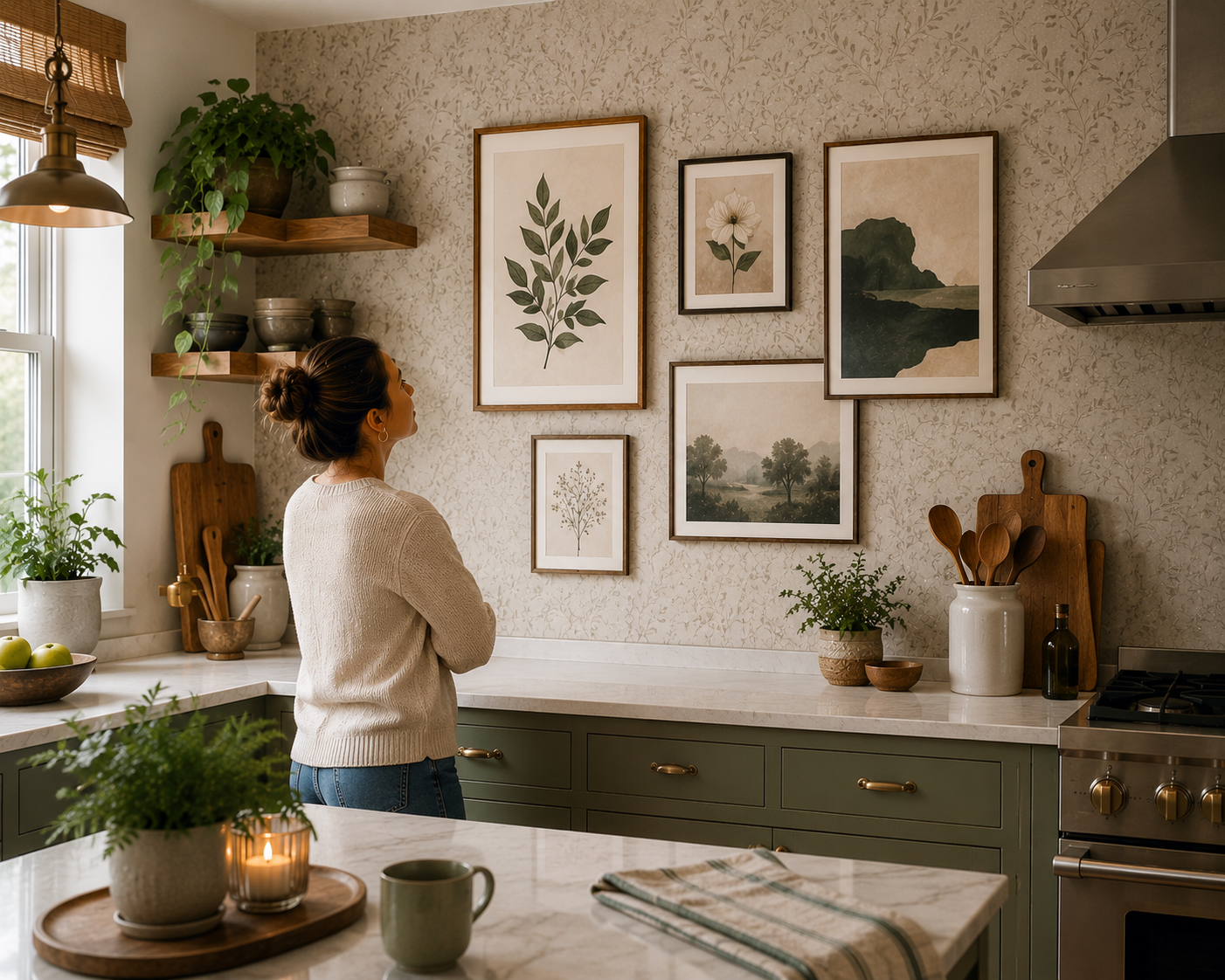
Whatever sits behind the frame competes with it, whether anyone notices consciously or not. A loud backsplash pattern or busy tile can swallow a piece of kitchen wall art whole before it registers with anyone walking by.
Peel-and-stick wallpaper has turned into a dependable backdrop for exactly this reason, especially where a full renovation isn’t on the near-term list. Pair a calm, textured pattern with a few well-hung frames and the whole wall reads more expensive than either piece alone would.
Still deciding between wallpaper and plain paint before adding anything at all? The kitchen wallpaper ideas page is worth a look first — it’ll steer you clear of picking art that fights whatever pattern ends up on the wall.
Cheap Tricks That Don’t Look Cheap
Custom framing costs jump fast, and honestly, they rarely need to. A standard-size print in a ready-made frame from a craft store looks identical once it’s mounted — nobody’s checking the frame’s origin story.
Printable digital art is the quiet budget hero nobody talks about enough. Grab a file, print it nearby, frame it yourself — a custom-feeling result for roughly the price of a coffee.
Old cutting boards, thrifted trays, mismatched vintage plates — cluster them and they double as kitchen wall art for next to nothing, usually with more personality than a matching store-bought set anyway.
Seasonal rotation is underrated too. Swap a few pieces every couple of months and the kitchen feels new again, no spending required.
Where Most People Go Wrong (Myself Included)
Hanging too high happens constantly, almost always because people mount art while standing, forgetting that eye level shifts once someone’s actually cooking or seated nearby.
Undersizing is the flip side of that mistake. A small frame on a big blank wall just looks stranded, like it belongs somewhere else entirely.
I ignored heat zones once, in my first apartment — a cheap paper print six inches from the stove warped within a month. That lesson stuck, expensively.
Perfect matching kills personality too. A little visual tension, a deliberate mismatch here and there, is what separates “lived-in” from “staged for a listing photo.”
Conclusion
Kitchen wall art occupies a strange spot in most renovation plans — invisible until it’s missing, easy to postpone while everything else gets decided first. Fixing that oversight is genuinely one of the cheapest upgrades available anywhere in the house.
Start with function. Map out which walls actually catch heat and steam, then pick materials built to handle it: sealed wood, glass-fronted frames, acrylic-mounted prints, wipeable metal pieces. Only after that does the fun part begin — choosing between a gallery cluster and one confident, oversized piece.
Placement height trips up more people than color choice ever does. A print hung a few inches wrong looks like it’s floating, disconnected from everything below it. Work from the counter line rather than the floor, and hold off on drilling until you’re sure.
Color deserves actual thought too, not whatever leftover swatch matched the countertop sample. Calm tones settle a loud kitchen down; bold ones wake a flat one up. Either path works, provided it’s chosen on purpose rather than inherited from a spare frame in the hallway closet.
None of this requires a large kitchen or a large budget, either. Vertical prints, mirrors, a shelf with two small framed pieces — small spaces handle more than people give them credit for. Thrifted finds and printable downloads, more often than not, end up looking more original than anything bought pre-matched in a set of three.
Treat kitchen walls with the same care the rest of the house already gets. It’s a weekend’s worth of effort, and the payoff shows up daily, right there while the coffee’s brewing.
FAQs
- Which materials hold up best for kitchen wall art near a stove?
Glass-framed prints, acrylic-mounted pieces, and metal art shrug off heat and grease far better than raw canvas or unsealed paper, both of which tend to warp under steady steam exposure.
- What’s the right height for kitchen wall art above a counter?
A gap of six to eight inches between the counter surface and the frame’s bottom edge usually looks correct, adjusted slightly depending on piece size and nearby cabinet placement.
- Does a gallery wall work in a small kitchen?
Generally yes, particularly on narrow or oddly shaped wall sections. Stick to varied frame sizes, odd-numbered groupings, and enough spacing that the arrangement avoids feeling crowded or chaotic.
- Will real prints get ruined by kitchen conditions?
Not if they’re glazed with glass or acrylic and positioned a reasonable distance from direct heat, steam-heavy areas, or splash zones near the stove and sink.
- What kitchen wall art trends are popular right now?
Botanical prints, abstract compositions, black-and-white photography, and wood-burned signage are all seeing renewed interest, especially alongside warmer, less clinical color palettes than in previous years.