

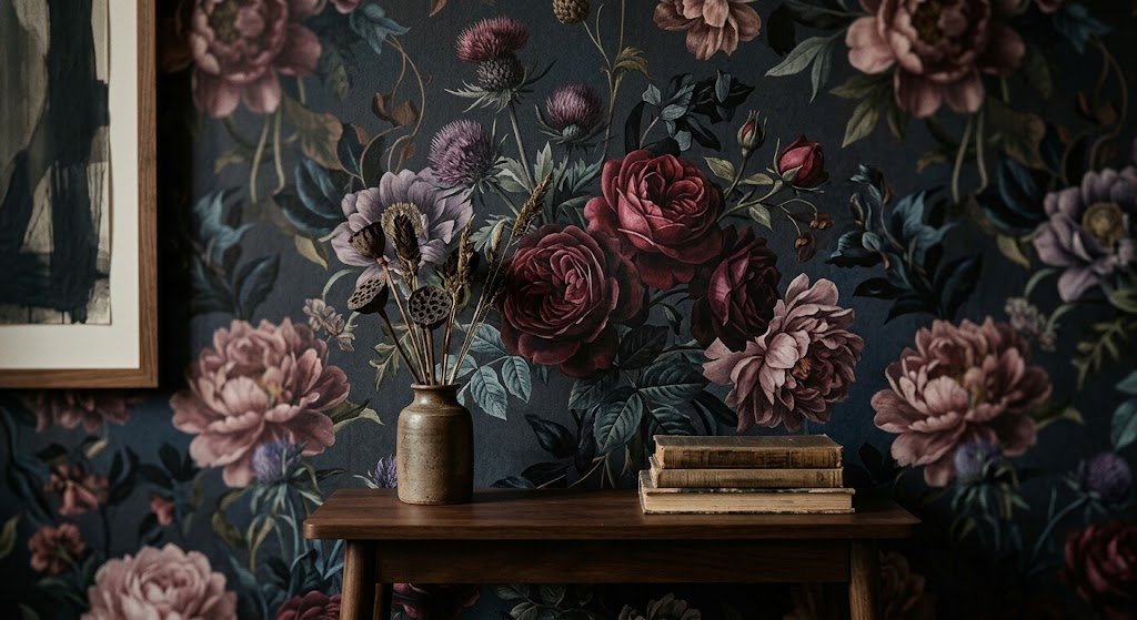
A woman in a narrow Brooklyn brownstone gave me a strange brief six years ago: make her dining room feel like a garden caught at midnight. Odd as that sounded, it’s the reason dark moody floral wallpaper turned into my default suggestion whenever a client’s walls felt flat, and every nervous first-timer since has gotten roughly the same pitch.
Most floral prints chase sunlight. Blush pinks, buttery yellows, that whole sweet cottage mood everyone’s seen a thousand times. Dark moody floral wallpaper does none of that. Shadow becomes the point rather than the problem, and that single reversal is why my inbox fills up with questions about it every spring.
This isn’t a universal fix, though — some rooms fight it, some clients hate the idea before they even try it. Yet when the pairing works, it works. A room nobody used to notice suddenly becomes the one people pause in front of on the way to the bathroom, phone already halfway out of a pocket. What follows is the part nobody puts on a mood board: the actual mechanics of getting there.
Why Dark Moody Floral Wallpaper Feels So Different
Brightness is the default move for most wallpaper. Charcoal, ink black, forest green, a navy that borders on midnight — dark moody floral wallpaper builds its whole backdrop from these instead, then lets the blooms burn against them. Contrast is doing almost all the work here. Put a soft pink peony against black, and it reads twice as loud as the same flower would sitting on white.
Something odd happens with clients who swear they dislike florals — plenty of them come around once they see this version. What they were rejecting wasn’t the flower shape at all. It was the sugary color story attached to it. Take the sugar out, add shadow, and a print that once belonged in a grandmother’s spare room suddenly wouldn’t look out of place in a design magazine spread.
Photographs undersell one part of this completely: texture. Stand in front of a wall like this in person and petals genuinely seem to lift forward while leaves sink back — an illusion flat lighting on a screen just can’t reproduce.
Best Rooms For This Look

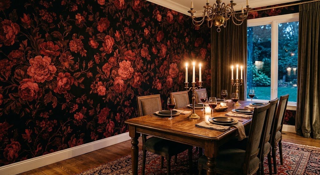
Dining rooms win, hands down, in my book. There’s something about candlelight hitting a black-and-crimson floral pattern that no other wall treatment quite pulls off — even a random weeknight dinner starts feeling like an event.
Bedrooms split people right down the middle. Half my clients find dark walls suffocating; the other half find them almost womb-like, exactly the mood they want before falling asleep. It usually comes down to how much daylight the room gets naturally. Good windows facing north? Go for it without hesitation. One tiny window in a basement guest room? I’d hold back on covering all four walls.
Powder rooms don’t get enough credit. Tiny square footage, low financial risk, maximum visual payoff. Anyone nervous about committing to dark moody floral wallpaper for the first time should start in a half bath — it’s the cheapest way to find out whether you actually love it.
Rooms I’d steer clients away from — windowless home offices, laundry rooms, anywhere that needs alertness and energy rather than hush and intimacy.
Kitchens catch people off guard the most. Almost nobody walks in expecting to fall for a dark floral backsplash or a moody butler’s pantry, yet it’s turned into one of my busiest requests this past year. Brass fixtures and warm open wood shelving against it, and suddenly the room loses that sterile showroom quality — it starts feeling like somewhere you’d actually cook dinner and linger over a glass of wine afterward.
Entryways get overlooked more than they should. Whatever’s on that wall is usually the first thing a guest’s eyes land on, so it ends up quietly setting a mood the rest of the house then has to answer to. More than one client has redone their entire downstairs palette simply because they fell for the entry paper first and built outward from there.
For more room-by-room styling inspiration, Wallsauce’s collection of dark floral designs is worth a scroll — it’s one of the more thorough looks at how this pattern behaves across different room types.
Choosing The Right Color Palette
Nearly every panicked email I get about undertones traces back to this exact step. Dark moody floral wallpaper isn’t a single style — it’s an entire family of looks, all sold under the same dark moody floral wallpaper label, and grabbing the wrong branch is basically guaranteed to leave you with a room that feels murky instead of rich.
Black backgrounds deliver the sharpest possible contrast, leaning hardest into gothic territory — there’s a whole collection of black floral wallpaper worth browsing if that’s the direction you want. Deep teal and navy soften things considerably, landing somewhere closer to coastal-meets-vintage, and a lot of my longer-term clients find that easier to live inside for years at a stretch.
Then there’s the cooler lane entirely — navy and teal give roughly the same moody depth without tipping fully into gothic drama, which makes either one a reasonable compromise for someone who wants intensity but not quite that much intensity.
Whichever palette you choose, watch the flower colors themselves closely. Rust, burgundy, mustard, and deep plum sit gorgeously against dark grounds. Candy-bright blooms fight that same background and end up reading cartoonish rather than romantic — a mismatch I see more often than you’d expect.
Metallic touches are worth a mention too. A hint of gold or copper woven into leaf outlines or flower centers catches candlelight beautifully, adding shimmer without dragging the whole thing into full “glam” territory. Restraint matters here — one or two metallic accents per pattern is plenty, and pushing past that starts pulling focus away from the florals themselves.
How To Test A Sample Before You Commit
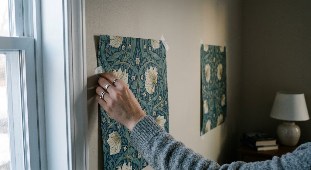
Every client hears this from me, so you’re getting it too: order a physical swatch. Skip the digital rendering, skip the screenshot someone forwarded from Pinterest. Get an actual piece of paper you can tape up and check at seven in the morning, then again at nine at night.
Lighting rewrites everything on a saturated pattern like this. A swatch that looks rich and inky under a warm evening bulb can turn almost grey and flat under cold morning sun — or the reverse, depending which way your windows face. Tape samples in three or four spots around the room and give it a few days before ordering enough rolls for the entire wall.
I learned this lesson the hard way. Years ago, still new to the job, I approved a navy floral for a client off a digital proof alone — no swatch, no second look. It showed up almost black-green under her living room’s northern light instead of the rich blue we’d agreed on. We fixed it eventually, but not before a rough week and a phone call I still cringe remembering.
What to check once your sample lands — hold it against your existing trim, view it under your real light bulbs rather than daylight ones if that’s what you actually use, then back up ten feet to see how the print reads from a normal distance instead of up close.
Before you even reach the sample stage, it helps to browse a few floral background wallpaper ideas just to sense how pattern density shifts a room’s whole mood. Plenty of layouts look chaotic on a screen and calm once installed — and it swings the opposite direction just as often.
Understanding Pattern Scale And Repeat
Repeat size gets almost no attention, yet it’s one of the more technical details separating a professionally hung dark moody floral wallpaper wall from one that looks slightly amateur. Repeat, put simply, measures how often a pattern reuses itself across a strip — tighter repeats read busier and more textural up close, while a longer repeat lets individual blooms stand apart like framed botanical prints.
Larger rooms usually do better with a longer repeat in my experience. It gives the eye somewhere to rest instead of drowning in visual noise. Hallways and small powder rooms can go the opposite direction — a tighter repeat works fine there since you’re rarely standing far enough back to register the density anyway, so it just reads as rich texture.
One more technical note worth knowing: seam matching matters. Straight match hangs easier and costs less to install. Drop match, where the pattern shifts on alternating strips, tends to look more organic and less mechanically “printed” — which suits the romantic, painterly mood this entire style is chasing in the first place.
Furniture And Lighting That Work
Dark walls swallow light — plain physics, not opinion — so lighting strategy matters here more than with nearly any other wallpaper choice. Layering is non-negotiable. Rely on an overhead fixture alone and dark moody floral wallpaper will flatten into a muddy blob by nine at night.
On every project, my minimum is a table lamp running warm bulbs plus a dimmer wherever the budget stretches that far — two extra sources beyond whatever’s on the ceiling. A mirror flanked by sconces earns its keep too, sending light back across the pattern instead of letting it get swallowed.
Trust your instinct less than usual here and lean lighter on furniture than feels natural. Cream, ivory, warm wood, brushed brass — pieces that push back against the wall instead of dissolving into it. I ignored my own advice once, matching black furniture to a black floral wall in a cramped den, and the room basically disappeared. Not moody. Just a cave.
Fabrics that help balance the room — light neutral linen at the windows, something textured underfoot like jute or wool, and cushions pulling a rust or cream tone straight off the wallpaper itself.
Peel And Stick Versus Traditional
Renters shouldn’t count themselves out of this trend at all. A floral peel and stick wallpaper option in a dark palette delivers nearly the same visual impact as a traditionally pasted install, and it comes down clean when it’s time to move — no landlord argument required.
That said, the removable version isn’t identical in feel. Traditional paste-the-wall paper carries a slightly richer texture and lies flatter across imperfect walls. Peel and stick installs more forgivingly on your own, but seams tend to show more easily on a large, uninterrupted surface — especially with a busy dark moody floral wallpaper pattern, where even slight misalignment stands out.
For a permanent accent wall meant to stay put for years, I lean traditional almost every time. For a rental, a nursery you’ll likely redo, or a first tentative try at this whole look, peel and stick wins. Neither choice is wrong here — it really just comes down to how long you’re planning to keep it up.
A quick story: I was nervous walking into one recent project — ink-black background, oversized burgundy peonies, wrapped around all four walls of a guest room with genuinely poor light. We layered in three separate light sources, kept the bedding ivory and the nightstands a warm oak, and the finished room ended up one of my favorites from the entire year. Guests staying there apparently ask about the wallpaper before they’ve even set their bags down. What that project taught me sticks with me now: thin natural light isn’t a dealbreaker by itself, it just means you plan the rest of the room with more care than usual.
Common Mistakes To Avoid
I’ve walked into plenty of rooms where the pattern itself was chosen well but the execution went sideways somewhere. The gap between “stunning” and “slightly off” usually comes down to a short list of avoidable slip-ups.
Skipping the sample stage — buying online sight-unseen, without checking a physical swatch in your own room’s actual light, is the single biggest regret I hear about afterward. Screens consistently lie about undertone.
Layering dark on dark on dark — floral walls plus a dark ceiling plus dark trim plus dark flooring, all at once, all in the same room. Pick a couple of dark elements and give everything else room to breathe.
Forgetting scale is a variable — a small, densely packed floral print can feel crowded in a tight room, while surprisingly, an oversized bloom often reads calmer, since there’s more empty space sitting between each motif.
Rushing straight to an accent wall — not every room needs pattern on all four sides. One wall behind a bed or dining table frequently does more visual work than wrapping the entire room ever would.
Forgetting the ceiling exists — a stark white ceiling floating above a dramatic dark wall can look unfinished, almost like the project stopped halfway through. Even a warm off-white, or something a shade deeper, helps the whole room read as intentional rather than incomplete.
Choosing based on trend alone — plenty of requests come purely from something going viral, which is a fine starting point but a weak sole reason. Wallanza’s trend guide actually supports something I tell clients often — this category’s been climbing for years now, not months, so it’s worth asking whether you’d still want deep botanical prints on your wall five years from now, not just this particular week.
Small Spaces And Big Drama
Here’s something that took me years to actually believe: small rooms often carry dark moody floral wallpaper better than sprawling open ones do. Inside a tiny powder room or a walk-in closet, there’s no long sightline for the darkness to weigh on you — it simply wraps around the space and reads as cozy and deliberate rather than heavy.
If full black feels like too big a leap for a smaller room, a blue floral wallpaper pattern splits the difference nicely — you keep that saturated, moody quality without swallowing whatever light the room does manage to get.
Hallways deserve more credit than they get, too. It’s the most overlooked spot for this whole trend, and the surface area is usually small enough that even a nervous first-timer can commit without much financial exposure.
Dark Moody Floral Wallpaper In 2026
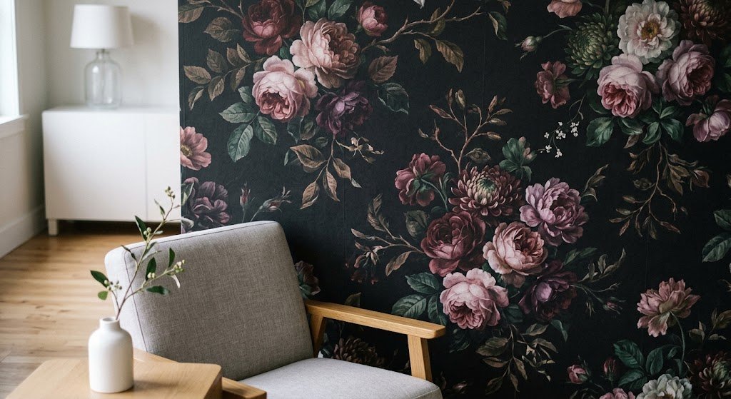
Nothing about this arrived suddenly, and nothing about it is leaving suddenly either. Dark moody floral wallpaper has been on a slow, steady climb for several years running, mostly because it manages to give people two things at once that usually feel like opposites: the gentleness of a botanical print and the drama of a heavily saturated, jewel-toned room.
I’ve dug through a fair amount of industry coverage on this subject, and one observation keeps repeating that matches exactly what I notice with clients — pairing these dark backgrounds with airy, uncluttered furnishings is what keeps a room from tipping into something heavy or cave-like, a point Olive et Oriel touches on in their piece on styling dramatic botanical wallpaper. Their argument is that this look draws from older painting traditions rather than a fleeting color moment, which tracks with why I keep pushing it toward clients worried about regretting a bold decision down the road.
None of that surprises me, honestly. I keep steering people toward dark moody floral wallpaper precisely because it avoids screaming any single year at you. It borrows from something considerably older, meaning it likely won’t feel dated in three years the way a neon geometric print almost certainly will.
Softer Alternatives If You’re Not Fully Sold
Not everyone’s ready to leap straight into the deep end of dark moody floral wallpaper, and that’s completely fine. When full darkness feels like too big a jump, there’s a whole world of floral wallpaper designs that lean sophisticated without going fully moody — muted sage backdrops, dusty rose palettes, that general family of softer tones.
Starting with a single statement piece instead of an entire wall is another option worth considering. A framed panel of botanical print, hung the way you’d hang art, offers a taste of the drama with zero long-term commitment — a trick I use constantly with clients who are curious but still hesitant.
Final Thoughts
I understand why this whole style intimidates people at first glance. Committing to dark walls feels far more permanent than a fresh coat of white paint ever does. But dark moody floral wallpaper rewards the people willing to commit — it’s one of the only design choices I’ve watched consistently turn a plain, forgettable room into the one guests bring up weeks later.
Start small if that helps. A powder room, a hallway, one accent wall tucked behind the headboard. Live alongside it for a week, and I’d genuinely be surprised if you weren’t already eyeing a second room for the same treatment. That’s simply how this particular style tends to unfold.
Ready to actually shop the look? Browse a handful of collections, save whatever makes you pause mid-scroll, and order a physical sample before anything else. Trust me on that last step specifically — it’s the one nobody regrets taking.
Frequently Asked Questions
Does dark moody floral wallpaper make a room feel smaller?
Not typically — it more often makes a space feel enclosed and cozy rather than cramped. Balancing it with lighter furniture and layered lighting is the real key.
What paint colors pair well with it?
Warm whites, soft greige, and muted cream trim tend to work best, since they let the wallpaper stay the loudest element in the room.
Is peel and stick a good option for renters?
Yes, absolutely. Removable versions deliver nearly the same visual punch and come off cleanly once your lease ends.
Will this style feel dated in a few years?
Unlikely. Dark moody floral wallpaper draws heavily from classic still-life botanical art rather than short-lived color trends, so it tends to age gracefully.
How much natural light does the room need?
More light certainly helps, but it isn’t a strict requirement — smaller rooms with warm artificial lighting can pull this look off just as well as sunlit ones do.