

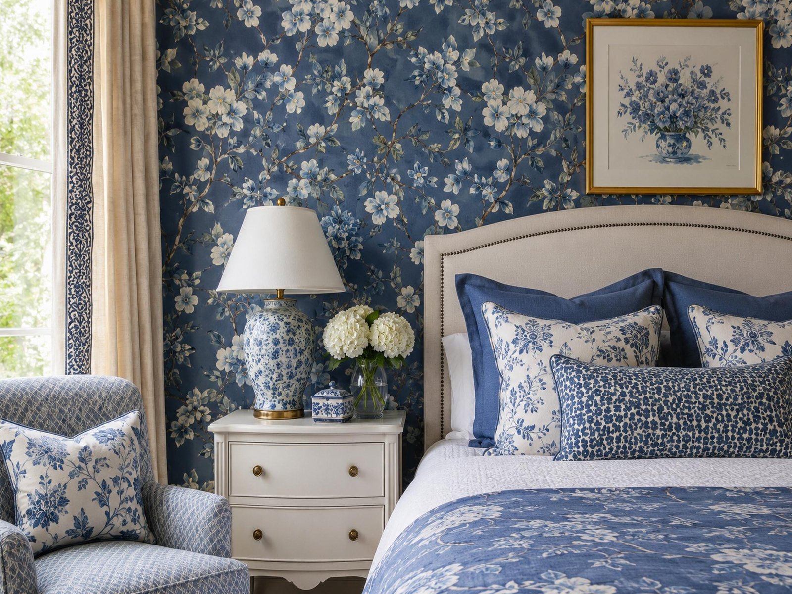
Something odd happens the moment blue floral wallpaper goes up on a wall — the room seems to exhale. Light bends softer, corners feel less sharp, even a cramped hallway stops fighting you. A properly chosen blue floral wallpaper doesn’t sit on a wall so much as rearrange how the whole space acts.
Clients who’ve lived in the same house for a decade will stand there afterward, genuinely confused about why it never looked like this before. This piece covers shade testing, matching prints to actual room conditions, and the mistakes that quietly wreck an otherwise solid choice.
That One Wall Everyone Stops To Look At
Every home tour has a spot where the conversation just stalls for a second. Rarely is it the sofa doing that. Usually it’s whatever pattern sits behind it.
Warm prints tend to demand attention loudly. Blue florals do the opposite — they hold a room’s focus without raising their voice, closer to how a well-placed painting works than how a typical accent wall behaves.
Why Blue Petals Read Calmer Than Warm Tones
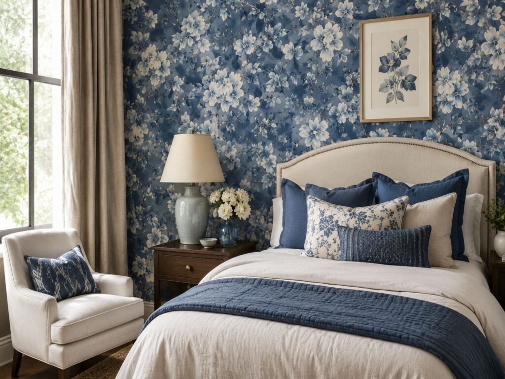
This isn’t just decorating folklore. Paint researchers have tracked the effect for years, and blue is repeatedly flagged as a steadfast bedroom choice because of its naturally soothing qualities, something color psychology research from paint specialists backs up fairly consistently. Benjamin Moore
Florals bring the opposite energy — movement, texture, a sense that the wall is alive rather than flat. Combine the two and the outcome is unusual: a pattern that looks busy from across the room but somehow settles the nervous system up close. Bedrooms and reading corners benefit most from this pairing, though a quiet home office corner works too.
Intensity still matters here. Dusty, powdery blues read as gentle. Cobalt and navy read closer to formal, almost commanding. Mixing those up is a mistake I still watch people make on a weekly basis.
Picking A Shade Before You Commit
Tape a sample to the actual wall and leave it there two full days before deciding anything. Store lighting flatters everything equally, which is exactly the problem.
Morning sun tends to wash a pale blue floral wallpaper into something closer to gray. Lamp light in the evening usually deepens it instead, pulling out violet undertones nobody noticed on the shelf. Rooms that catch harsh afternoon sun should lean one shade darker than instinct suggests, since the light will soften it anyway.
Anyone leaning toward richer, more saturated florals rather than something pale should browse moody dramatic wall styles before finalizing a shade — contrast shifts dramatically once paper actually meets wall, in ways swatches rarely predict.
Matching Patterns To Room Size And Light
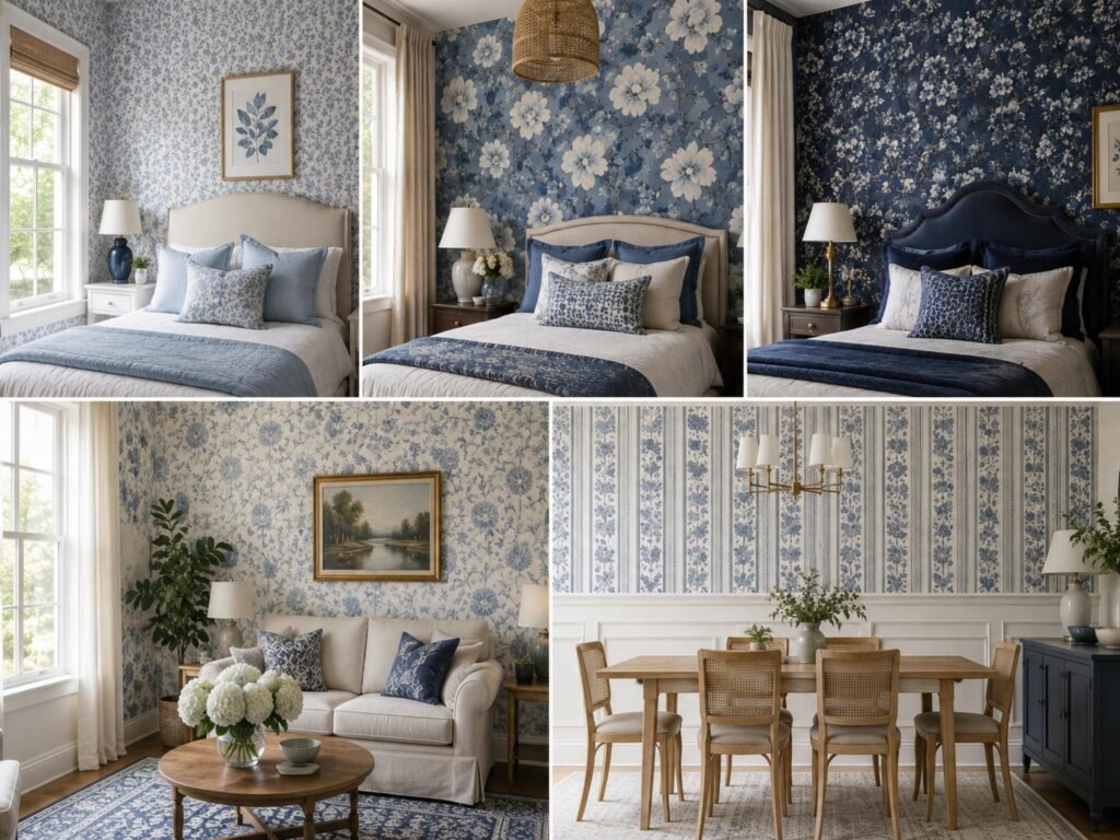
Oversized prints punish tight rooms. A small guest bedroom wrapped in giant blue blooms starts closing in on itself, particularly under a low ceiling. Scale the print down, and suddenly the same room reads as deliberate rather than cramped.
Large rooms flip that logic entirely. A timid, small-scale floral gets swallowed whole by a spacious living room, fading into background static. Going bigger than feels comfortable is usually correct once furniture fills the gaps.
Light direction changes the math too. North-facing rooms with cooler, dimmer daylight can carry richer, more saturated blues without turning cold. South-facing rooms already flooded with sun can absorb a bold floral without tipping into overwhelming.
Design Styles That Pair Well With This Print
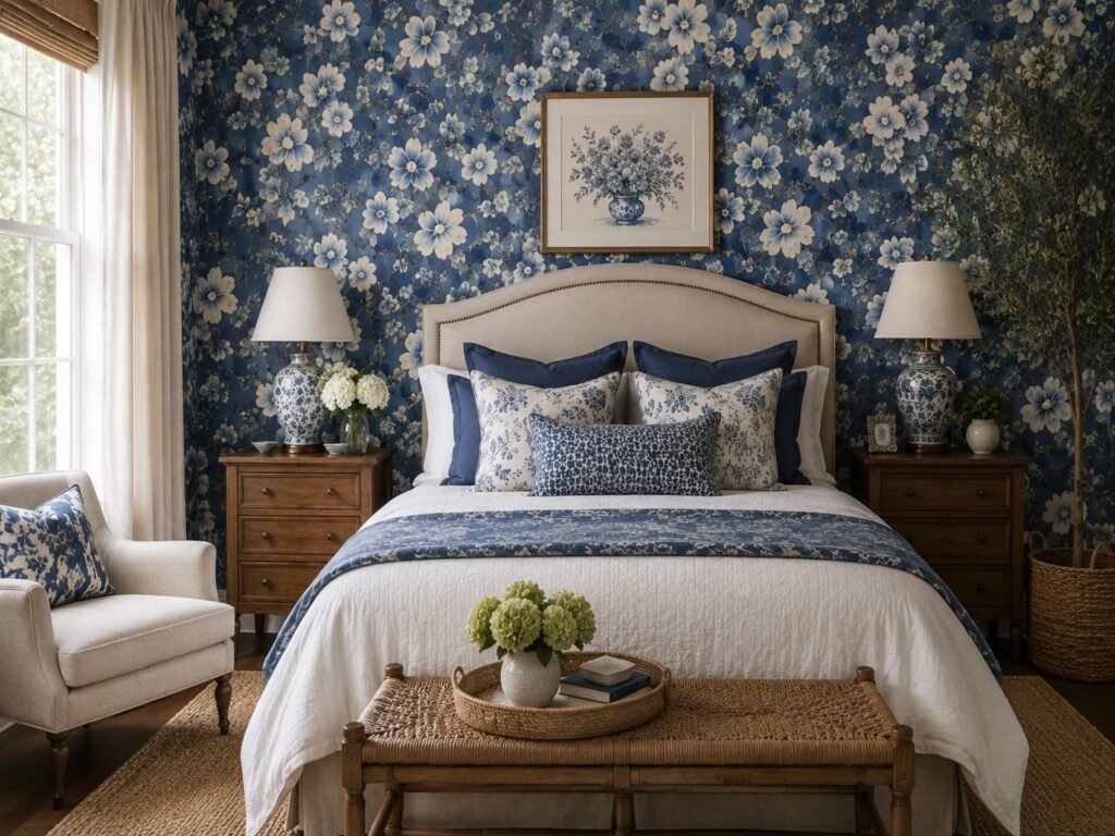
Blue florals aren’t locked to a single aesthetic, which surprises people more often than it should. Cottagecore leans on it constantly — brass fixtures, linen curtains, furniture with some visible wear. Coastal interiors borrow it too, though with cleaner lines so it doesn’t slide into dated territory.
There’s a quieter route as well: a single accent wall inside an otherwise minimal room, paired with matte black frames and sparse furniture. That version reads less like a statement and more like a mood someone deliberately built.
Designers working with layered botanical prints often describe the effect in almost architectural terms — one well-known voice in the field noted that covering a room’s surfaces in matching botanical print creates the sensation of sitting inside a garden structure, a comment that shows up in bedroom wallpaper coverage from Homes & Gardens and lines up with what most florals actually do once installed floor to ceiling. Homes and Gardens
A Quick Way To Compare Options
| Room Type | Recommended Print Scale | Best Blue Tone |
| Small bedroom | Small to medium print | Powder or dusty blue |
| Living room / lounge | Large, oversized print | Cobalt or deep teal-blue |
| Home office | Medium print, low contrast | Slate or muted navy |
| Bathroom (vapor-resistant paper only) | Small, tight repeat | Soft sky blue |
| Hallway or entryway | Medium, high-contrast print | Navy on cream base |
Treat this as a starting point. Light and furniture placement will nudge the final call either way.
Step-By-Step: Getting It On The Wall Without Regret
- Measure the wall twice and add roughly 10% extra paper for pattern matching waste.
- Prime the surface, especially over a previously dark-painted wall.
- Begin at the most visible corner, never a hidden one.
- Dry-fit the first strip against a plumb line before touching any adhesive.
- Smooth outward from the center to push trapped air toward the edges.
- Trim excess along the baseboard last, once the paper has fully settled.
Skipping step four is where most weekend DIY jobs quietly go sideways.
A Bedroom That Didn’t Go As Planned
A client once picked a deep cobalt floral for a north-facing bedroom, certain it would feel cozy immediately. It did — a little too well. Without enough supplemental lighting, the room leaned closer to cave than retreat, and we ended up adding two extra wall sconces just to rebalance it.
That’s the part nobody mentions upfront: deeper blues demand more artificial light support than the swatch ever suggests. The room turned out lovely in the end, though it cost her an extra weekend and two unplanned hardware runs.
If a room already leans slightly cooler than expected, softer blush toned room accents are worth a side-by-side comparison before committing — sometimes swapping the undertone solves more than adjusting the shade of blue itself.
Small Mistakes That Ruin An Otherwise Good Room
Skipping the repeat-pattern measurement is a common one. Large-scale prints with a tall vertical repeat need more wall height than most people budget for, and it shows up immediately as an awkward cut line near the ceiling.
Ignoring existing undertones is another trap. Warm flooring or trim can clash harder against a cool blue floral than expected — testing a swatch against the actual floor, not just the wall, prevents most of that regret.
Then there’s the primer step people skip to save an afternoon, only to watch seams start lifting within the year.
Caring For Printed Walls Long Term
Most modern blue floral wallpapers, particularly vinyl-coated versions, tolerate a damp cloth without complaint. Abrasive scrubbing dulls the print faster than sunlight ever manages to.
Bathrooms and kitchens need humidity kept in check specifically. Seams are the weak point — trapped moisture behind them, not the paper itself, is usually what triggers peeling.
For a broader sense of pattern options before finalizing anything, it’s worth scrolling through botanical print collections available, since seeing multiple intensities side by side tends to make the final decision noticeably easier than comparing single swatches in isolation.
FAQs
Is blue floral wallpaper too bold for a small bedroom?
Not if the print scale stays small to medium. Pale, dusty blue tones tend to open up compact rooms rather than shrink them further.
Does this pattern work outside bedrooms?
Yes — living rooms and hallways both handle it well, particularly with a larger, higher-contrast print scale.
What blue shade pairs best with warm wood furniture?
Slate or muted navy bridges warm wood tones more comfortably than a bright, saturated cobalt does.
Can peel-and-stick versions handle bathroom humidity?
Only vapor-resistant, vinyl-coated versions belong in bathrooms — standard peel-and-stick paper will bubble over time there.
How do I know if a print is too large for my room?
If the full repeat can’t complete at least once between floor and ceiling, the scale is likely too big for that wall.
Will blue floral wallpaper date as fast as other trends?
Compared to pink or red florals, blue tends to age slower and pairs with a wider range of furniture styles over time.
Conclusion
Choosing blue floral wallpaper has less to do with finding the prettiest roll in a catalog and more to do with matching intensity, scale, and light to a room that already has its own habits. The exact same print that calms one bedroom can overwhelm another simply because the light angle differs, or the ceiling sits a foot lower than expected.
Patience during the decision phase separates a good outcome from a disappointing one far more than installation skill does. Sampling the shade under your own lighting, checking repeat size against actual wall height, and being honest about how much contrast the furniture can absorb — these three things prevent more regret than any tutorial on smoothing air bubbles ever will.
Anyone still weighing options between softer and bolder florals should browse a few classic floral pattern designs side by side before locking anything in, since comparing intensities directly tends to clarify a decision that photos alone rarely settle.
At the end of it all, blue floral wallpaper rewards whoever’s willing to slow down before buying. Get that part right, and the wall genuinely does the rest of the work on its own.