

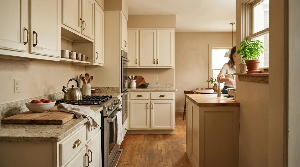
A client called me last spring, frustrated because her brand-new kitchen “felt like a hospital waiting room.” Same layout, same cabinets, same everything as her Pinterest board — except the wall color was a stark, icy white that made the whole room feel clinical instead of inviting. We swapped it for a soft tan, and within a week she texted me a photo saying it finally felt like her kitchen. That’s the power warm neutral kitchen wall colors have, and it’s why I reach for them constantly in my work.
There’s nothing flashy about warm neutral kitchen wall colors. That’s kind of the point. They sit in the background, they don’t demand attention, and they somehow make everything else in the room — your cabinets, your hardware, your countertops — look better by comparison.
The Real Difference Between Warm And Cool Neutrals
Confusing warm and cool neutrals happens more often than most homeowners realize, mostly because paint labels rarely spell out the undertone clearly. Cool neutrals — icy grays, blue-tinted whites — pull toward the blue or purple end of the color wheel. Warm neutral kitchen wall colors pull the other way, toward yellow, tan, or soft red. Simple enough on paper, but paint chips lie to you constantly under store lighting.
Here’s what I actually tell people to do: grab the swatch, tape it up somewhere near natural light, then forget about it for a day. Check back once in early morning sun and again once the evening light hits. A shift toward peach or gold confirms warmth; a pull toward gray or blue means it’s cooler than the paint chip made it look.
Warm neutral kitchen wall colors tend to photograph better too, oddly enough — something about the way they catch light makes kitchens look sunnier in photos even on overcast days. If you’re browsing broader kitchen wall colors options before narrowing down to warm shades specifically, it’s worth seeing the full range side by side first.
Paint Shades I Actually Recommend For Warm Neutral Kitchens

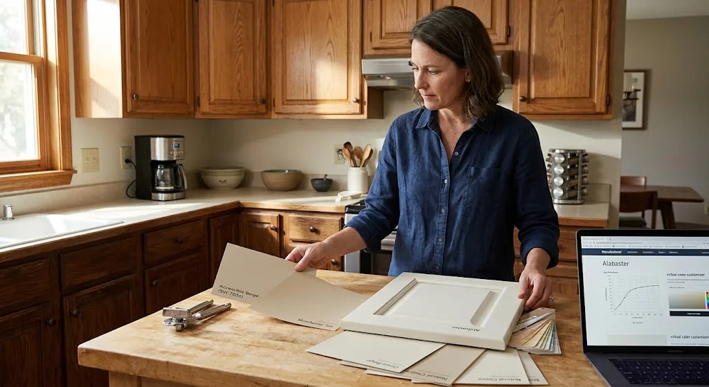
Every consultant has their shortlist, and mine hasn’t changed much in years because these warm neutral kitchen wall colors just perform. Instead of listing every color the same way, I’ll walk through why each one earns a spot on my shortlist.
Sherwin-Williams Accessible Beige (SW 7036) is my most-used color, period. It works with oak, walnut, painted cabinets — pretty much anything. Manchester Tan from Benjamin Moore leans golden and deep, which makes it a strong match for kitchens with darker wood cabinetry — it doesn’t wash out next to walnut or espresso finishes the way lighter shades sometimes do. Natural Choice, from Sherwin-Williams, sits at the opposite end: soft, almost milky, and useful in kitchens that already run a little dim. Grant Beige works well for anyone nervous about looking too tan; it holds warmth without tipping into orange. And Alabaster, while technically marketed as an off-white, carries enough underlying warmth that I still recommend it constantly among warm neutral kitchen wall colors.
Before committing to Alabaster, it’s worth pulling up how the shade performs under different lighting directly from the manufacturer, since screens rarely render paint color accurately.
If I had to pick one warm neutral for a client I’ve never met, Accessible Beige wins every time. Boring answer, I know. But it just doesn’t fail.
Undertones Vs Greige: Don’t Confuse The Two
Greige gets thrown around as a synonym for warm neutral, and it’s really not the same thing. Greige blends gray into beige, which cools the whole shade down. True warm neutral kitchen wall colors skip the gray entirely and lean purely into tan, cream, or soft gold.
Gray-veined quartz, chrome faucets, and stainless appliances tend to look sharper next to greige rather than a pure warm neutral, since greige carries just enough coolness to match those finishes. Flip that around for a kitchen built on warm wood flooring or brass fixtures — greige will fight the space instead of complementing it, and that’s exactly when warm neutral kitchen wall colors earn their keep.
I remember a project where the homeowner went through three separate greige samples convinced she just hadn’t found “the right one” yet. Turned out the issue wasn’t the shade at all — her oak cabinets needed genuine warmth, not another gray dressed up as neutral. One switch to a real warm neutral solved what three greige cans couldn’t.
Pairing Walls With Cabinets And Counters
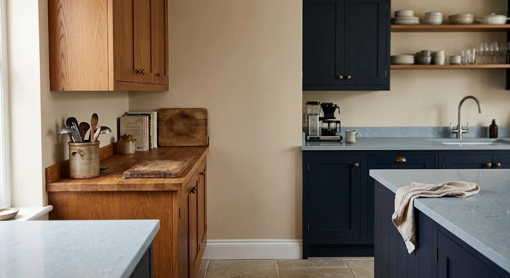
This part decides whether the whole room works or not, and I don’t think it gets enough attention. Cream or ivory cabinets look sharp against a slightly deeper warm neutral wall — enough contrast to define the space without going dramatic. Wood cabinets need a wall color a shade or two lighter than the wood itself, otherwise the whole kitchen reads as one heavy, brown blur.
Dark cabinets — navy, forest green, even black — are having a real moment right now, and warm neutral kitchen wall colors make that darkness feel deliberate instead of harsh.
Still deciding on cabinet finishes? It’s worth browsing kitchen wall cabinets styles before locking in paint, since cabinet tone should really steer your choice of warm neutral kitchen wall colors, not the reverse.
Countertops matter here too. Warm quartz and butcher block sit comfortably next to almost any warm neutral shade on my list above. Cooler marble or blue-gray quartz calls for a more muted option — something closer to Grant Beige than a golden tan — so the whole space doesn’t feel like it’s pulling in two directions.
How Light Exposure Changes Your Options
I can’t stress this one enough: the same paint can produces different results depending on which direction your kitchen faces, and this matters more for warm neutral kitchen wall colors than almost any other palette. Kitchens facing north deal with cooler, bluer daylight most of the day, so the wall color needs extra richness just to read as warm at all. Kitchens facing south get the opposite problem — so much warm sun pours in that an already-golden paint can tip into looking orange by mid-afternoon.
| Kitchen Facing | Natural Light Type | Suggested Approach |
| North | Cool, bluish | Choose a richer warm neutral |
| South | Warm, direct | Go more muted, avoid golden tones |
| East | Bright mornings, dim evenings | Mid-range warm neutral works most hours |
| West | Dim mornings, intense evenings | Test the swatch at both 8am and 6pm |
| Minimal natural light | Relies on artificial lighting | Choose warm-toned bulbs in the 2700K-3000K range to support the wall color |
Paint a large swatch — bigger than the store’s little card, at least two feet square — and watch it for two full days before deciding. I’ve had clients paint an entire kitchen based on a two-inch chip and regret it by week’s end, and it’s almost always because the lighting test got skipped.
When This Approach Doesn’t Actually Work
I won’t pretend warm neutral kitchen wall colors are right for every kitchen, because they’re not. If your space already leans warm — orange-toned floors, brick backsplash, terracotta accents — stacking another warm neutral on top can turn muddy fast. Sometimes a kitchen needs something cooler to create balance, even a crisp white or muted sage.
Rooms that don’t get much sun are the ones most likely to end up regretting a deeper shade — warm neutrals can tip from inviting to gloomy fast once natural light drops. My rule for dim kitchens: stay light, always, especially when narrowing down warm neutral kitchen wall colors for a north-facing room. Sheen deserves attention too, since it’s the detail people forget until grease starts showing on the wall six months in.
Sheen, Finish, And How They Shift The Color
Finish choice changes how warm neutral kitchen wall colors actually read on your wall, and it’s a step people skip. Flat finishes absorb light, which can make a color look slightly duller or grayer than the sample card promised. Satin and eggshell bounce more light back, which tends to make the warm undertone more noticeable — sometimes more than intended if you wanted something subtle.
Benjamin Moore’s Swiss Coffee page is a genuinely useful reference for seeing how sheen shifts a single color across different lighting setups, even if that particular shade isn’t the one you land on.
Kitchen-friendly sheen: washable matte or eggshell — both wipe clean without excess shine.
Patterned backsplash tile and warm neutral kitchen wall colors can look genuinely striking together, but only when the paint echoes an undertone already present in the tile rather than ignoring it. Skip guessing from memory — bring the actual tile swatch with you to the paint counter every time. If your backsplash is still undecided, take a look through some kitchen wall tile options before finalizing paint — the two choices really need to happen together.
Small Kitchens Need A Different Strategy
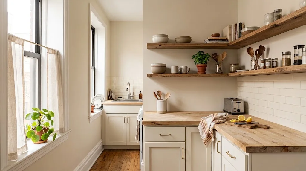
Tight kitchens shrink further under dark, saturated color, so I usually steer small spaces toward the lighter side of warm neutral kitchen wall colors — Natural Choice or Alabaster rather than something as deep as Manchester Tan.
A few things that help small kitchens specifically:
- Keep trim slightly lighter than the wall to preserve height
- Swap heavy upper cabinets for open shelving to open up sightlines
- Add warmth through textiles and decor instead of a bolder paint choice
- Use sheer window coverings to maximize whatever daylight you have
Leaning toward open shelving in a smaller layout? Browse kitchen wall shelves ideas before painting, since shelf placement changes how much of your warm neutral kitchen wall colors actually stay visible once everything’s styled.
Consistency helps small spaces too — keeping walls, cabinets, and grout in a similar warm family avoids jarring contrast that makes a tight room feel choppier than it is.
Styling The Room Once Paint Is Dry
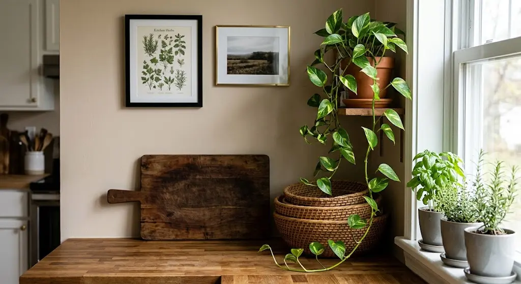
A freshly painted wall in one of these warm neutral kitchen wall colors is basically a blank stage — it looks its best once you layer texture back on top. Wood cutting boards, woven baskets, framed art in black or brass frames all pop nicely against this kind of backdrop without competing for attention.
Clients who match their decor too closely to the wall color — same beige family top to bottom — often end up with a room that feels flat. You want contrast somewhere, even if the wall itself stays quiet. A handful of kitchen wall decor ideas can help if the space feels a little plain once the paint dries.
Plants do more work here than people expect. A trailing pothos or a small windowsill herb garden adds green that warm neutral kitchen wall colors seem built to showcase.
What This Actually Costs And How Long It Takes
Pricing shifts depending on where you live and how big the kitchen is, so treat every number here as a ballpark rather than a fixed rule. One gallon from most major paint brands covers roughly 350-400 square feet per coat, and two coats are standard for kitchens, especially over a previously dark wall. Going the DIY route keeps spending limited to paint, primer, and basic supplies. Hiring out adds labor, so get a couple local quotes before assuming a flat rate applies to your project.
A typical kitchen can be prepped and painted with warm neutral kitchen wall colors over a single weekend if walls are already in decent shape. Add an extra day if there’s grease buildup near the stove. Skip that step and you’re asking for trouble — unremoved grease keeps paint from bonding properly, and peeling shows up within months, not years.
Frequently Asked Questions
Are warm neutral kitchen wall colors still relevant in 2026?
They’ve actually grown more popular, with homeowners now favoring deeper, richer warm tones over the flatter greige that dominated a decade back.
What separates warm neutral from warm white?
Warm white stays close to true white with a whisper of warmth, whereas warm neutral kitchen wall colors show a clear tan or golden cast throughout the shade.
Does stainless steel clash with warm-toned walls?
Not typically — stainless is neutral enough to sit comfortably next to most warm neutral kitchen wall colors, with only the heaviest yellow tones occasionally feeling mismatched.
Is a matching ceiling necessary?
Not at all. Going a touch lighter than the wall — or sticking with plain white overhead — tends to make the room feel taller.
Do warm neutral kitchen wall colors work with black cabinets?
Yes, and it’s one of my favorite pairings — the contrast between soft warm walls and matte black cabinetry reads current, not dated.
Final Thoughts
What keeps pulling me back to warm neutral kitchen wall colors is simple: they don’t age out. They flatter nearly every cabinet style, skip the trend-cycle anxiety of bolder colors, and turn a kitchen into somewhere people actually want to spend time, not just cook and leave.
Test your swatches morning and night, take stock of what’s already warm or cool in your space, and lean a shade lighter than your instinct if you’re unsure — kitchens amplify color more than most rooms. Grab a sample pot first, live with it a couple days, and trust what your own eyes tell you once warm neutral kitchen wall colors are actually on the wall.