

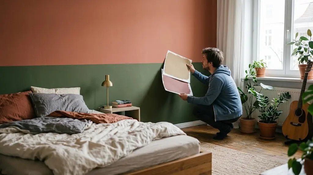
I’ve stood in more paint aisles than I’d like to admit, holding two swatches up against each other under fluorescent lighting that makes everything look slightly wrong. Picking a bedroom wall colour combination isn’t hard because the options are limited — it’s hard because there are too many, and most of them look fine on a chip but fall apart once they’re actually on your wall.
Here’s what I’ve learned after years of helping people through this exact decision: the right bedroom wall colour combination almost always comes down to contrast, undertone, and how much natural light your room actually gets — not whatever’s trending on Pinterest that week. So let’s get into what actually works, room by room, mistake by mistake, and I’ll throw in the stuff nobody tells you until you’ve already repainted twice.
Why One Wall Color Almost Never Feels Finished
A single flat color on every wall reads as “unfinished” more often than people expect. It’s not wrong, exactly — it’s just safe in a way that can leave a bedroom feeling like a hotel room you haven’t personalized yet. Adding a second tone, even a subtle one, gives the eye somewhere to land.
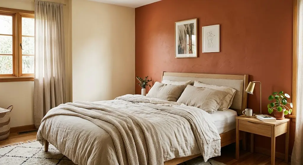
I’ve noticed this especially in bedrooms with low ceilings or awkward proportions. A single wall in a deeper shade — behind the headboard, usually — visually anchors the whole layout. Without it, furniture just sort of floats in the middle of a beige box, and no amount of throw pillows fixes that.
That’s really the whole case for pairing colors instead of picking one. A good bedroom wall colour combination does two things at once: it creates depth, and it gives you a built-in focal point without needing to hang anything. It’s honestly one of the cheapest design moves you can make, because you’re not buying furniture or art — you’re just being smarter about paint you were going to buy anyway.
I get asked a lot whether a bold bedroom wall colour combination is “too much” for a room meant for sleeping in. My answer’s usually no, as long as the boldness is contained. A whole room of saturated color can feel like a lot. One wall of it, balanced against something quieter, almost never does.
There’s also a practical side to this that people forget. A bedroom wall colour combination gives you flexibility down the line — if you get bored of the accent color, you’re repainting one wall, not four. That alone has talked more than one hesitant client into finally committing to something with a bit more personality than plain white.
Finding a Bedroom Wall Colour Combination That Fits Your Room
Your room tells you more than any trend report will. North-facing bedrooms with cooler light handle warm tones better — terracotta, warm taupe, dusty rose. South-facing rooms flooded with sun can carry cooler blues and greens without feeling cold, because the light itself is already doing some of the warming for you.
Undertone matching is where most people trip up when choosing a bedroom wall colour combination. You can love two colors individually and still have them clash the second they’re on adjacent walls, because one leans yellow and the other leans grey, and your eye picks up on that even if you can’t name why it feels off. This is the number one thing I check first with any client — not the color itself, but what’s hiding underneath it.
Here’s a quick reference I actually use with clients when they’re stuck choosing a bedroom wall colour combination:
| Pairing | Undertone Match | Mood It Creates | Works Best In |
| Soft sage + warm white | Warm/neutral | Calm, grounded | Small or medium rooms |
| Navy + dusty pink | Cool/warm contrast | Cozy, a little romantic | Rooms with lots of natural light |
| Terracotta + cream | Warm/warm | Inviting, sunlit even at night | North-facing bedrooms |
| Charcoal + soft blush | Cool/warm contrast | Moody but not dark | Larger primary suites |
| Olive + sand | Warm/warm | Earthy, grown-up | Bedrooms with wood furniture |
None of these are the “correct” answer — they’re starting points. But if you’re staring at forty paint chips and need somewhere to begin, this table will save you a weekend of second-guessing.
One thing I always tell people: test both colors on the actual wall, not just next to each other on a card. Paint changes completely depending on what light hits it and what time of day you’re looking at it, and a bedroom wall colour combination that looks great at 2pm can feel totally different at 9pm with the lamps on. I’ve watched a client fall in love with a green at noon and hate it by dinner, purely because the bulbs in her lamps ran warm.
What This Actually Costs (And How Long It Takes)
People underestimate both of these, so let’s be real about it. A basic two-color bedroom, done yourself with a roller and painter’s tape, usually runs somewhere in the range of one to two gallons per color for an average-sized room, plus sample pots for testing beforehand. Sample pots are the part nobody budgets for and the part you genuinely shouldn’t skip.
Timeline-wise, give yourself a full weekend if you’re doing it properly: one day to test swatches and let them dry so you can actually judge them, and one day to tape, paint, and let coats cure between applications. Rushing a bedroom wall colour combination is how you end up with visible tape lines or a second coat that looks patchy because the first hadn’t fully dried.
If you’re hiring it out, cost obviously climbs, but a professional paint job on a two-tone bedroom tends to move faster than most people expect — a day, sometimes two, depending on how much prep the walls need. Either way, the testing phase is the one step I’d never tell anyone to skip, hired painter or not, since it’s the cheapest insurance policy you’ll ever buy against hating your bedroom wall colour combination six months in.
Two-Tone Paint Or Just One Accent Wall?

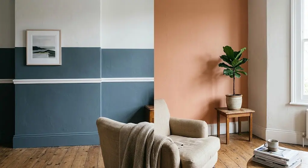
Both work, and honestly, which one you pick has more to do with commitment level than design rules. An accent wall is lower-risk — you’re only fully committing to the bold color on one surface, and the rest of the room stays neutral enough that you’re not repainting everything if you change your mind in a year.
Two-tone walls, where you split the room horizontally (say, a darker lower half with a chair rail or picture rail dividing it from a lighter upper half), read as more intentional and a little more traditional. I like this approach in rooms with high ceilings — it brings the scale down and makes the space feel cozier without losing height. It’s also a great option if you want a bedroom wall colour combination that feels a bit more custom than a single accent wall, without going full wallpaper.
If wallpaper is part of your plan instead of straight paint, an accent wall is honestly the easier lane to start in. There’s a good rundown of pattern and placement options in our wallpaper accent wall bedroom guide if you want to see how texture changes the equation.
Whichever route you go, don’t split the difference and do a half-hearted version of both. Pick one approach and commit — a room with an accent wall AND uneven two-toning usually just looks like the painter ran out of one color halfway through, which is not the vibe you’re going for.
What’s Actually Trending in 2026
Neutrals took over hard this year, but not the flat, lifeless beige everyone associates with rentals. Sherwin-Williams named Universal Khaki its 2026 Color of the Year, and it’s a warm, grounded tan that pairs beautifully with almost anything you throw at it — deep greens, soft whites, even a muted burgundy if you’re feeling bold. It’s the kind of neutral that makes a bedroom wall colour combination feel current without dating itself in two years, which honestly is rarer than you’d think in the paint world.
I’ve also noticed clients gravitating toward tonal pairings lately — two shades of the same color family, like a mid-tone green paired with a near-white green-grey. It’s subtler than high contrast pairings but still gives you that layered, designed look people are after when they search for bedroom wall colour combination ideas in the first place. You can read more about how Sherwin-Williams is positioning the shade for 2026 on their color of the year page.
For anyone working on a primary suite specifically, the calculus shifts a bit — bigger rooms can absorb more contrast and bolder statement walls without feeling closed in. Our master bedroom wallpaper ideas piece has some good direction if you’re leaning toward pattern over solid paint for that space, and it pairs surprisingly well with a lot of the same 2026 neutrals.
Dark academia-adjacent palettes are still hanging around too — deep forest green with brass accents, or a near-black charcoal paired with warm wood tones. It’s not for everyone, but in a bedroom with good natural light, it doesn’t feel oppressive the way people assume it will. I’ve talked more than one nervous client into trying a moody bedroom wall colour combination like this, and every single one has ended up loving it more than the safe option they almost chose instead.
Small Bedroom, Big Color Decisions
Small rooms get bad advice constantly. “Always go light and neutral” is the default, and sure, it’s safe, but it’s not the only option, and honestly it’s a little boring if that’s genuinely all you do. A thoughtful bedroom wall colour combination can work in a tiny room just as well as a big one — it just needs different rules.
What actually matters in a small bedroom is contrast placement, not just color lightness. A darker accent wall on the shortest wall in the room, paired with lighter tones everywhere else, can actually make the room feel more dimensional rather than smaller. Painting the ceiling the same lighter shade as the walls also helps — it removes a visual “stop point” that makes low ceilings feel lower.
A few things I’ve picked up doing this for smaller rooms specifically:
- Keep contrast to two tones max — three or more starts feeling busy fast in tight square footage.
- Glossier finishes bounce more light, so a satin or eggshell on the lighter wall helps.
- Mirrors placed opposite the accent wall double the visual depth almost instantly.
- Skip heavy, dark trim if the walls are already deep-toned — it closes the room in.
A well-planned bedroom wall colour combination can genuinely make a tiny room feel more considered than a huge one with mismatched furniture and no color plan at all. Scale isn’t the enemy here — lack of intention is. I’d take a well-executed bedroom wall colour combination in a 100-square-foot room over a random paint job in a huge one, every time.
Should Your Palette Match Your Furniture Style?
This is a question I get constantly and the answer is: sort of, but not as strictly as people assume. A bedroom wall colour combination doesn’t need to be dictated entirely by your furniture — it needs to coexist with it without fighting for attention.
Mid-century modern pieces, with their warm wood tones and clean lines, tend to sit best against muted, slightly retro colors — think mustard, burnt orange, or a soft olive paired with white. Farmhouse-style rooms, heavy on distressed wood and neutral textiles, usually look right with warm whites and soft sage or dusty blue. Traditional furniture with darker wood and more ornate detail can actually handle richer, deeper colors like navy or hunter green without feeling dated, because that combination has been around for a very long time for a reason.
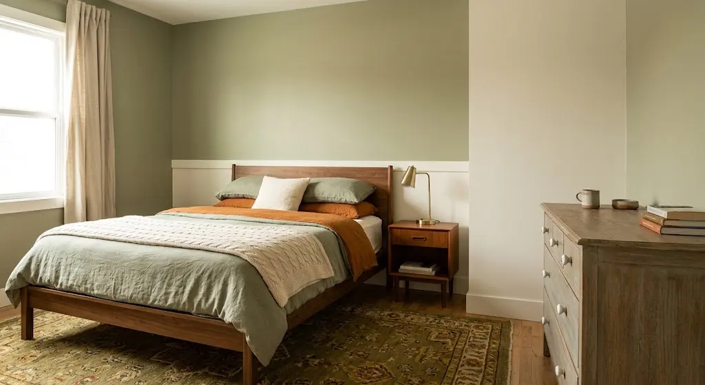
If your furniture is more of a mixed bag — which, honestly, most people’s is — lean on undertone consistency instead of trying to match a specific style era. A bedroom wall colour combination built around warm undertones will generally play nice with warm-toned wood, regardless of whether that wood is a mid-century dresser or a hand-me-down from your grandmother. It’s less about matching eras and more about not letting your walls and furniture argue with each other over temperature.
One thing I’d genuinely avoid: picking your bedroom wall colour combination first and your furniture second, unless you’re starting completely from scratch. It’s much easier to build a wall color around pieces you already own and love than to hunt down furniture that matches a color you got attached to on a swatch.
Kids’ Rooms Need Their Own Rules
Kids’ rooms are where I see people overthink the least and underplan the most, which is a strange combination but it happens constantly. Parents pick “kid colors” — bright primary tones, cartoonish combos — without thinking about how the room needs to age with the child, or at least survive a few years before a full repaint.
My honest take: soft, slightly muted versions of bold colors work better long-term than the saturated stuff marketed specifically at kids. A dusty blue instead of primary blue. A sage green instead of neon lime. They still read as playful but they don’t feel like they need to be repainted the second your kid turns ten and decides the room is “babyish.” A good bedroom wall colour combination for a kid’s room should really be built to last five or six years, not five or six months.
For Girls’ Rooms
Blush pink paired with a warm white or soft grey is still doing a lot of heavy lifting here, but I’ve also seen lavender and cream age really well without feeling too young too fast.
For Boys’ Rooms
Navy and warm grey continues to be the workhorse combo — versatile enough to layer sports themes or a more grown-up look on top of it later without repainting.
If wallpaper feels like a better fit than solid paint for a child’s space — and honestly, for kids’ rooms it often is, since it hides scuffs better — our kids bedroom wallpaper guide breaks down patterns that actually hold up to years of use, not just the first six months.
Whatever direction you go, involve the kid in the decision if they’re old enough to have an opinion. A bedroom wall colour combination they helped pick is one they’ll actually enjoy sleeping in, instead of one that just looks nice in photos you took for yourself.
Does Your Wall Color Affect How You Sleep?
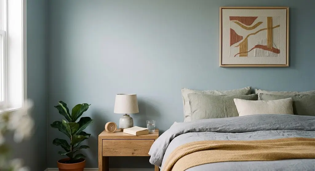
Short answer: probably, yes — though the research is more “strong correlation” than “guaranteed science.” A well-known Travelodge study surveyed thousands of bedrooms and found that people in blue rooms averaged nearly eight hours of sleep a night, more than any other color tested. Yellow and green followed close behind, while purple bedrooms came in dead last.
The Sleep Foundation explains this through wavelength and psychological association — cool tones like blue tend to lower heart rate and blood pressure, both of which help your body wind down before bed. Warm, saturated colors like red or bright orange do the opposite; they keep your nervous system a little more alert, which isn’t exactly what you want at 11pm when you’re trying to fall asleep.
That doesn’t mean you’re locked into an all-blue bedroom wall colour combination if that’s not your style. It just means if sleep quality is genuinely a priority, leaning toward cooler, muted tones for the majority of the room — and saving bolder, warmer colors for smaller accent moments — is probably the smarter call for your bedroom wall colour combination overall. You can read more of the specifics on how color and sleep interact through the Sleep Foundation’s research.
I’ll be honest, I repainted my own bedroom from a warm terracotta to a muted blue-grey a few years back mostly out of curiosity after reading about this, and I did notice I fell asleep faster. Is that placebo? Maybe partly. But I haven’t gone back, and it’s genuinely the calmest my bedroom has ever felt.
Mistakes That Ruin A Good Pairing
Most bad bedroom wall colour combinations aren’t bad because the colors themselves are ugly — they’re bad because of how they’re applied. A few things I see over and over:
- Matching undertones incorrectly (pairing a warm beige with a cool grey, which fights instead of complements).
- Going too high-contrast in a small room, which can make walls feel like they’re closing in rather than adding depth.
- Ignoring the flooring and existing furniture entirely, then wondering why the “perfect” color looks wrong once the bed’s back in place.
- Choosing colors purely from a swatch under store lighting instead of testing a sample patch at home.
- Splitting walls unevenly with no clear logic — one accent wall is intentional, four random walls in different shades usually isn’t.
Fixing most of these just takes slowing down for a week before you commit to a bedroom wall colour combination. Buy the sample pots. Paint a two-foot square. Look at it in the morning and at night before you paint the whole room. It’s tedious, I know, but it’s a lot less tedious than repainting three months later.
Making The Combination Feel Complete
Paint sets the tone, but it’s rarely the whole story. The finishing layer — decor, textiles, art — is what makes a color pairing feel deliberate instead of accidental, and honestly it’s where a lot of otherwise-good bedroom wall colour combination choices fall a bit flat.
Layering In Decor
Textiles do a lot of the connecting work between two wall colors. A duvet or curtain panel that pulls in both shades ties the room together visually, even if the colors themselves are pretty different. Our bedroom wall decor guide has some good direction on where to layer texture without cluttering the space.
Choosing Wall Art
Art is where a lot of good color plans get undone, honestly — a piece with clashing undertones can throw off an otherwise solid bedroom wall colour combination. Stick to art that echoes one of your two main tones, even loosely, and it reads as pulled-together instead of thrown up as an afterthought. There’s more on picking pieces that actually complement your palette in our wall art for bedroom roundup.
Lighting matters here too, more than people give it credit for. Warm bulbs shift cooler colors slightly, and cool-toned LEDs can make warm walls look strangely clinical. If your bedroom wall colour combination looks off at night compared to daytime, it might genuinely just be your bulbs, not your paint choice — swap them before you assume the paint’s wrong.
FAQ,s
Do two wall colors always need to be in the same color family?
No — contrasting pairs like navy and blush work well specifically because they contrast. Matching undertone (both warm or both cool) matters more than matching the hue itself when building a bedroom wall colour combination.
How many colors is too many for one bedroom?
Two is the sweet spot for most rooms; three can work in larger primary suites if one is used sparingly, like just on trim or a ceiling.
Should the ceiling match one of the wall colors?
It can, especially in smaller rooms where a matching ceiling helps the space feel taller and more continuous rather than boxed in.
Is a bold bedroom wall colour combination bad for resale value?
Not usually a dealbreaker — buyers repaint anyway — but sticking closer to versatile neutrals with one bold accent wall tends to appeal to a wider range of tastes if resale is a real concern.
What’s the easiest combination to try first if I’m nervous about commitment?
A soft, warm white paired with one deeper accent wall behind the headboard. It’s low-risk, easy to change later, and gives you most of the visual payoff without repainting the whole room.
Final Thoughts
Picking a bedroom wall colour combination really comes down to being honest about your room’s light, your own style, and how much risk you’re actually comfortable with.
Test the sample pots, look at undertones before hue, and don’t be afraid to lean into a bolder pairing if the room and the light can support it. Start small if you need to — one accent wall is a completely valid place to begin, and you can always build from there once you see how it actually feels to live with.