

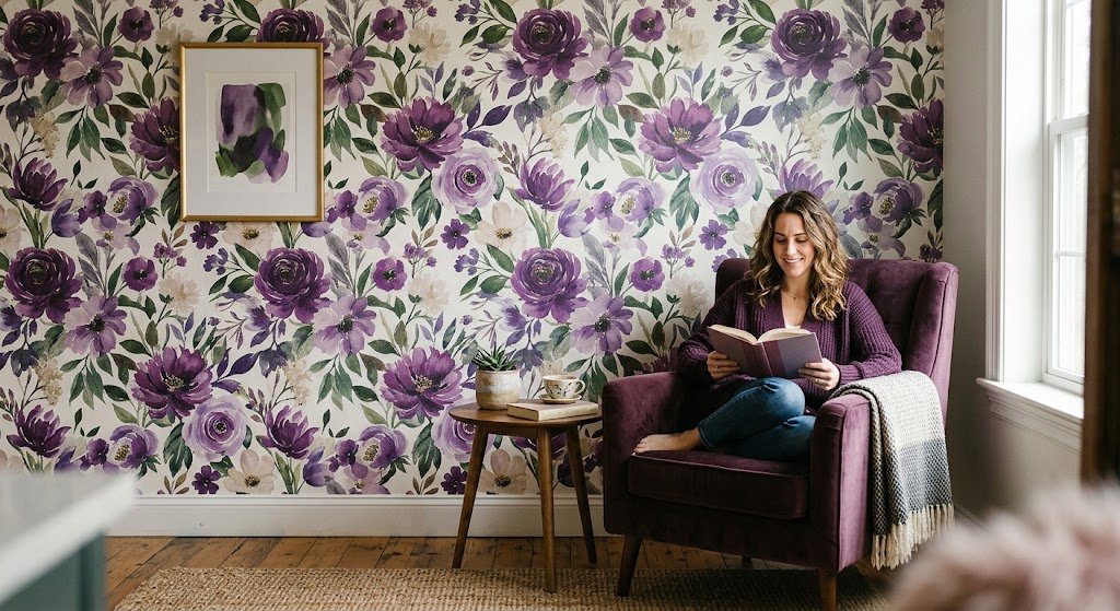
I get asked about purple floral wallpaper more than almost any other color-pattern combo I work with, and honestly, I get why. It’s one of those choices that either looks stunning or looks like a dorm room decision from 2009. There’s not much in between. The difference usually comes down to shade, room, and how much restraint you use with everything else around it.
I’ve spent the better part of a decade helping people pick wallpaper for rooms they’re often terrified to commit to, and purple floral wallpaper is one of the trickiest combos to nail. It’s moody. It’s romantic. It can also swallow a small room whole if you’re not careful. So let’s actually get into what makes purple floral wallpaper work — and where I’ve seen it go sideways.
Why Purple Floral Wallpaper Works So Well

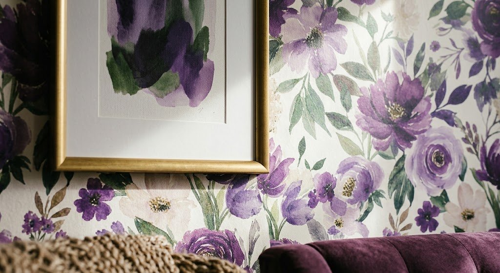
Here’s the thing most people miss: purple floral wallpaper isn’t actually as risky as it feels. Green got trendy a few years back and everyone jumped on it without blinking. Purple carries a reputation as “too much,” but in floral form, it’s usually softened by the pattern itself. The flowers break up the color, so you’re not staring at a solid violet wall — you’re looking at movement, texture, depth.
I’ve noticed clients who are scared of bold color will still say yes to purple floral wallpaper because the floral part feels safe, even traditional. It’s a sneaky way to get drama into a room without it reading as a “statement” the way a solid magenta wall would.
There’s also a practical upside. Purple floral wallpaper photographs beautifully — I say this because half my clients are picking wallpaper with Instagram or a listing photo in mind, whether they admit it or not. The pattern catches light differently depending on the shade, which gives rooms a kind of depth that flat paint just doesn’t have. If you want a broader look at how floral patterns function in general before narrowing down to purple specifically, our floral wallpaper guide breaks down the different print styles worth knowing.
Not every purple floral wallpaper reads the same way, though. That’s really the whole ballgame here — the shade you pick changes everything about how the room feels.
Picking Your Shade: Lavender, Plum, or Moody Violet
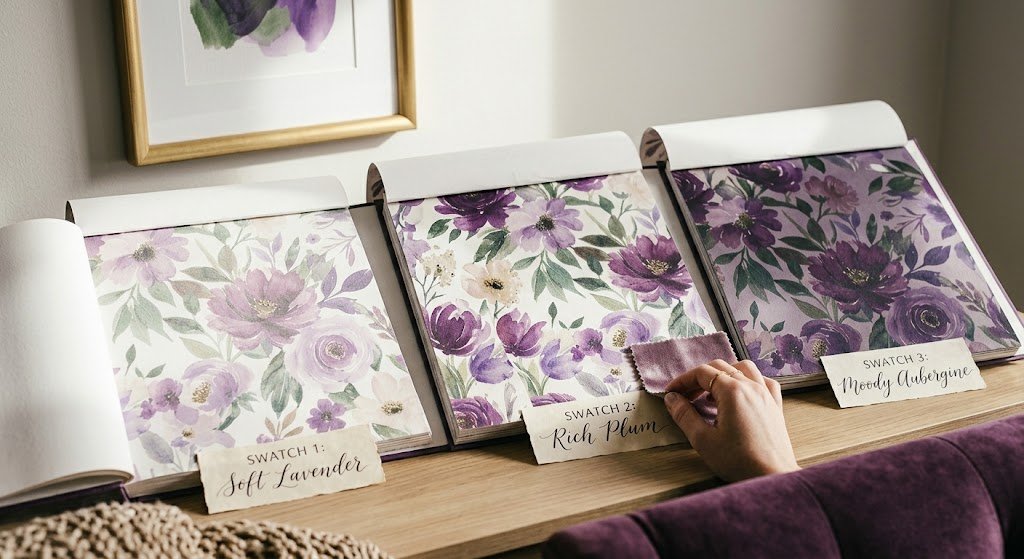
This is where I spend most of my consultation time, honestly. People say “purple” like it’s one color, but there’s a massive difference between a soft lavender floral print and a deep aubergine one, and it changes how purple floral wallpaper reads in a real room.
Soft lavender and lilac tones feel airy, almost like a step above white. They work in nurseries, bathrooms, and small bedrooms where you don’t want the walls to feel heavy. If your room doesn’t get much natural light, I’d steer you here before going darker — dark purple floral wallpaper in a dim room can start feeling like a cave by 4pm.
Mauve and dusty rose-purple blends split the difference. They’re warm enough to feel cozy but still clearly purple, not pink pretending to be purple. This is my go-to recommendation for people who like the idea of purple floral wallpaper but worry it’ll date fast.
Deep plum, eggplant, and moody violet are a completely different animal. These read as sophisticated, even a little dramatic, especially with gold or brass hardware nearby. I did a dining nook for a client last year in a near-black plum floral print, and it’s still one of my favorite rooms I’ve touched — candlelight just does something to that color at night. If you’re drawn to that darker end of the spectrum, our dark moody floral wallpaper roundup has a lot of good reference points for how far to push it.
Color trends do shift here and there — Pantone’s yearly picks have leaned toward richer, more saturated tones the last few cycles, and you can track that on Pantone’s color of the year page if you’re curious how purple keeps cycling in and out of favor.
Sherwin-Williams has echoed a similar movement toward deeper, moodier palettes in their own color trend forecasts, which lines up with what I’ve been seeing walk in the door lately when clients ask about purple floral wallpaper specifically.
Which Rooms Actually Suit It?
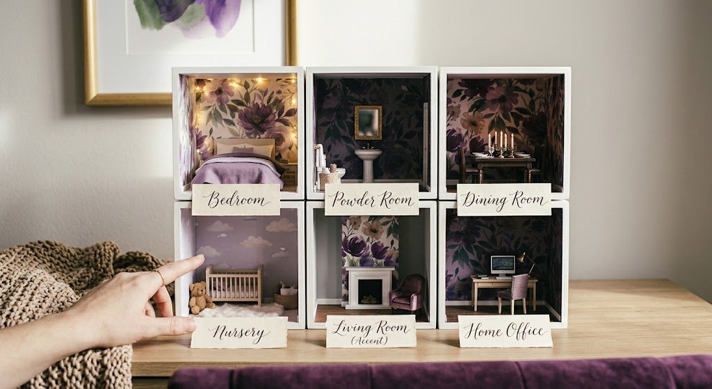
Not every space wants purple floral wallpaper, and I’ll say that plainly. Some rooms fight it. Here’s how I’d break it down:
- Bedrooms — probably the strongest fit overall. Purple has a natural association with rest and romance, and floral patterns soften it further.
- Powder rooms and small bathrooms — great for bold shades since you’re not living in the space all day. This is where I actually recommend the darker, moodier purples most.
- Dining rooms — works especially well for evening-lit spaces, less so for bright breakfast nooks.
- Nurseries — soft lavender florals are timeless here and won’t feel too “baby” as the kid grows older.
- Living rooms — trickier, since you’re in there for hours a day. Usually works best as one accent wall rather than the whole room.
- Home offices — surprisingly good. Purple’s associated with focus and creativity, and it’s a nice break from the gray-on-gray look most offices default to.
For bedrooms specifically, I’d point you toward our romantic bedroom wallpaper guide — a lot of the shade and pairing advice there translates directly to purple floral options.
If you’re leaning toward a living room accent wall instead, our piece on how to choose wallpaper for living room walks through the sizing and placement questions people usually get stuck on before committing to purple floral wallpaper on a feature wall.
I’ll be honest, I don’t love purple floral wallpaper in kitchens. It’s not a hard rule, but between grease, steam, and the general chaos of a working kitchen, the pattern tends to get lost against cabinetry and appliances. If you’re set on it, keep it to a small accent — a pantry door, maybe, not a full wall.
Peel-and-Stick or Traditional — What’s Better For You?
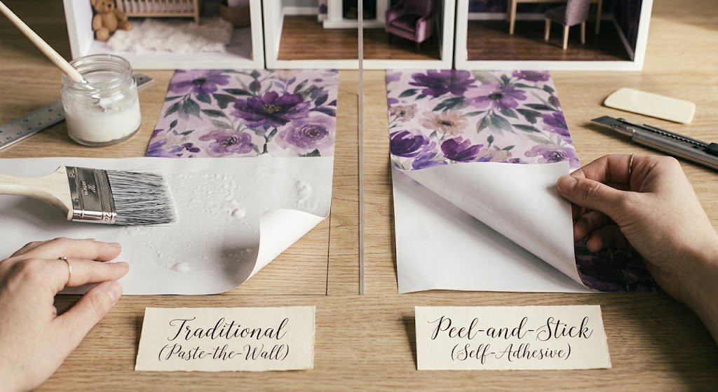
I get this question constantly, and my answer’s always “it depends on how committed you are.” Traditional wallpaper, the kind that’s pasted on, tends to have richer color depth and a slightly more textured finish. If you’re going for that deep plum, moody-dining-room look I mentioned earlier, traditional purple floral wallpaper usually renders the color more true.
Peel-and-stick, though, has come a long way. It used to look obviously cheap — thin, shiny, prone to bubbling. That’s not really true anymore. The better brands print at a resolution that holds up close, and removal is genuinely painless if you’re renting or just not ready to commit for a decade. Purple floral wallpaper in peel-and-stick form is honestly where most of my rental clients land, because it lets them take the risk without the long-term commitment.
If that flexibility matters more to you than absolute color richness, our guide on floral peel-and-stick wallpaper covers which brands actually hold up well over time versus the ones that peel at the seams within a year.
Here’s a quick side-by-side, since this decision trips people up more than the color choice itself:
| Factor | Traditional Wallpaper | Peel-and-Stick Wallpaper |
| Color depth | Richer, especially in dark purples | Good, slightly flatter |
| Installation time | 1-2 days with paste drying | A few hours, DIY-friendly |
| Removal | Difficult, often needs a steamer | Easy, minimal wall damage |
| Best for | Long-term homeowners | Renters, frequent redecorators |
| Cost range | Generally higher per roll | Generally lower per roll |
Neither option is objectively “better” for purple floral wallpaper — I’ve installed both in the last month alone. It really comes down to whether you’re decorating for the next fifteen years or the next lease term.
Styling Around Purple Floral Prints
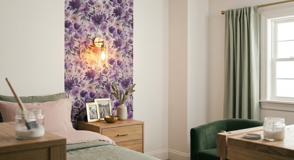
This is where a lot of good wallpaper gets ruined, in my opinion. People pick a gorgeous purple floral wallpaper and then pair it with furniture and accents that fight it instead of finishing the look.
A few things I’ve learned the hard way, both from my own house and client projects:
- Keep trim neutral. White or a soft off-white trim lets the wallpaper breathe. Colored trim next to a busy floral print usually looks cluttered.
- Pick one metal finish and stick with it. Brass and gold tend to flatter purple more than chrome or nickel — there’s a warmth to it that cool metals just don’t have.
- Don’t match your bedding or curtains to the wallpaper color exactly. It reads as matchy in a dated way. Pull one secondary color from the print instead — often a green or blush tone hiding in the florals — and build off that.
- Balance busy with plain. If the wallpaper has a dense, layered floral pattern, keep furniture upholstery mostly solid. Two competing patterns in a small room is a lot.
I’ll admit purple floral wallpaper pairs surprisingly well with green — sage, olive, even a deep forest tone. It’s not the obvious pairing people reach for (that’s usually pink), but I think it looks more grown-up.
Lighting matters more than people expect, too. Warm bulbs (2700K, roughly) bring out the richness in purple floral wallpaper. Cool white bulbs can make it look almost gray and lifeless, which is a genuine bummer after spending real money on a nice print.
Mistakes That Make Purple Floral Wallpaper Look Wrong
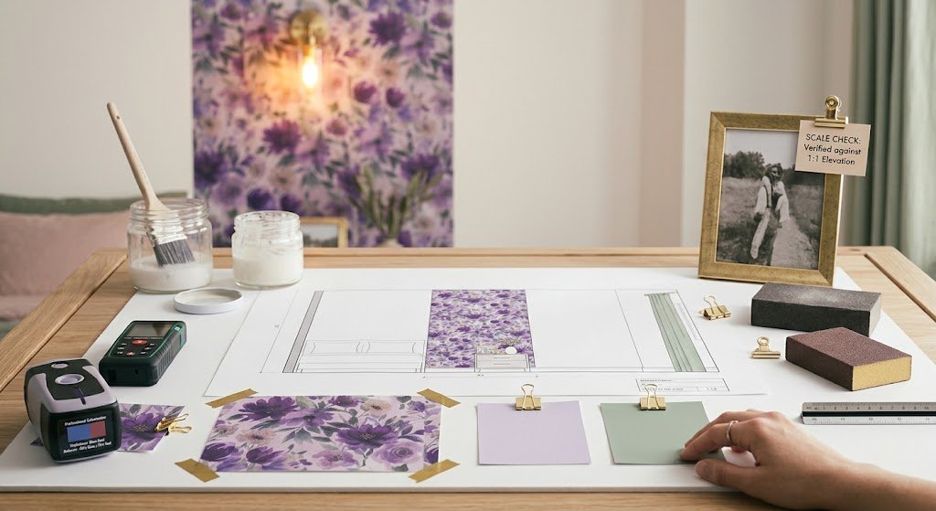
I’ve walked into more than a few rooms where the wallpaper itself was gorgeous but the execution missed. The usual culprits:
- Wallpapering all four walls in a tiny room with a dark, dense print. It can feel claustrophobic fast. Try one accent wall first.
- Ignoring the undertone. Some purples lean blue, some lean red-pink. Mixing a blue-leaning purple with warm wood tones can clash more than people expect.
- Skipping the sample. Always order a sample swatch and look at it in your actual room, morning and night. Screens lie about color constantly.
- Rushing the prep work. Purple floral wallpaper, especially traditional paste-type paper, shows every bump and seam if the wall underneath isn’t properly primed and sanded.
- Forgetting scale. A huge, oversized floral print can overwhelm a small powder room, while a tiny delicate print can disappear in a large open space.
I made the scale mistake myself, years ago, in my own guest bathroom — picked a purple floral wallpaper print that looked delicate and lovely on the sample card and turned out microscopic and washed-out once it was up on four walls. Had to redo it within a year. Lesson learned: bring the sample into the actual room before you commit to a full order.
Cost and Timeline: What to Expect
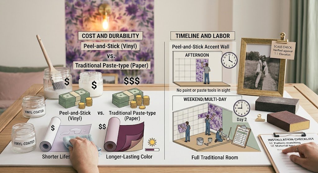
People always want a number, so I’ll give you a realistic range rather than a false-precision figure. Peel-and-stick purple floral wallpaper generally runs cheaper per roll than traditional paste-type paper, and installation is quicker since there’s no drying time between application and use of the room. Traditional purple floral wallpaper costs more upfront in materials and labor if you’re hiring it out, but the finish tends to last longer and holds color depth better over years of sun exposure.
Timeline-wise, a single accent wall with peel-and-stick purple floral wallpaper can realistically be done in an afternoon by one person with basic patience. A full room with traditional paste-type paper is more of a weekend project, or a multi-day job if you’re bringing in a professional installer, especially with a busy floral pattern that needs careful pattern-matching at the seams.
If durability in a high-moisture spot like a bathroom is a concern, look specifically for vinyl-coated or washable purple floral wallpaper rather than a standard paper-based print — it holds up dramatically better against humidity and the occasional splash.
Frequently Asked Questions
Does purple floral wallpaper make a room look smaller?
Darker, densely patterned versions can, especially on all four walls. Lighter lavender tones or a single accent wall usually avoid that shrinking effect entirely.
What colors pair best with purple floral wallpaper?
Sage green, warm white, and brass or gold accents tend to complement it the most naturally, without competing for attention.
Is peel-and-stick purple floral wallpaper as durable as traditional?
It’s improved a lot, but traditional paper generally holds color and texture better over many years. Peel-and-stick is fine for shorter-term or rental use.
Can I use purple floral wallpaper in a kids’ room?
Absolutely, especially softer lilac or lavender shades — they tend to age well as kids grow older rather than feeling babyish within a couple years.
Should I wallpaper the whole room or just one wall?
For beginners or smaller spaces, one accent wall is usually the safer, more flattering choice. Full-room coverage works best in larger rooms with good natural light.
Final Thoughts
Purple floral wallpaper isn’t as intimidating as it looks on the sample wall at the store, I promise. Get the shade right for your room’s light, pick your installation type based on how long you’re staying put, and keep the rest of the room simple enough to let the pattern do its job. That’s really the whole formula — nothing more complicated than that.
If you’re on the fence, start small. One wall, one sample, a weekend project. You’ll know within a day whether purple floral wallpaper is right for your space, and honestly, that’s the best way to find out with any bold wallpaper choice.
Write by Maren Colby:
A member of the Wallsbloom design team with over 8 years of hands-on experience in residential wallpaper installation and interior styling, including dozens of accent-wall and full-room floral wallpaper projects across bedrooms, dining rooms, and bathrooms.