

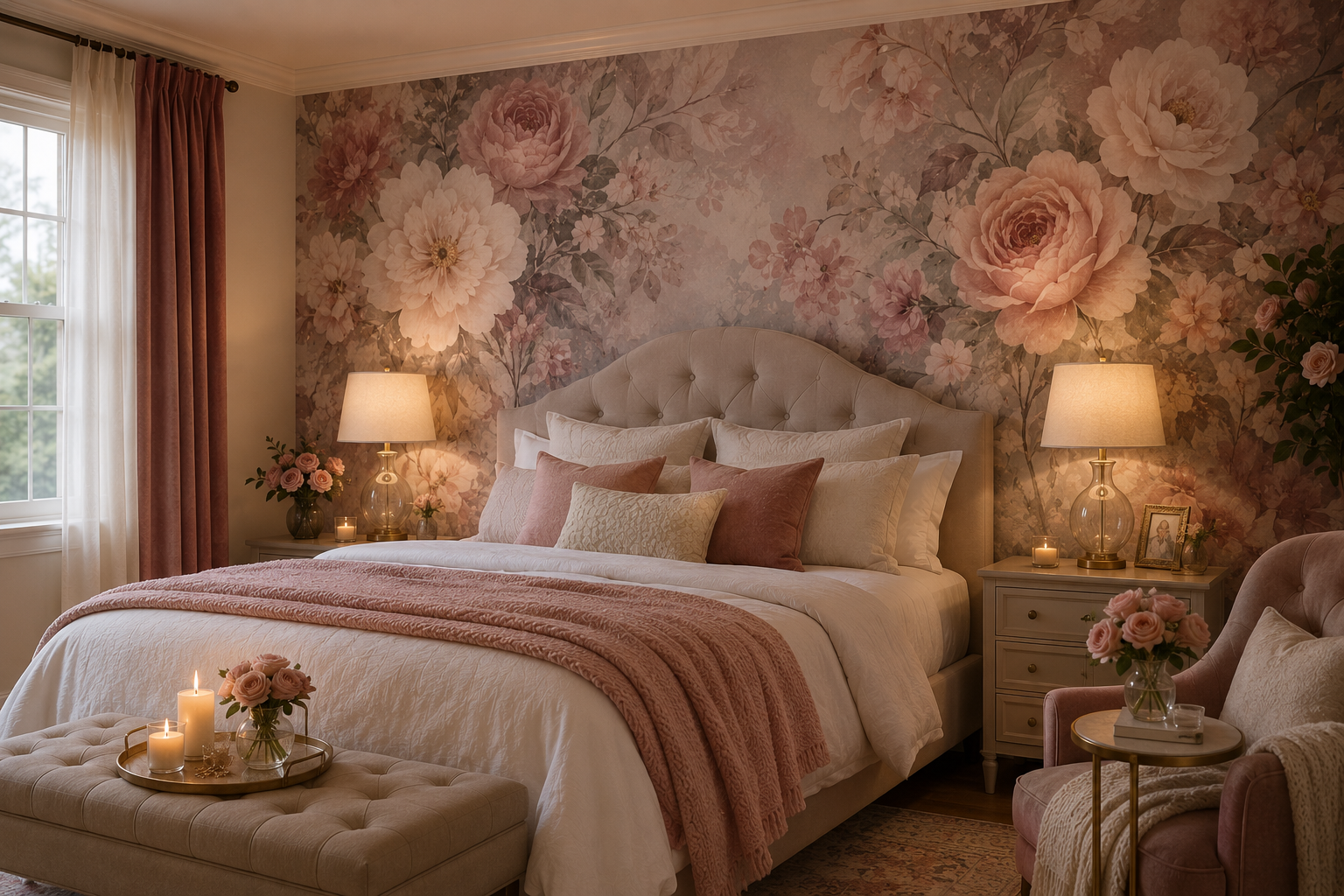
romantic bedroom wallpaper out loud to most people and watch their face — half of them picture a honeymoon suite that tried too hard, and the conversation dies right there. Which is a shame, because the bedrooms that actually pull off romantic bedroom wallpaper almost never look staged.
Lived-in is the word I’d use. Warmer, in a way nobody can quite point to. Years of hauling paste buckets up narrow staircases taught me the gap between a wall trying hard and a wall that just belongs. What’s coming next skips the showroom decor talk nobody needs while half-asleep and scrolling for ideas.
Where the “Romantic” Part Actually Comes From
Took me embarrassingly long to land on this — romance was never hiding in the pattern. It’s sitting inside the color’s temperature. Blush, wine, sage, lavender: none of these showed up by accident. They mimic candlelight, or a lamp dimmed low, minus the risk of setting anything on fire.
Sherwin-Williams has actually dug into this in their color psychology guide. Their color experts point to warmer reds as the shade most closely tied to passion and closeness in a room. Nobody’s saying paint your wall stop-sign red. A muted terracotta, maybe a wine-toned floral, borrows that same trick — just at a whisper instead of a shout.
Romantic bedroom wallpaper, stripped down to basics? Warm color plus a pattern that isn’t shouting for attention. Icy gray geometrics belong in an airport lounge. Not next to your pillow.
Patterns That Didn’t Age Out
Blunt truth: not every “romantic” print survives past year one. Some scream a very specific decade the second you unroll them. What follows actually held up — I know because I’ve walked back into these same bedrooms years later.
Small trailing florals beat oversized tropical prints, nearly every time. Watercolor peonies. Sketch-style botanicals. Vines wandering instead of repeating in stiff, obvious rows. That looseness is the entire point.
Damask and toile still earn their keep, old-world formality intact, so long as the palette stays muted rather than stark black-on-white.
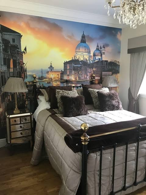
Then there’s the one everybody forgets — scenic murals. A soft, dreamy landscape behind the headboard reads more intimate than any repeating print, mostly because it isn’t fighting the rest of the room for attention. Want to go further down that road? There’s a solid breakdown of scenic wallpaper styles worth a scroll before you commit to anything.
Texture minus pattern deserves a mention too. Grasscloth, or a subtle linen-weave paper in blush or terracotta, skips print entirely. The texture alone still carries the romantic weight.
Sorted By Whatever “Romantic” Means to You
People don’t all mean the same thing by that word, and pretending otherwise wastes everyone’s time. Figure out your lane before buying anything.
Cottagecore leans toward small florals, gingham trim, soft yellow folded into sage. Less glossy magazine spread, more farmhouse above a bakery.
Parisian vintage brings faded damask, muted gold, gray layered against blush — the “old apartment with good bones” daydream, and it wears remarkably well over time.
Modern romantic keeps furniture clean-lined, adds one soft botanical wall, throws in warm brass hardware. Probably the safest lane if frilly makes you nervous.
Moody maximalist goes deep burgundy or emerald, gold veining, heavy drapery. Not every room can carry it, but in a spacious primary bedroom with decent lighting? Genuinely stunning.
Match the lane to how you actually live, not to whatever’s trending on someone else’s feed. Drop a cottagecore print into a sleek minimalist apartment and watch it argue with everything else in the room instead of settling in.
Full Room, or Just the One Wall?
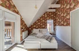
I get asked this constantly, and honestly my answer has less to do with square footage than with nerve. Papering every wall is a real commitment — gorgeous, cocooning, not exactly forgiving if your taste shifts a year from now.
An accent wall, usually right behind the headboard, delivers most of that same payoff for a fraction of the risk. Frames the bed almost like artwork instead of drowning the whole room in pattern. Leaning that way already? This guide on wallpapering just one wall covers exactly where the paper should start and stop, so it doesn’t read half-finished.
My honest take, for what it’s worth: first-timers, start with one wall. Going bigger later stays entirely on the table once you’ve actually lived with it.
Small Rooms Don’t Follow Big-Room Rules
A cramped guest room and a sprawling primary suite don’t play by the same wallpaper logic. Pretending otherwise sets people up to be disappointed.
Smaller spaces do better lighter — blush tones, modest print scale, nothing that boxes the room in further. Dark, dense wallpaper crammed into a tiny space slides from “romantic” toward “cave” faster than you’d expect.
Bigger primary bedrooms give you room to swing bolder — deep burgundy florals, a full mural, wallpaper climbing right up onto the ceiling if you’re feeling brave enough. There’s a thorough roundup built specifically for larger rooms in this master bedroom wallpaper guide, worth a look before ordering anything.
Making It Feel Romantic, Not Just Photogenic
Wallpaper alone won’t finish the job. Plenty of gorgeous rolls end up sitting in rooms that still feel cold, purely because nothing else backs them up.
A handful of things consistently help:
- Warm, low lighting instead of one harsh overhead fixture
- Layered textiles — a velvet throw, linen sheets, something knit folded at the foot of the bed
- Metallic touches in brass or warm gold, never chrome
- Curtains echoing one shade from the wallpaper, not all of them at once
Designers have leaned hard into this “cocooning” idea lately — deep color, drapery, texture, working together instead of one lonely statement piece doing everything alone. House Beautiful put together a solid rundown of top bedroom design trends shaping this shift, and a good chunk of it lines up with what genuinely works for romantic bedroom wallpaper specifically.
For styling beyond just the wall — furniture pairing, rugs, lighting choices — this bedroom wallpaper decor guide goes deeper than I’ve got room for here.
Combinations Worth Stealing Outright
Sometimes seeing pairings laid out beats picking colors in a vacuum. A few I keep circling back to, based on what survives in finished rooms rather than mood boards:
Blush floral against warm walnut furniture and brass hardware stays soft without tipping sugary. Toss in ivory linen bedding and it grounds itself instead of feeling precious.
Deep burgundy damask paired with black-framed art and warm gold sconces goes dramatic but cozy — particularly in a primary bedroom with enough square footage for the pattern to actually breathe.
Sage green grasscloth next to rattan or cane furniture and cream bedding proves romance doesn’t need a single floral anywhere in the mix.
Dusty lavender with white trim and soft gray textiles stays airy. Works especially well in smaller rooms, or ones that don’t see a ton of sun.
None of this is carved in stone. Consider it a starting point, nothing more. The right romantic bedroom wallpaper choice still comes down to whatever matches how your actual room feels at the end of a long day.
Lighting Changes Everything, So Don’t Skip This
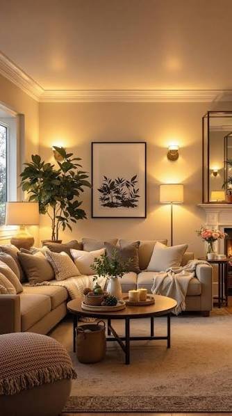
Touched on this earlier, but it deserves its own spotlight. Lighting might be the single most underrated factor in whether wallpaper reads as romantic or just kind of sits there, existing. Overhead lighting flattens both color and pattern. Practical, sure — but it kills mood almost instantly.
Swap in table lamps. A dimmer switch. Maybe a few flameless candles if you’re nervous about anything open-flame near paper. Warm bulbs, anything under 3000K, pull undertones out of blush, burgundy, and terracotta far better than cool white ever manages. This single change costs less than one wallpaper sample and does more heavy lifting than most people give it credit for.
Mistakes That Quietly Wreck the Whole Effect
Same handful of errors, over and over. Let’s just name them plainly:
- Matching bedding exactly to the wallpaper. Flattens the room instead of layering it.
- Going too dark with zero lighting plan. Deep colors demand warm lamps, or the room reads gloomy instead of cozy.
- Skipping the sample stage entirely. Wallpaper looks wildly different under real bedroom light versus a showroom wall.
- Ignoring pattern scale against furniture size. Tiny prints vanish behind an oversized headboard; huge prints swallow a small room whole.
- Forgetting ceiling height matters. Vertical stripes or trailing florals can stretch a low ceiling nicely — flat repeat patterns usually can’t.
Caring for It Once the Paper’s Up
Nobody mentions upkeep, and then people wonder why their gorgeous accent wall looks tired a year in. Not complicated. Just easy to forget.
Dust every couple weeks with a dry cloth, or the soft brush attachment on your vacuum. Skip anything wet on traditional paper — moisture’s the real enemy, especially near humid seasons or a shared bathroom wall.
Peel-and-stick tolerates a slightly damp microfiber cloth for light marks, though testing a hidden corner first never hurts. Sunlight’s the other quiet threat; UV fades reds and pinks faster than most people expect, which is exactly why sheer curtains aren’t purely decorative. They’re protection, too.
If a seam starts lifting anywhere, don’t ignore it. A small dab of wallpaper adhesive, pressed flat and smoothed with a soft cloth, stops a minor issue from becoming a peeling corner six months down the line.
Is It Actually Worth the Money?
Short version: yes, if you start with removable or peel-and-stick options. Longer version: depends how long you’re staying put. Renters and frequent movers should lean toward peel-and-stick in blush or sage — costs less, commits less, still delivers that softened, intimate feel people were chasing to begin with.
Homeowners settling in long-term can justify pricier grasscloth or hand-printed murals, especially kept to a single accent wall where material cost stays reasonable.
But Does It Actually Work?
Answering honestly here instead of reaching for a marketing line. Yes — but only when the rest of the room cooperates. Wallpaper dropped into a space with harsh overhead lighting and mismatched cool-gray bedding won’t feel romantic, no matter how expensive the roll was.
Paired thoughtfully, though — warm light, layered textures, a palette matching your existing furniture — romantic bedroom wallpaper pulls off something plain paint simply can’t touch. It hands a room a sense of intention, like someone actually chose to be there instead of just filling empty space. That’s the whole appeal, honestly, and it’s worth chasing if your bedroom walls have sat untouched for far too long already.
Frequently Asked Questions
What colors work best for romantic bedroom wallpaper?
Blush pink, deep burgundy, sage green, dusty lavender, and warm terracotta all hold up well. These shades read warm and calming rather than sharp, which is really the entire point behind romantic wallpaper choices.
Should I wallpaper the whole bedroom or just one wall?
One wall, usually behind the headboard, tends to be the safer and often more effective route. It creates a focal point without overwhelming the room, and it’s far easier to change later if your taste shifts.
Is romantic bedroom wallpaper too much for a small bedroom?
Not really, as long as you lean lighter and keep the print scale modest. Dense, dark patterns can visually shrink a small room, so stick with softer blush or pastel tones and subtle repeats.
Does romantic bedroom wallpaper work with modern furniture?
Yes, provided the pattern stays soft rather than heavily ornate. Pair a muted floral or a textured plain with clean-lined furniture, and skip anything too Victorian if your style leans contemporary.
How long does peel-and-stick wallpaper actually last?
Most decent peel-and-stick wallpaper holds up two to five years under normal handling. It won’t outlast traditional paste-based paper, but it removes cleanly without wrecking your walls, which matters a lot for renters.
Final Thoughts
If there’s one thing worth walking away with, it’s this — romantic bedroom wallpaper was never really about hunting down the “prettiest” roll on a shelf somewhere. It’s about matching color temperature, pattern scale, and room size to something that genuinely feels good to fall asleep in, night after night, season after season. A showroom sample rarely tells you that part. Your actual room, lamps dimmed, around nine at night, usually does.
Start small if you’re on the fence about any of this. An accent wall behind the headboard costs less, commits to less, and still delivers most of the emotional payoff people chase when typing “romantic bedroom wallpaper” into a search bar in the first place. Expanding later stays entirely possible, once you’ve lived with it through a few different seasons and lighting conditions.
Don’t skip the sample stage either — seriously. Too many people order full rolls off a thumbnail image, then discover the color shifts entirely once it’s taped to their actual wall under their actual lighting. A five-dollar sample beats a two-hundred-dollar regret, every single time.
And if you’re renting, none of this should stop you. Peel-and-stick options in blush, sage, or muted terracotta have gotten genuinely good — good enough that most guests won’t clock the difference between that and traditional paste. Romance, turns out, was never about permanence.
At the end of it, the goal was never a magazine cover. It’s a room that feels like yours, warmer somehow than it used to be, the kind of space that makes lingering in the morning more appealing than rushing straight out the door. That’s what solid romantic bedroom wallpaper actually does — it doesn’t just decorate a wall, it shifts how the whole room feels to exist inside of. Pick a palette that matches your light. Choose a pattern scale that respects your furniture. Give yourself permission to start with just one wall. Everything else tends to click into place once that first decision feels right.