

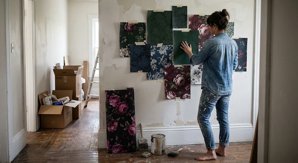
A friend of mine spent three weeks deciding between eleven wallpaper samples taped to her hallway wall like a slightly chaotic art installation. Eleven. By the time she picked, half the neighbors had opinions. That’s usually how moody floral wallpaper goes — people either commit in an afternoon or agonize for a month, and there’s not much in between.
I’ve gone through both versions of that process myself, on different rooms, at different points. What follows is less a tidy how-to and more a collection of things I wish someone had told me before I ordered my first roll — some of it practical, some of it opinion, all of it based on actually living with this stuff rather than just admiring it in photos.
Quick disclosure: I’m a homeowner who renovates on weekends, not a trained designer. I’ve hung wallpaper crooked more than once. Everything below comes from doing this, not from reading about it.
Dark ≠ Moody: A Distinction Worth Making
Something bugs me about how casually people use “moody” online. Slap a black background on any floral print and suddenly it’s “moody floral wallpaper” — except it usually isn’t. It’s just dark.
Real moodiness comes from depth. Petals with actual shadow modeling, the kind that looks brushed rather than printed flat. Backgrounds that feel like they have distance to them instead of sitting like a solid sheet of color behind the flowers. Picture an old oil painting hung in a dim gallery room versus a phone-screen wallpaper — that’s roughly the gap between good and mediocre versions of this look.
Scale plays into it too, more than people expect. Shrink a pattern down small and tight, and your eye reads it as texture — busy, repetitive, forgettable. Blow the exact same flowers up two or three sizes larger, and suddenly it stops behaving like wallpaper and starts behaving like art stretched across drywall. Nothing else changed except the size of the print, and the whole feeling of the room shifts.
Color-wise, black gets all the credit, but it isn’t required. Bottle green does this. So does aubergine, so does an ink-adjacent navy, so does a near-black chocolate brown if you want something warmer. The common thread across all of them is saturation — nothing chalky, nothing faded-looking. A useful gut check: if you can imagine the color glowing under candlelight rather than washing out under it, you’re probably in the right lane.
Before buying anything, I test samples under two totally different bulbs — one cool white, one warm and yellow. Decent moody floral wallpaper keeps its richness under both conditions. Cheap runs tend to go flat or muddy the second you switch to bright, cool lighting, which is usually the giveaway that the print quality won’t hold up long-term.
There’s also a production detail worth knowing. Budget wallpaper runs cut costs by using fewer ink layers, which means shadow areas get approximated with a flat gray or brown block instead of genuine gradient blending. Stand close and you’ll notice banding — visible steps between light and dark instead of a smooth transition. Better-quality moody floral wallpaper builds that shadow with far more layers, and once you’ve seen the difference side by side, you can’t unsee it in cheaper prints.
Room by Room: Where This Actually Belongs
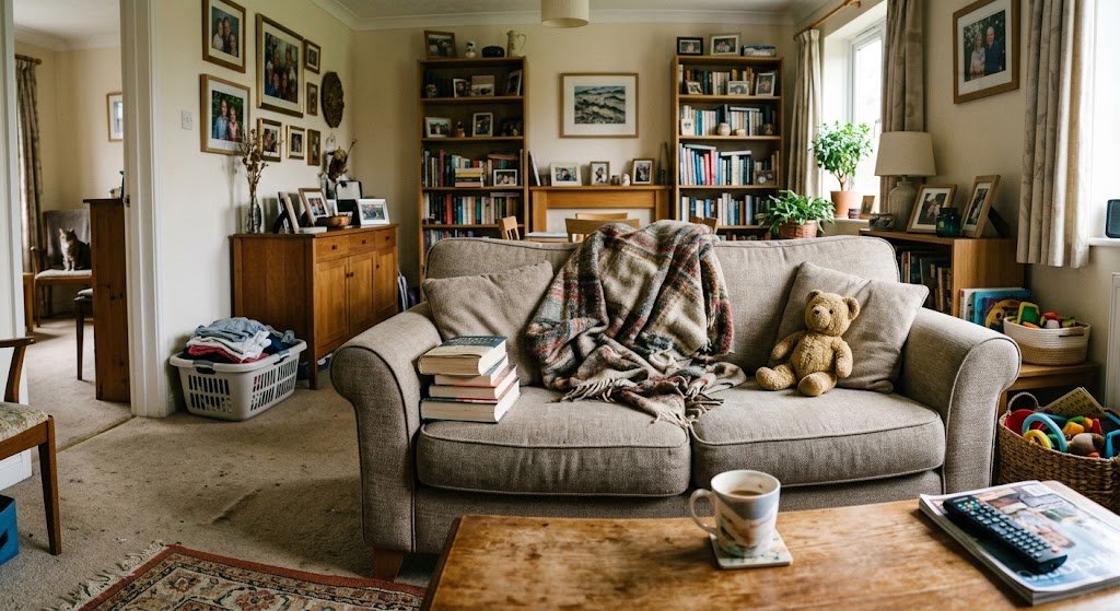
Some walls want this treatment. Plenty don’t. Forcing moody floral wallpaper into the wrong spot is the fastest route to regretting the whole project, so here’s my honest ranking.
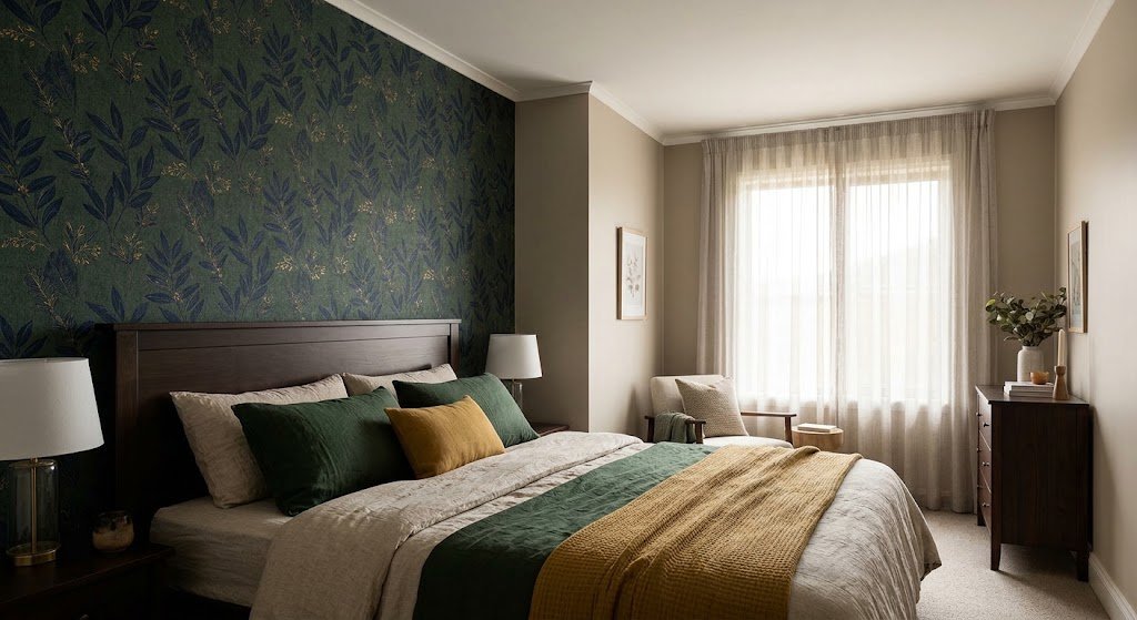
Bedrooms sit at the top for a reason that has nothing to do with trends. A bedroom’s job is to feel closed off from the world, not bright and open like a showroom. One wall behind the headboard does that job without requiring you to commit the whole room to darkness. Anyone weighing exact placement should look at this master bedroom wallpaper guide, which covers headboard-only versus full coverage in more detail than I’ll get into here.
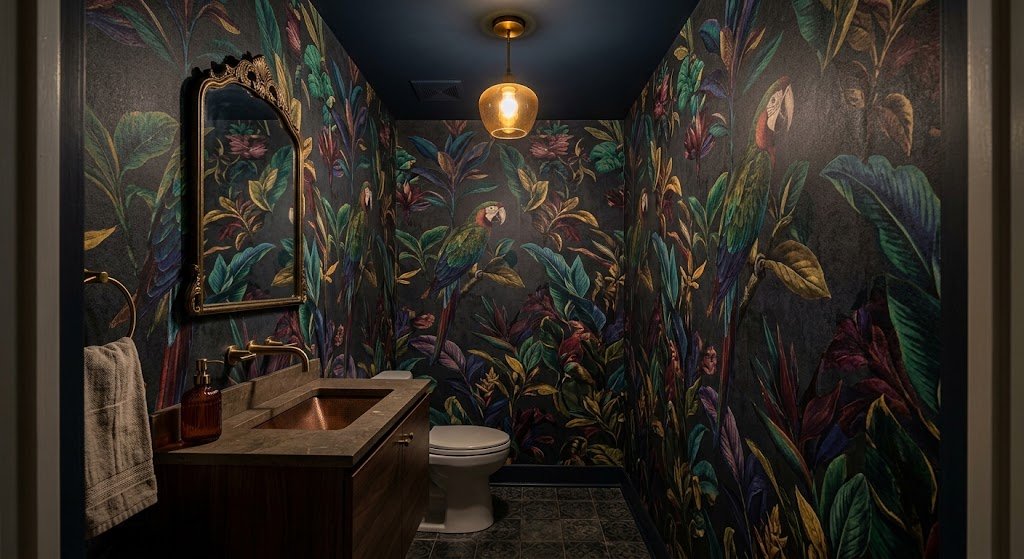
Powder rooms are, in my opinion, criminally underused for this. Small, often no window, barely any foot traffic — a powder room can absorb an intensity level that would exhaust you in a room you spend real hours in. Guests are gone in two minutes. The one non-negotiable: confirm the finish is rated for moisture before it goes anywhere near a sink. This bathroom wallpaper ideas page sorts out which finishes actually survive humidity.
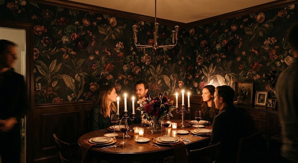
Dining rooms rarely get mentioned in this conversation, and I think that’s a mistake. Most dining happens at night, under low light, exactly the setting moody floral wallpaper was made for. Unlike a kitchen, it doesn’t need to also look good under full daylight for eight hours straight.
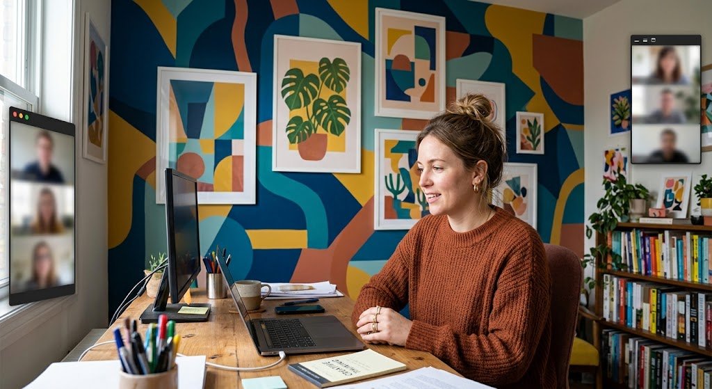
Home offices are the wildcard. Standard advice pushes neutral, calm backdrops for workspaces, and for a lot of people that’s genuinely correct. But if your work involves any creative thinking, a bold wall behind your desk — visible on every video call, which is either a bonus or a liability depending on your job — can turn a forgettable room into somewhere worth showing up to.
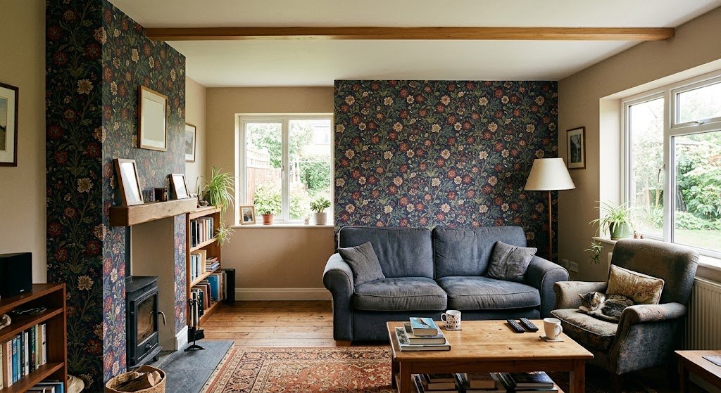
Living rooms work fine as an accent, not as full coverage. Behind a sofa, inside a nook, on one chimney breast. Cover all four walls and an average-height living room can start closing in on itself fast.
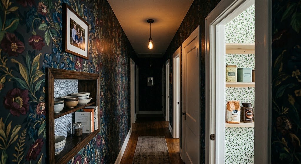
Kitchens and hallways get small doses only — a pantry door, the back of open shelving. A long hallway without natural light at either end wrapped entirely in moody floral wallpaper can start feeling like a tunnel rather than a hallway. Tread carefully there.
Worth adding: none of these room picks are fixed rules. I’ve seen moody floral wallpaper used successfully in a kitchen breakfast nook that gets almost no direct sun, and it worked precisely because the room already leaned dim. The room itself, more than any category like “bedroom” or “kitchen,” is really what decides whether this style belongs.
If I had to rank these by how often people tell me a year later they’re still happy with the choice: bedroom first, powder room close behind, dining room third. Living rooms and hallways generate the most second-guessing, mostly because daylight is a lot less forgiving than lamp light.
The Small-Room Question, Answered Honestly
Does moody floral wallpaper shrink a room? Sometimes, yes — no reason to dodge the question. Dark surfaces soak up light instead of bouncing it, so a small room with one modest window can start feeling a little cave-like once the sun goes down.
But smaller-feeling isn’t automatically bad. Plenty of people specifically want that wrapped-up, enclosed quality in a bedroom or a tucked-away reading corner. It comes down to intent. Chasing airy and expansive? This look isn’t for you. Chasing something closer to a jewel box? You’re exactly where you should be.
A short list of things that genuinely help:
- Skip the single overhead light entirely. Table lamps and sconces at eye level do more for dark walls than any ceiling fixture ever will.
- Keep the ceiling pale. A light ceiling against dark walls keeps your eye moving up instead of the room feeling boxed shut.
- Stick to one wall if square footage is genuinely tight, rather than committing the whole box.
- Hang a mirror facing the pattern. Bounces light back and, strangely, reads as more spacious rather than busier.
I learned the lighting piece the hard way in my own powder room. Wallpaper went up first, proper lighting got delayed by budget for close to two months. During that stretch it genuinely felt gloomy, not moody. Then I dropped in a 2700K bulb and added a small sconce beside the mirror, and the exact same paper suddenly read as deliberate instead of like an unfinished thought. The wallpaper never changed. Only the light did — and I’d argue bulb temperature matters more to this whole look than most people budget for. Anything past roughly 3000K starts pushing rich, saturated colors toward flat and clinical instead of warm and layered.
Peel-and-Stick or Traditional Paste?
Comes down to what you’re prioritizing: upfront cost and flexibility, or depth and staying power in your moody floral wallpaper choice.
Traditional pasted paper generally wins on richness. Heavier stock plus real adhesive gives moody floral wallpaper that layered, near-hand-painted texture that’s the whole point of the style in the first place. It also hides minor wall flaws better, since paste fills small dips. The cost is either hiring a professional or losing a weekend to your own labor, plus a seam-matching learning curve that nobody enjoys on attempt number one.
Peel-and-stick has narrowed the gap considerably. Print resolution on the better brands now holds onto shadow detail that used to get lost entirely on cheap removable rolls. It’s renter-friendly, reasonably forgiving for a first-timer, and a sensible entry point if you’ve never hung wallpaper before. This floral peel and stick wallpaper collection is a decent starting point if that’s the direction you’re leaning.
One caveat that doesn’t get mentioned enough: peel-and-stick can shrink slightly with temperature and humidity swings, and small seam gaps sometimes show up after a year or two. Rarely dramatic — you’d have to be standing right up against the wall to notice — but “removable” isn’t quite the same promise as “maintenance-free forever.” Properly hung traditional paper mostly just sits there behaving itself for a decade or longer.
Rough numbers from pricing both routes across a couple of my own projects:
| Factor | Traditional Pasted | Peel-and-Stick |
| Average cost per roll | $60–$150 | $35–$90 |
| Color/pattern depth | Excellent | Good to very good |
| Install difficulty | High (or hire a pro) | Low to moderate |
| Renter-friendly | No | Yes |
| Typical lifespan | 10–15 years | 3–7 years |
| Best for | Feature walls, whole rooms, resale value | Accent walls, rentals, first-timers |
Resale factors into this more than people assume, too. Traditional paper generally has the edge with buyers and appraisers, who still tend to read pasted wallpaper as a “finished” upgrade rather than a temporary fix. And the market timing works in favor of bold color right now — Zillow’s 2026 paint color research found buyers consistently offering more for rooms painted in dark, saturated tones over plain white, which mirrors the exact reasoning behind why a well-executed moody floral wallpaper wall reads as a selling point rather than a gamble.
What a Room Actually Costs
Rough numbers help more than vague budgeting talk, so here’s what I’ve seen across a handful of projects.
A standard four-wall powder room usually needs three to five rolls of moody floral wallpaper, depending on ceiling height and how many doors or windows cut into the wall space. Traditional pasted pricing lands that around $250–$600 in materials, before installation. Peel-and-stick drops that closer to $150–$400 for the same room.
A single bedroom accent wall behind a standard queen headboard needs roughly two to three rolls — $150–$350 for pasted paper, or $90–$220 for peel-and-stick. Installation labor, if you’re not doing it yourself, tends to add another $150–$400 depending on region and whether the installer has to pattern-match a large repeat, which this style often has.
Full-room coverage in a dining or living room scales up quickly, often six to ten rolls for an average-sized space — this is where the traditional-versus-peel-and-stick cost gap really starts mattering for anyone watching a budget.
Colors Beyond Just Black

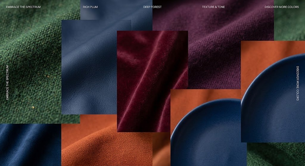
Black-background prints get most of the attention online, understandably, but they’re not the only lane worth exploring.
Deep plum and aubergine pair beautifully with brass or warm gold hardware, and feel a touch softer than pure black. If that range appeals to you, this purple floral wallpaper collection shows how far the tone can stretch without tipping into overly theatrical territory.
Forest and bottle green lean grounded and traditional — closer to an English countryside estate than gothic drama — and pair especially well with dark wood furniture and brass fixtures.
For anyone set on the darkest possible version, high-contrast black-background florals with genuine painterly detail remain where most designers land, and they photograph beautifully under warm, low light.
Broader color forecasting backs up the direction, too. Benjamin Moore’s 2026 color of the year, Silhouette, sits deliberately between warm and cool — a charcoal-meets-burnt-umber shade — and coverage of this year’s palette announcements, including ArchDaily’s roundup, points to the same shift: away from stark minimalism, toward richer tonal depth. That’s the same current pulling interest toward moody floral wallpaper right now.
If full commitment feels like too big a leap, there’s a middle ground worth trying — not pastel, not pitch-black. A dusty blue floral with charcoal shadowing splits that difference nicely and is a lower-stakes way to test whether this whole look actually suits how you live. For a broader sense of what dark, moody florals look like across a full room rather than a single swatch, this dark moody floral wallpaper gallery is worth a scroll before ordering anything.
Things I’d Do Differently Next Time
Trusting a coaster-sized sample. It tells you almost nothing useful about how moody floral wallpaper will actually behave on your wall. It shifts dramatically depending on light — rich and warm under a shop’s fluorescent tubes, then flat and lifeless once it’s actually on your north-facing bedroom wall. Get the largest sample available, tape it up, and live with it a full day before ordering the whole roll.
Surrounding it with equally dark furniture. My own mistake, and a costly one to fix after the fact. Dark wallpaper plus a dark table plus dark chairs adds up to a room that swallows itself whole. This style wants contrast — pale furniture, light linens, something to stop the eye from going flat.
Skipping white trim. Small detail, outsized effect. Crisp white trim against a dark, patterned wall is the difference between a room that reads as intentional and one that reads as unfinished. It costs little relative to the wallpaper itself — don’t cut this corner.
Rushing seam placement. Most moody floral wallpaper repeats on a large scale, so a seam cutting straight through the middle of a rose or peony is something your eye will catch daily for years. Dry-fit every panel before adhesive goes anywhere near the wall, even if it eats an extra hour standing there holding paper up like a slightly absurd human easel.
Assuming it only suits “formal” rooms. It works in a kid’s reading corner. It works behind a home office desk. Pretty much anywhere you’re willing to pair it with real thought about lighting and contrast, moody floral wallpaper holds up.
Keeping It Looking Right for Years
Upkeep on moody floral wallpaper is lighter than most people expect going in. A dry microfiber cloth handles routine dust on most finishes — steer clear of anything abrasive, since scuffs show up far more visibly against dark backgrounds than pale ones.
For any room with real moisture exposure, choose a vinyl-coated or laminated finish rather than plain paper-backed stock. Costs a little more, but it means splashes wipe away without worrying about ink bleeding or seams lifting at the edges. Direct sun is the other thing to watch — a south-facing wall soaking up hours of unfiltered light can fade even a well-printed pattern over several years, so sheer curtains end up doing double duty protecting both furniture and wallpaper in that kind of room.
If a section ever does get damaged — a scuff from moving furniture, a small tear near a switch plate — hang onto whatever’s left of the roll. Most moody floral wallpaper ships with enough extra to patch a section almost invisibly, provided you match the repeat carefully. Store the leftover somewhere safe instead of tossing it. You’ll want it the next time something gets dragged across that wall during a move.
Frequently Asked Questions
Is moody floral wallpaper just a passing trend?
Doesn’t look that way. Floral and botanical patterns have stayed near the top of designer trend surveys for several consecutive years, and interest in richer, darker palettes appears to be building rather than fading out.
Will moody floral wallpaper feel dated in a few years?
Less likely if the print is large-scale and painterly rather than a tight, fussy repeat. Small vintage-style florals tend to age visually faster than the bold, oversized botanical scenes typical of moody floral wallpaper today.
Can renters realistically use moody floral wallpaper?
Yes, through peel-and-stick. Test a hidden patch first — textured or heavily painted walls sometimes cause removable wallpaper to bubble at the edges.
How do I figure out how many rolls I need?
Measure the wall’s width and height for total square footage, then pad that number by roughly 10-15% for pattern matching and mistakes. Standard rolls generally cover 28-35 square feet, though large-repeat prints eat through that faster.
Does moody floral wallpaper clash with an otherwise neutral home?
Rarely, and it often performs better surrounded by calm neutral spaces than crammed into a room already busy with pattern. Let it be the single loud thing in the house rather than one more pattern competing for attention.
Final Thoughts
Moody floral wallpaper was never meant to be the safe pick, and honestly that’s the entire appeal of it. Nobody chooses moody floral wallpaper to please a future buyer or a neutral-loving houseguest — you choose it because a plain wall stopped doing anything for you, and you wanted the room to finally feel like something. My friend with the eleven samples eventually picked a deep plum peony print for her hallway, and a year later, it’s still the first thing anyone mentions walking through her front door.
If you’re on the fence, start small. One wall, warm bulbs, furniture with enough contrast to let the pattern breathe. Grab the biggest sample you can find and sit with it for a few days before deciding anything permanent. You’ll know fast whether moody floral wallpaper actually fits how you live — and once it clicks, plain walls stop feeling like much of an option at all.