

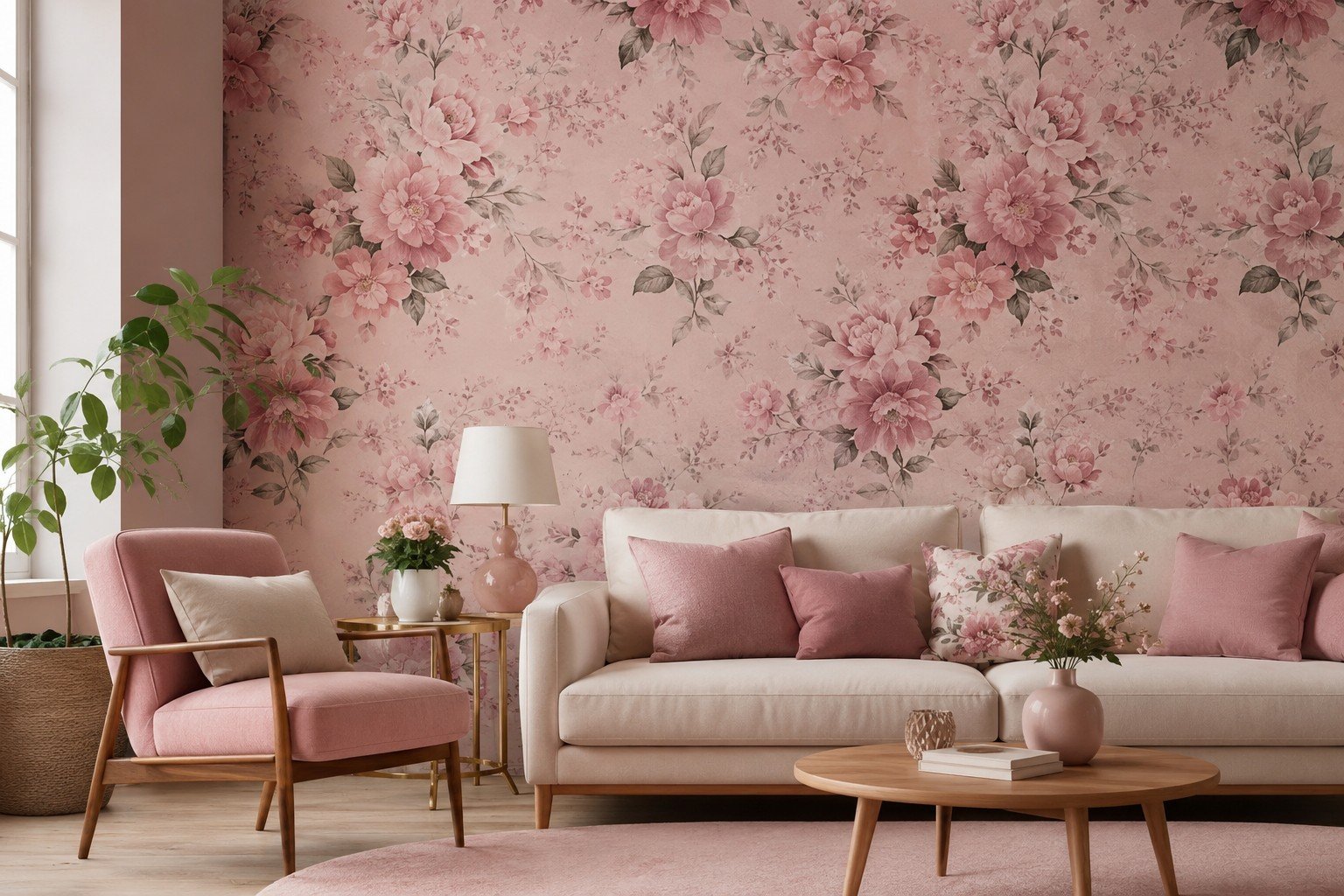
Nobody warns you that pink floral wallpaper sits in an awkward middle zone — one wrong shade and a room tips from charming into something closer to a doll’s house. That’s not a reason to avoid it, though. A botanical print earns its space on a wall in ways paint just can’t touch; it has texture, a bit of history behind it, some personality.
What actually separates a good pink floral wallpaper job from a regretted one usually comes down to color saturation and how large the pattern repeat is next to the size of the room. Nail those two, and pink floral wallpaper reads as a decision someone made on purpose, not a whim.
What Made Pink Floral Wallpaper Suddenly Everywhere?
Scroll any renovation account for five minutes and the same wall keeps reappearing — soft pink, vines or peonies climbing across it, sometimes a loose watercolor bloom. Part of that is nostalgia doing its usual work; grandmillennial style dug florals out of the attic and put a fresh frame around them. But there’s a duller, more practical reason too. This particular look photographs well, and once everyone’s renovation ends up on a feed somewhere, that fact quietly outweighs a lot of design theory. Anyone curious what that actually looks like across different homes can browse floral wallpaper picks before narrowing down a shade.
There’s a longevity angle people skip over. Paint gets swapped every couple of years without much thought, while a wallpaper chosen with some care can sit through several furniture rotations and still look deliberate. Homeowners also got tired of everything in a room matching everything else. One accent wall like this gives a space something to look at without dragging every other choice in the room along with it.
Picking a Shade Without Losing Your Nerve
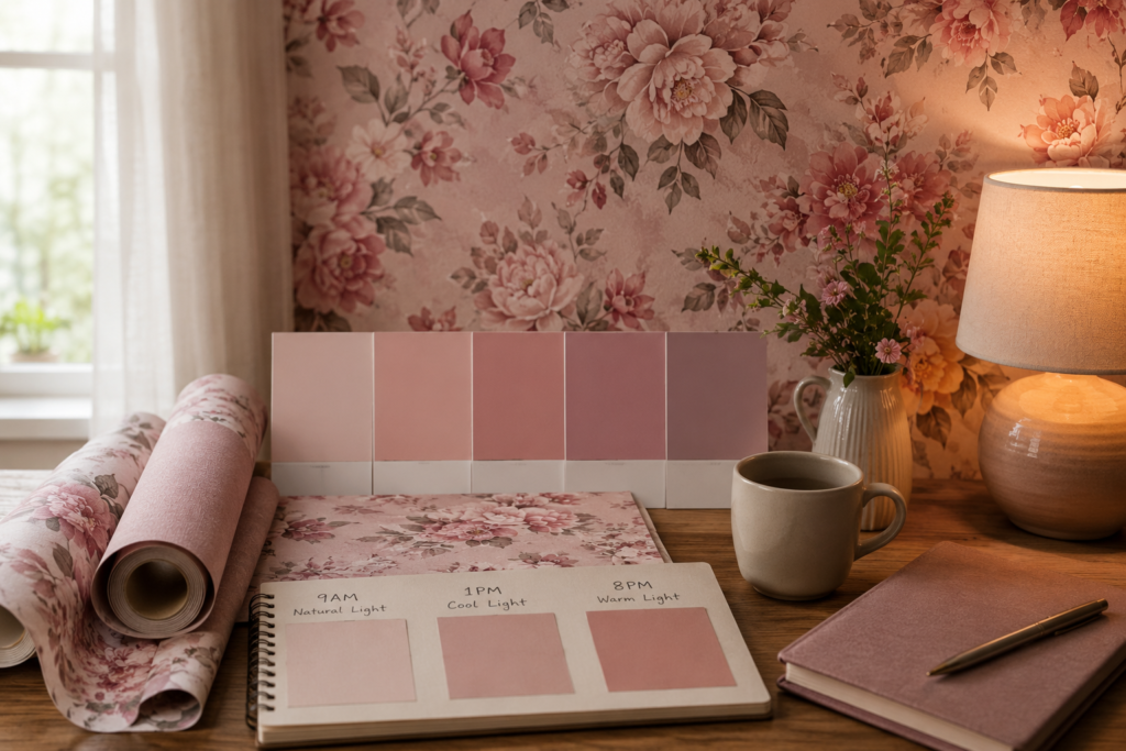
Blush isn’t rose, rose isn’t dusty mauve, and none of them behave like a salmon-leaning coral once it’s on four walls instead of a paint chip. Cooler pinks — ballet slipper, that pale lilac-pink some brands call “quartz” — settle a room down. Warmer pinks skew cozier, occasionally retro, especially set against real wood. Anyone hesitant about committing should start with a muted dusty rose; from across the room it almost reads neutral, and only up close does the color actually declare itself.
Check the swatch under more than one light source before deciding anything is final. What looks gently muted at 9am can turn nearly fluorescent under a warm bulb at 8pm. Sounds like overkill, maybe, but this single habit prevents more returned rolls than any color wheel diagram ever has.
Pattern Scale Is the Detail Most People Get Wrong
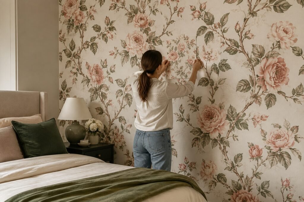
A six-inch swatch lies to you, at least about scale. Something delicate on that tiny square can turn into a wall of oversized blossoms the second it’s hung floor to ceiling. Tighter rooms generally do better with a smaller, denser repeat; a genuinely large room can take an oversized floral and still feel intentional rather than cluttered. When unsure, tape a printed sheet directly to the wall and just live with it a few days before the full order goes in.
Repeat length changes the feeling as much as bloom size does. A short, tight repeat hides seams better and reads busier, denser, from across a room. A longer repeat feels closer to scattered botanical illustrations than an all-over pattern — calmer, if that’s the effect someone’s after.
Where Pink Floral Wallpaper Actually Earns Its Keep
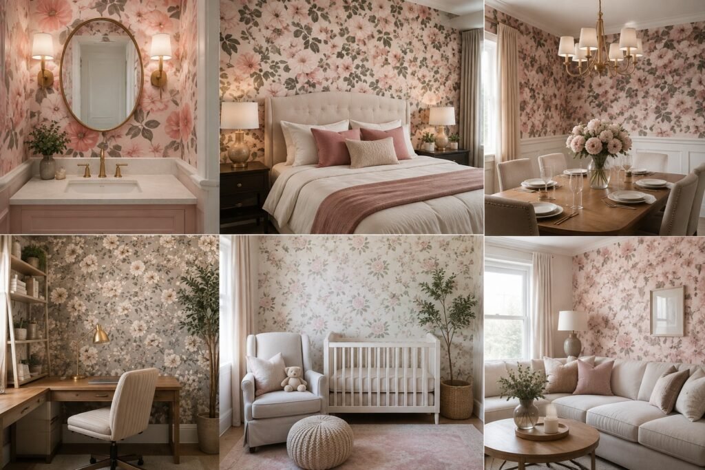
Powder rooms remain the obvious pick, and fairly so — low traffic, small square footage, meaning a bold choice never turns into a permanent regret. Bedrooms come a close second, particularly the wall directly behind a headboard. Dining rooms hold up better than expected too, mostly because people sit and look at the walls there instead of brushing past them on the way somewhere else. Kitchens and busy hallways are the harder call; grease, humidity, constant contact — florals wear down faster in those spots than most people plan for.
Living rooms land somewhere in between those extremes. Plenty of foot traffic passes through, but rarely the direct contact a hallway takes on, so the finish quality ends up deciding whether it lasts five years or fifteen.
Home offices get overlooked constantly, and that’s a missed opportunity. One wall of it behind a desk holds up well on video calls and keeps an otherwise sterile room from feeling like a waiting area. Nurseries are an obvious fit too — though a slightly muted shade ages better once the room needs to outgrow the toddler phase.
Pairing Pink Florals With Furniture and Trim
White or cream trim keeps a floral wall from feeling like it’s pressing in on you — closer to a picture frame than a full-room commitment. Matte black hardware and light fixtures cut some of the sweetness so the space doesn’t tip into overly precious. Wood furniture, walnut in particular, roots the pink in something less nursery and more grown-up. Anyone starting with furniture that already leans warm should push the wallpaper cooler, and the reverse holds too.
Metal finishes are worth a second thought. Brass frames or a gold-edged mirror against a floral wall look planned rather than accidental, as if the room got built around the pattern instead of the pattern getting bolted on at the end. Chrome and steel pull the whole space in a colder, more contemporary direction instead. For a wider look at how different botanical prints pair with furniture, see flower pairing ideas before locking in a final roll.
Material and Finish Options Worth Knowing
Pink floral wallpaper isn’t manufactured one single way, and the finish changes both the look and how long the thing survives. Traditional paper costs the least and forgives installation mistakes the least too — a rough combination for a first-timer. Non-woven versions go up easier and come down easier later, which matters for renters or anyone who redecorates on a whim. Vinyl-coated stands up best in bathrooms specifically, and peel-and-stick has quietly gotten good enough to trust in a rental unit now.
Sheen matters almost as much as the base material. Matte finishes disguise wall imperfections better and generally look more composed in a botanical print. A slight gloss makes small blooms catch lamplight nicely, though it’s less forgiving about showing every seam and air bubble too.
| Material Type | Best For | Durability | Removal Difficulty |
| Traditional paper | Low-traffic accent walls | Moderate | Difficult |
| Non-woven | Bedrooms, dining rooms | Good | Easy |
| Vinyl-coated | Powder rooms, kitchens | Excellent | Moderate |
| Peel-and-stick | Rentals, temporary rooms | Fair | Very easy |
Installation Realities Nobody Mentions
Large-repeat florals eat more paper than most budgets account for, since every strip needs to line up against the one before it. Corners in older houses are almost never square, which knocks pattern alignment off unless someone plans around it beforehand. Paying a professional costs more upfront but usually spares the pattern from an awkward, half-matched seam right where the ceiling meets the wall. Doing it solo works fine too, provided there’s a slow afternoon and a read hanging technique walkthrough instead of a rushed evening before guests arrive.
Block out a full weekend for an average-sized room, even with prior wallpapering experience under someone’s belt. A busy floral repeat takes noticeably longer to align than a plain or striped roll, and the final strip is where most visible mistakes happen because everyone rushes the finish. Hang onto the leftover scraps regardless — they’re useful later for a switch plate or a small patch job.
Small Rooms, Big Impact With Pink Floral Wallpaper
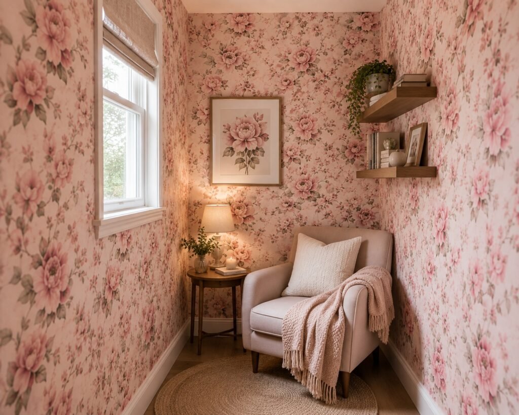
A cramped bathroom or an awkward little reading nook is exactly where this pattern earns its keep, changing the room’s whole character instead of just dressing it up. Wrapping all four walls, rather than stopping at one, actually makes a tiny space feel more unified, not smaller.
Mirrors bounce the pattern around and add a sense of depth that a single flat wall can’t manage alone. Skip the single-accent-wall approach here specifically — half-committing in a small room usually just looks unfinished.
Common Mistakes That Ruin the Look
Trusting a screen’s color rendering is the biggest misstep — monitors and phones lie about undertones constantly, no exceptions. Skipping the extra roll meant for pattern matching runs a close second; running short mid-project is genuinely miserable to deal with. Overlooking natural light direction is another one — north-facing rooms cool pink down noticeably, south-facing light warms it up more than people expect. Rushing wall prep, especially over old paint or texture, is usually what causes bubbling months down the line.
Layering too many other patterns into the same room quietly ruins things too. A busy floral wall wants calm neighbors — solid rugs, plain bedding, simple curtains, nothing competing for attention. Let the wallpaper carry the noise in the room and keep everything else in a supporting role.
Caring for Your Wallpaper Long-Term
Vinyl-coated and peel-and-stick surfaces wipe down fine with a barely damp cloth. Traditional paper needs a dry method instead — a soft brush, a vacuum attachment, nothing wet touching it. Keep direct sunlight off it where possible, since even ink marketed as fade-resistant shifts color somewhat over a few years regardless. Fix a peeling seam the moment it’s noticed; a small dab of adhesive solves it in minutes, whereas ignoring it turns into replacing an entire strip later.
Humidity swings cause quieter damage than most people realize, even in rooms nowhere near a bathroom. A space that runs muggy in summer and dry come winter can cause paper edges to lift slightly across a few seasons. Running a small dehumidifier, or just cracking a window during the worst humid stretch, does more good than it sounds like it should.
Budgeting for the Project Without Getting Surprised
Costs swing more than people anticipate once waste, labor, and prep work all get added into the total. A patterned roll with a large repeat almost always ends up pricier per usable square foot than a plain one simply because more of it gets thrown away as offcuts. Professional installation typically runs higher for florals specifically, since the installer spends extra time matching seams instead of unrolling paper straight up a blank wall.
Build in a cushion past the initial estimate — most people underbuy by a roll or two, and reordering later risks a slightly different dye lot arriving. Small detail, sure, but a mismatched batch is obvious the moment it’s hung side by side with the original.
How This Pattern Sits Alongside Different Design Styles
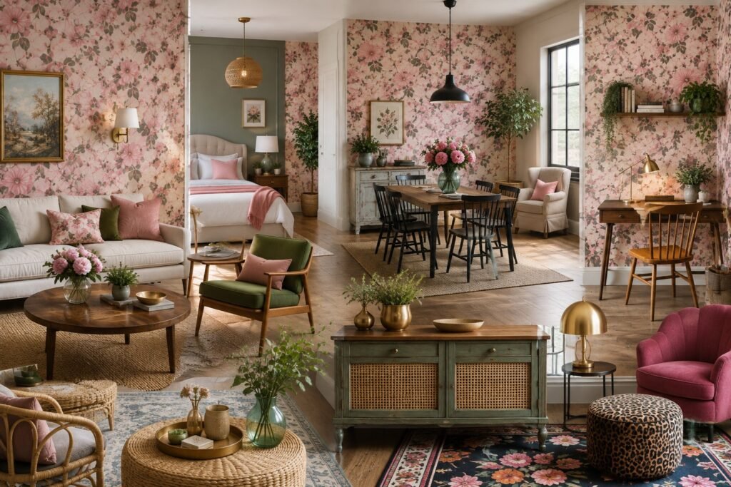
It fits into more styles than most people assume walking in. Traditional and cottage interiors are the obvious match, but a botanical print also softens a mid-century room that otherwise leans entirely on clean lines and bare wood. Even a mostly modern space can absorb a single floral wall, provided everything else around it stays restrained — a plain sofa, understated lighting, no other pattern competing nearby.
Coastal and farmhouse interiors tend to prefer looser, watercolor-leaning prints over anything tight or formal. Maximalist rooms can swing the opposite way entirely, layering a bold botanical against other patterns on purpose — though that combination needs a steadier hand to actually pull off.
A Quick Word on Color Psychology
There’s a real reason pink shows up so often in rooms meant to feel calm instead of energized. Designers have leaned on that for years, and it’s worth understanding before committing a full wall to it — you can understand pink’s emotional pull in more detail if the full breakdown sounds useful. For most homes the short version holds up fine: softer pinks settle a room down, brighter pinks wake it up, and whichever shade gets picked should match the mood someone actually wants in that space.
Where to Start If You’re Still Undecided
Anyone still torn should start with the room itself, not the roll of paper. Work out how much light it gets, how often people pass through, and how long the current furniture is sticking around. For something a little less pink-specific but still botanical, check classic bloom designs to get a feel for what pattern scale actually suits a given space.
Final Thoughts
Pink floral wallpaper doesn’t demand a cautious approach exactly, but it does reward patience over impulse. Rooms where it works well are rarely the ones where someone grabbed the first pretty roll they scrolled past online. They’re the rooms where someone actually sat with the question of light, scale, and daily use before ordering anything.
Starting small makes sense for anyone unsure — a powder room, a closet interior, the back panel of a bookshelf. These low-stakes corners teach how a busy floral pattern actually behaves in specific light before committing an entire bedroom or living room to it. Details a screen never shows up become obvious fast — how the pink shifts between morning and evening, or how a repeat that looked fine on a small sample suddenly feels loud across a whole wall.
Cost deserves honest planning too. Decent wallpaper isn’t cheap, professional installation less so, which makes this worth treating as a considered purchase rather than something grabbed on impulse. Measure twice, order a bit more than any calculator suggests, and keep one spare strip tucked away for repairs down the line.
It’s also worth remembering that walls aren’t permanent, even when a project mid-way through feels that way. Tastes shift, rooms change purpose entirely, and a pattern that reads bold today might feel exactly right in five years — or ready for something new by then. Either way is fine; that uncertainty is part of what makes a statement wall worth attempting at all.
None of this is meant as a warning away from it. Pink floral wallpaper, handled with a bit of intention, tends to outlast most trends precisely because it was never loud purely for the sake of being loud. It’s warm, a touch nostalgic, and — once the shade and scale actually suit the room — genuinely difficult to grow tired of.
Frequently Asked Questions
Does pink floral wallpaper make a small room feel smaller or bigger?
Depends entirely on the pattern scale — a smaller, tighter floral repeat tends to open a small room up rather than closing it in further.
Is pink floral wallpaper difficult to remove down the line?
Not typically, especially with non-woven or peel-and-stick versions, which peel away cleanly without demanding much wall prep afterward.
Which rooms suit pink floral wallpaper best?
Powder rooms, bedrooms, and dining rooms tend to perform best, since they take on less daily wear than kitchens or busy hallways do.
Does pink floral wallpaper clash with wood furniture?
Rarely — warm wood tones like walnut or oak generally ground a pink floral wall rather than fighting against it.
How much extra wallpaper should someone order for a floral pattern?
Add roughly ten to fifteen percent above the measured amount to cover pattern matching and any cutting errors along the way.
Does pink floral wallpaper fade fast under sunlight?
Constant, direct sun exposure fades most inks within a few years, so shaded or filtered-light rooms hold their color noticeably longer.
Can pink floral wallpaper suit a modern, minimalist home?
Yes, provided the surrounding elements stay simple — plain trim, minimal furniture, one accent wall rather than the entire room covered.
Is peel-and-stick pink floral wallpaper as sturdy as the traditional kind?
Close enough for low-traffic rooms, though traditional or vinyl-coated versions still outlast it in bathrooms and busier areas.