

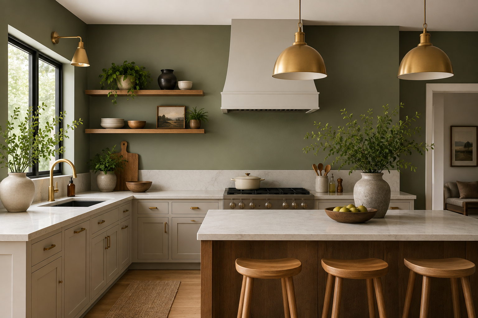
Nobody warns you about this before you start holding up little cardboard swatches — kitchen wall colors have almost nothing to do with whatever’s trending and everything to do with light, mess, and how your cabinets look at 7am while you’re half-asleep making toast.
I’ve stood in more paint aisles than I care to admit, squinting under fluorescent bulbs that lie through their teeth. So skip the “top ten shades” list. Here’s what actually survives once the paint dries and real life starts happening in the room.
Why Kitchen Wall Colors Behave Differently in This Room
There’s usually a window over the sink, a pendant light or two, maybe an under-cabinet strip humming away — all fighting for the same wall’s attention. A shade that reads calm in a bedroom can go muddy or faintly green under that mix, and no swatch card at the store will tell you that ahead of time.
Grease and steam beat up kitchen wall colors harder than almost anywhere else in the house, too. Flat matte shows every fingerprint like it’s keeping a diary; eggshell or satin shrugs most of it off without much effort.
A Few Kitchen Wall Colors That Keep Earning Their Spot
Warm white gets dismissed as the boring, out-of-ideas pick among kitchen wall colors, but that’s unfair. When cabinets or countertops already carry personality — patterned tile, dark wood grain — warm white steps back and lets them do the talking instead of fighting for it.
Sage green is one of the kitchen wall colors that didn’t blow up by accident. It reads as green without tipping into “herb garden” territory, and it sits unexpectedly well next to brass pulls or matte black fixtures.
Terracotta isn’t for every kitchen, and I won’t pretend otherwise. But with even moderate daylight, it brings a warmth that no beige has ever managed to fake, especially paired with wood or cane furniture. It’s a color that asks a little more of the room around it — good lighting, some texture nearby — but pays that back when it’s right.
A single navy wall, rather than four of them, adds real drama without turning a modest kitchen into something cave-like. Pair it with brass or unlacquered fixtures and it starts looking like a choice rather than an accident.
Lining Kitchen Wall Colors Up With Your Cabinets
| Cabinet Tone | Tends to Work | Usually Doesn’t |
| White | Sage, soft blue, warm greige | Stark white — flattens the room |
| Dark wood | Warm white, muted yellow, terracotta | Dark brown or navy — too much weight |
| Black | Soft white, blush pink, pale sage | Charcoal — kills the contrast |
| Natural wood | Sage, dusty blue, off-white | Orange-leaning neutrals fight the grain |
Nothing on that “works” list of kitchen wall colors is loud on purpose. The wall’s meant to support the room, not steal the scene from it.
If Your Kitchen’s on the Smaller Side
Dark, saturated kitchen wall colors close a tight kitchen in fast — it’s just how small spaces absorb rather than bounce light. Pale, warm neutrals do the opposite. That said, one confident accent wall can trick the eye into reading more depth than the room actually has, which is a decent workaround if you’re renting and can’t touch the rest of it.
Carrying a pale color right up onto the ceiling, instead of stopping at the trim, removes the visual “lid” a lot of small kitchens end up stuck with. Small trick, real difference.
Undertones Will Wreck a Good Plan
This is the part almost everyone underestimates about kitchen wall colors. A “greige” that looks perfectly neutral in the can can turn distinctly pink or green once it’s rolled onto your wall, depending entirely on your flooring, your counters, even your fridge. It’s genuinely unpredictable until you see it in your own light.
For a sense of where things are heading industry-wide, Sherwin-Williams’ current color forecast has been leaning toward warm, grounded neutrals paired with one unexpected accent — which tracks with what a lot of small kitchens are already doing on their own, whether or not the homeowner’s ever read a trend report.
Benjamin Moore’s trend page makes a related point worth sitting with: the same color can genuinely shift depending purely on what’s sitting next to it — a cabinet finish, a countertop, even the metal on your faucet.
What Goes On Top of Kitchen Wall Colors Matters Too
Picking the shade is genuinely only half the job. A neutral wall picks up real texture from wallpaper accents placed on just one feature wall, rather than repainting the whole room to add interest.
A kitchen that already leans bold usually does better with simpler decorating ideas instead of piling on more visual noise on top of an already loud wall.
Open shelving or a bare stretch above the counter is prime territory too. A handful of décor pieces can pull warmth out of a neutral wall without adding clutter.
If you’d rather go with something more curated, a couple of framed prints in muted tones tend to sit better against bolder walls — terracotta or navy especially — than busy, colorful pieces do.
Still torn on direction entirely? A wider set of more inspiration is worth ten minutes before committing to anything permanent.
A Few Kitchen Wall Colors That Rarely Age Well
Cool gray turns clinical almost instantly without warm wood or brass somewhere nearby to soften it. Bright yellow feels cheerful for about a year before it starts reading dated, which is faster than most people expect.
Stark, cool white is another one of the kitchen wall colors people default to thinking is “safe” — in a kitchen that doesn’t get much daylight, it just goes flat rather than clean, which is basically the opposite of what people usually want from it.
Test It Before You Trust It
Buy the small sample pots, always, before committing to any kitchen wall colors. Paint a two-foot square in two separate spots — one near the window, one further from it — and just live with it for a few days before deciding anything’s permanent.
It’s the cheapest insurance there is against a repaint you’ll end up regretting by week two.
Frequently Asked Questions
What are the most popular kitchen wall colors right now?
Warm neutrals and soft sage green, mostly because both pair easily with wood or painted cabinets without forcing a full redesign around one shade.
Should walls go lighter or darker than the cabinets?
Lighter, generally, especially in smaller kitchens — it keeps the room feeling open. Darker pairings work better in bigger, well-lit spaces where the room can absorb the extra weight.
Does the wall need to match the backsplash exactly?
Not really, and it usually looks better when it doesn’t. A slight contrast tends to read as more intentional than a perfect match ever does.
How do I catch a bad undertone before painting the whole wall?
Sample it in more than one spot and check it across a full day. If it starts turning pink, green, or muddy, that’s the undertone announcing itself.
Is a single bold accent wall a risky move?
Not particularly — it’s often the smarter call over committing the whole room, especially somewhere small where a full wall of color can feel like too much.
How often does a kitchen actually need repainting?
More often than most rooms in the house, thanks to grease and steam — usually every five to seven years, sooner near the stove itself.
Final Thought
Let the fixed things in the room — cabinets, counters, flooring — decide the wall color, not the other way around. A shade that looks flawless in a photo can fall apart entirely under your own kitchen’s light, so test before you buy the full gallon, not after. It sounds like extra work in the moment, but it’s nothing compared to redoing an entire wall a second time.
It’s fine to let one wall carry more personality than the rest, too. Not every surface in the room has to play it safe, and a little contrast usually reads as more considered than a house painted entirely in one safe neutral.
The real measure of a good kitchen wall color isn’t how it looks the day you finish rolling it on. It’s whether you still like it standing there six months later, coffee in hand, not thinking about it at all — because at that point, it’s just stopped being a decision and started being your kitchen.