

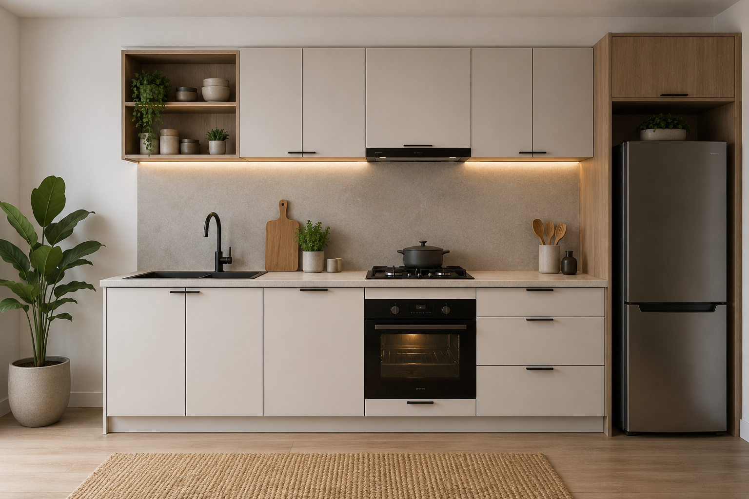
Mention a one wall kitchen to ten designers and watch the room split in half — eye-rolls from some, grins from the rest. Nothing sits in between with this layout. Sink, stove, fridge, cabinets, all of it lined up on a single stretch of wall, and that squeeze is either the whole problem or the whole point, depending who you ask.
Restriction, oddly enough, tends to sharpen decisions rather than ruin them. What follows is less a checklist and more a map of where this layout quietly falls apart versus where it earns the bragging rights.
Three Walls Were Never the Requirement
Most kitchens sit half-empty on any ordinary Tuesday. Forty percent used, the rest just… occupying square footage nobody touches. Strip that dead weight away and every remaining inch has to justify itself — which is basically the entire premise here.
Call it a compromise if you want. Tokyo studios and Brooklyn lofts have run this exact setup for decades, feeding people better meals than kitchens triple the size manage on a good week. Small doesn’t mean lesser. Sometimes it just means sharper.
The Skeptics Are Coming Around
“Budget apartment” used to be the whole reputation. Not anymore — homeowners with full square footage to spare are tearing out U-shapes on purpose now, chasing an open sightline into the living room over a second prep zone they barely touched anyway.
Money plays into it too. Run plumbing and wiring along one wall instead of three, and the bill drops without anyone trying. A workable footprint starts around six by ten feet, roughly three feet of breathing room to move through — snug, sure, but livable for most apartments and first homes. <cite index=”2-1″>Interiors writers covering this exact trade-off note that the working space you give up often returns as room to socialize or slot in an extra design feature</cite>, and that framing tracks with what shows up in practice.
Cabinet Color Decisions That Actually Hold Up
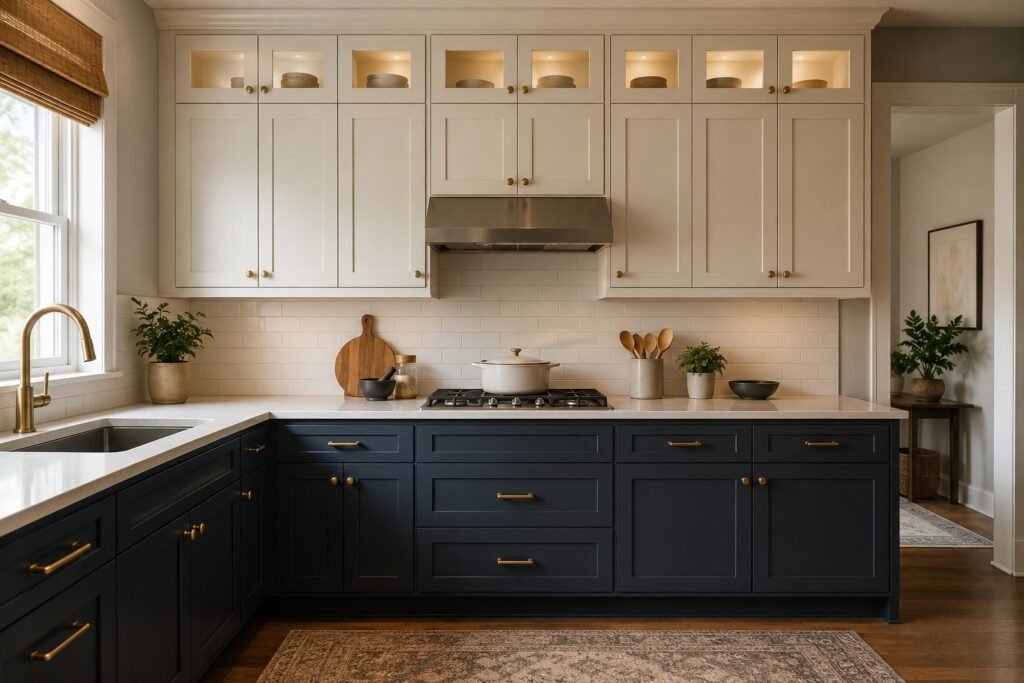
Dark cabinets on a narrow run split two ways: rich and moody, or closet-adjacent. Light decides which. Big window, decent daylight — lean dark, lean dramatic. Dim room, no real sun — bounce as much light back as the finish allows.
Two-tone gets recommended constantly for good reason. Deeper shade down low, pale or white up top, and the eye travels upward instead of stalling on one flat block. Our cabinet style options page sorts through door styles that don’t turn a narrow wall into something resembling a corridor.
Nowhere for a bad call to hide, either — that’s the real reason color matters more in a one wall kitchen than in a sprawling U-shaped layout. Our shade selection guide is worth a look before paint gets ordered; swatches lie under store lighting more than people expect.
Where the Eye Actually Lands: Tile and Backsplash
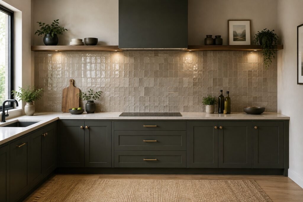
Cabinet hardware gets all the attention while the backsplash does the real visual work on a single-wall run. One continuous surface, start to finish — pattern reads as a full statement here, not some small accent tucked behind the stove.
Zellige keeps getting picked for a reason: the handmade wobble in each tile stops a long run from reading flat or printed. Large-format works too, fewer grout lines cutting across the sightline. Our backsplash tile picks page has combinations built for tight spaces without tipping into visual noise.
Heavy veining plus a busy countertop equals chaos — skip that pairing. Two loud surfaces fighting for attention on one wall is a rookie move, and it’s behind most of the “why does this room feel off” complaints that land in our inbox.
Storage Moves Nobody Volunteers Upfront
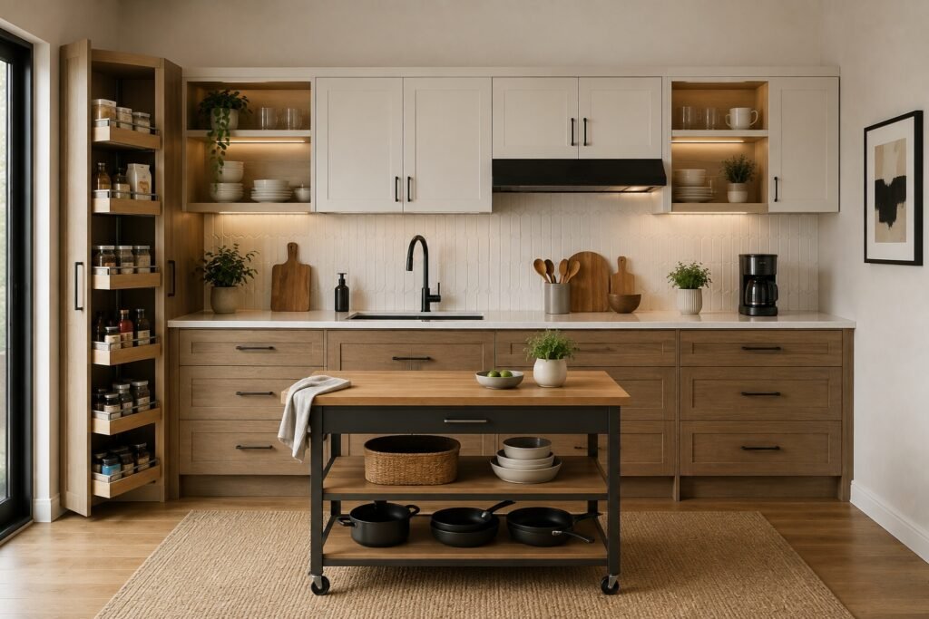
Vertical is the entire game plan for a one wall kitchen. Losing that extra cabinet run other layouts get means ceiling-height uppers stop being optional — they’re the line between organized and permanently cluttered counters.
Drawers beat doors for pots and pans, nearly always. No blind reaching into a dark cavity hunting a lid; everything glides forward, visible. Pull-out pantries at the far end of the run reclaim space that would otherwise just sit dead.
A rolling island earns its keep if the floor plan spares even a narrow gap — extra prep surface that doesn’t permanently steal walking room. Shove it against the wall when it’s not needed and the whole kitchen exhales.
Corner blind spots simply don’t exist here, which nobody mentions often enough. Everything sits in a straight line within reach, so the lazy-Susan compromise eating up corner cabinets in L-shaped kitchens never becomes a problem worth solving. That alone recovers real square footage most comparisons on paper skip entirely.
One Wall Kitchen Layout vs. the Rest, Side by Side
| Layout | Typical Space Needed | Storage Capacity | Renovation Cost | Best For |
| Single-Wall Setup | 6–10 ft wall length | Moderate (vertical-heavy) | Lowest | Studios, apartments, open-plan homes |
| Galley Kitchen | Two parallel walls | High | Moderate | Narrow homes, serious home cooks |
| L-Shaped Kitchen | Two adjoining walls | High | Moderate–High | Families, multi-cook households |
| U-Shaped Kitchen | Three walls | Highest | Highest | Large homes, dedicated cooking space |
Lighting Tricks That Widen the Room
Overhead alone flattens everything on this kind of wall — one distance, one read, and the run looks shorter than it actually is. Layering earns its keep here more than in almost any other room of the house.
Under-cabinet strips pull double duty: task light for actual cooking, plus a soft glow that separates uppers from the lower run and fakes a bit of depth. Pendants over any bit of counter or peninsula drag the eye up and sideways instead of straight ahead.
Warm bulbs — 2700K to 3000K territory — flatter tight kitchens far more than cool white ever manages. Cool light turns a narrow run clinical, almost hospital-corridor cold, which is nobody’s design goal.
Decorating the Wall Itself, Not Just What Hangs on Cabinets
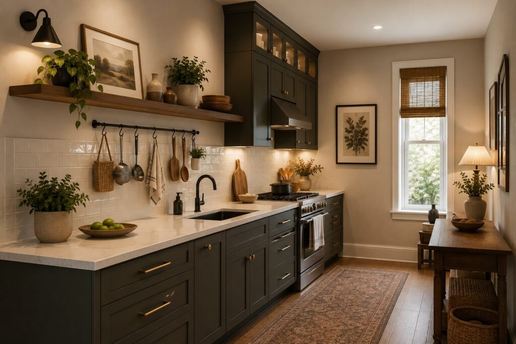
There’s usually a forgotten strip between counter and uppers. Prime real estate, and mostly ignored — a floating shelf, one small print, a row of hooks for utensils people actually reach for daily instead of burying in a drawer.
Working area shrinks a little in exchange for breathing room elsewhere in the space, and that trade means the open wall opposite the counter deserves real thought, not an afterthought. Our wall styling inspiration page has options that won’t clash with an already busy backsplash.
Anything fragile stays away from the stove — steam and grease ruin art faster than most people expect. Save delicate pieces for the far end, near the sink or a dining nook instead.
Mistakes That Quietly Shrink the Room
Overcrowded counters top the list, by a wide margin. Every appliance left sitting out — toaster, coffee maker, stand mixer — eats visual length off a wall that never had much slack to begin with.
Skip the rangehood and pay for it later. Cooking smells and grease film cling to everything in a tight space with nowhere else to go, aging the whole room faster than it should.
Match everything too perfectly and sterile creeps in where clean was the goal — a common trap in a one wall kitchen with nowhere to hide the sameness. White cabinets, white counters, white walls, zero contrast — a wood shelf, a black faucet, one patterned rug breaks the monotony before it reads as a showroom nobody actually cooks in.
Then there’s the faucet nobody budgets for properly. A short, low-arc spout photographs fine and annoys daily — filling a stockpot on a run with limited counter depth gets old fast. Taller, pull-down styles earn their price here more than almost any other single fixture in the room.
Appliances Sized for a Narrow Run
Full-depth refrigerators cause the most regret, hands down. They jut past the counter line and wreck the clean sightline that makes a single-wall layout feel deliberate instead of squeezed. Counter-depth costs more going in, pays it back in how calm the room ends up feeling.
Slide-in ranges beat freestanding here — no visible gap on either side catching crumbs. Tight budget means freestanding still works, just plan a filler strip so it doesn’t leave an odd seam in the counter.
Dishwasher placement matters more than people assume, too. Tuck it beside the sink and plumbing runs stay short and cheap, no hauling a stack of plates the length of the wall to load it.
Clearances Worth Getting Right Before Demolition Starts
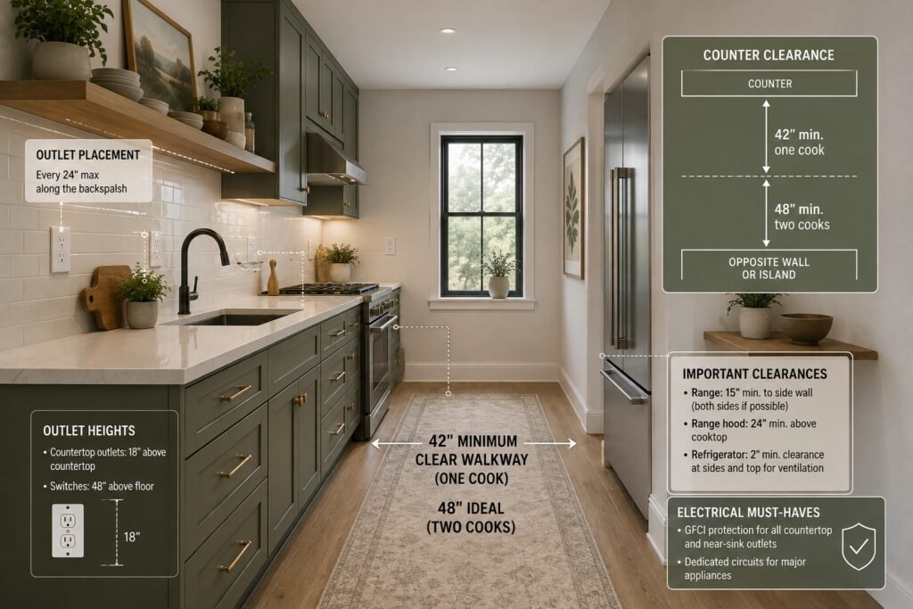
Skipped constantly, regretted just as often. The National Kitchen & Bath Association keeps a full set of tested dimensions — counter frontage, walkway width, appliance clearance — built specifically so a compact kitchen doesn’t turn into an obstacle course. The official planning standards are worth a read before cabinets get ordered, not after.
Forty-two inches of clear floor in front of the counter run, minimum, for one person to work without bumping the opposite wall. Two people cooking together often? Push toward forty-eight if the footprint allows it.
Outlets deserve planning on paper, not mid-demolition. GFCI protection, spaced close enough that no appliance ever needs an extension cord snaking across the counter — a fire-code issue first, a visual mess second, and neither one worth dealing with once tile’s already set.
Common Questions About a One Wall Kitchen
Does this setup work for a family with kids?
Fine for smaller households or simple cooking routines. Bigger families feel storage and counter limits sooner, so a nearby pantry closet or slim island usually closes that gap.
How much counter length is actually enough?
Eight feet of continuous run, minimum, including sink and stove space. Drop below that and it feels cramped fast, especially once small appliances start piling onto the surface.
Does an island belong in every one wall kitchen?
Not required. A narrow rolling cart or slim peninsula adds real prep space without blocking the room — optional in a studio, close to necessary past 300 square feet.
How does the renovation cost compare to an L-shaped kitchen?
Single-wall plumbing and cabinetry usually run 15 to 25 percent cheaper than an equivalent L-shaped layout, mostly from shorter electrical and plumbing paths.
Can a full-size fridge and dishwasher both fit?
Yes, past nine or ten feet of wall. Slim or counter-depth models help — a full-depth fridge eats visual and physical room fast on a single line.
What ceiling height helps most with storage?
Past eight feet, a second row of cabinets near the ceiling becomes realistic for rarely used items — worth a lot when floor storage is already tight.
Center or end placement for the stove?
Center keeps workflow balanced, prep on one side, plating on the other. End placement wins if one long clear stretch matters more, say for baking or entertaining setups.
Does open shelving work in a small single-wall kitchen?
Often, yes — it reads as less boxed-in than solid uppers. Trade-off is visible clutter, so it only holds up if what sits out stays genuinely tidy.
Where This Layout Actually Earns Its Keep
Not a downgrade. Not automatically the smart minimalist pick either — it depends entirely on how a household actually cooks and lives day to day. Studios, open-plan lofts, smaller homes tend to come out ahead, especially once that open sightline kicks in and the renovation bill lands lighter than expected.
Two or three cooks working at once, a pantry that empties weekly — that’s where the layout starts to strain. Not a design failure, just a mismatch between what got built and what got demanded of it. Worth figuring out which camp a household falls into before any wall comes down that’s expensive to put back.
Cabinet contrast, layered lighting, honest clearances, a wall that gets styled instead of ignored — these are the details separating a one wall kitchen that photographs well from one that actually earns its keep daily. None of it costs much to get right. Mostly it’s about deciding early instead of patching mistakes after the fact, which holds true for any renovation, really, not just this one.
Treat the single wall as a constraint worth leaning into, not something to apologize for. The strongest examples never look like they’re missing two walls — they look like nobody would ever bother adding them back.
Scroll through renovation forums long enough and a pattern shows up: the kitchens people actually love rarely belong to the biggest thread. They belong to the ones where every drawer, every tile, every fixture got chosen on purpose instead of defaulted into. That’s the real takeaway a single wall forces on a person — not that smaller wins, but that intention beats square footage nearly every time.