

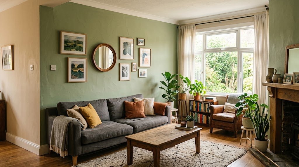
Four gallons of regret taught me this lesson. Twice I stood in my own living room at midnight, staring at a wall I’d just finished, wondering why the color I picked on a phone screen refused to show up the same way in person. It didn’t. A screen flatters everything. A tiny paint chip held near a lamp does too. The real wall, under your real windows, has other plans.
None of what follows got pulled from some list somewhere else and reworded. These are living room wall colors that survived actual furniture, actual mismatched lighting, actual mornings when the sun hits differently than you expected. A few I’d choose again without hesitation. A couple still sit in the “maybe, with conditions” pile for me.
Weeks of scrolling through paint options and still landing nowhere isn’t a sign you lack taste. Usually it just means the color got judged for ten rushed minutes instead of a few honest days on the wall.
Why This Choice Feels Harder Than It Should
A paint chip behaves nothing like a wall. The chip sits flat, catches even light, gives you no surprises. A wall stretches across a whole room, catching shadows from furniture, sun angles that shift by the hour, and whatever’s parked across from it — sofa, rug, that lamp nobody’s replaced since college.
Most rooms that end up looking wrong aren’t wrong because of the shade itself. Usually the sample was too small, or it got chosen under a store’s fluorescent glow that has nothing in common with your actual windows at 4pm — and that’s the biggest reason living room wall colors disappoint people once the whole gallon’s dry.
Your furniture already tells a color story, whether anyone planned it or not. Whatever goes on the wall either joins that story or argues with it — and living with an argument on your walls every day gets old fast.
What Actually Controls How Living Room Wall Colors Behave

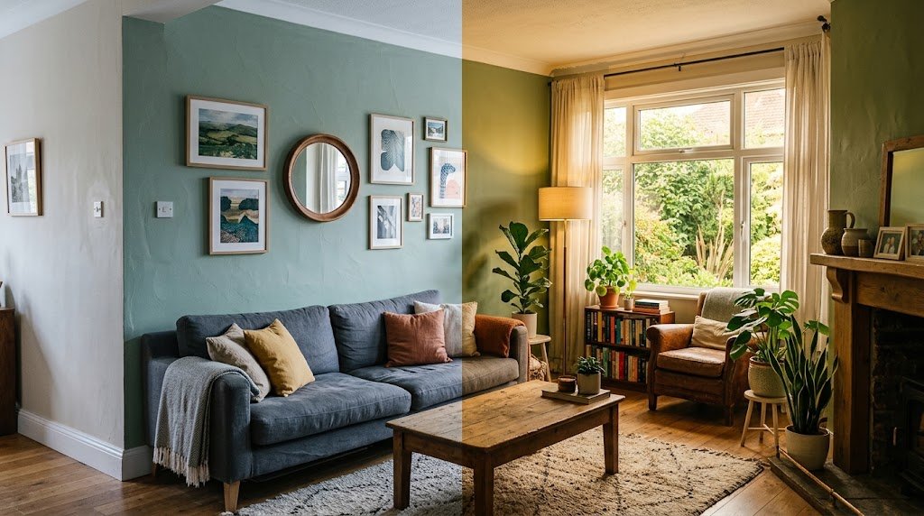
Three forces decide the fate of any wall shade: which way your windows face, how much trim and furniture is already fighting for attention, and the sheen you land on. This is exactly why living room wall colors can look completely different in two houses that used the same can of paint. Matte and eggshell can read like two entirely different colors from the exact same tin.
North light drags everything toward gray. South light warms a color up fast enough that a “neutral” gray can drift into something close to lavender by mid-afternoon. I found this out the hard way in a rental with west-facing glass — a greige I adored in the store turned faintly pink by dinnertime, every single evening.
Hidden underneath nearly every so-called neutral sits a second color nobody mentions out loud — green, pink, violet, yellow — and it waits until the paint covers a full wall next to your real furniture before showing itself. A scrap of white paper held against the sample usually catches it early, before a whole gallon does the catching for you.
Warm Neutrals — Living Room Wall Colors That Rarely Disappoint
Warm neutrals earn their reputation as the safe first pick, and I say that even though I usually nudge people toward braver territory. A soft oat or greige tone flexes with almost anything you bring into the room later, without slipping into “landlord special” territory.
Where people trip up is the undertone hiding inside. A warm neutral leaning pink or peach fights ugly with cool wood flooring. Hold the sample against your actual floor — not just the wall — before a full can of these living room wall colors gets ordered.
Calling this pick boring wouldn’t be far off. But boring here means it ages gracefully, plays nicely with furniture you haven’t bought yet, and won’t spook a future buyer if the house ever goes on the market. Sometimes the unglamorous answer is still the smart one.
Soft Green Has Quietly Become The Default
Sage and dusty olive have crept into nearly every recent color conversation, and the attention feels earned. In daylight a soft green nearly disappears into neutral territory, then flips warm and rich the second lamps switch on — few colors manage that particular trick.
Sherwin-Williams’ own inspiration gallery has leaned harder into green and blue-green territory lately, matching what I keep noticing in real houses picking living room wall colors this year. Green on a living room wall used to feel like a dare. Now it barely counts as a risk.
Deep, Moody Shades Aren’t Just For Big Rooms
Conventional wisdom says dark paint shrinks a room. Reality sometimes flips that entirely — a deep charcoal or inky blue can make a small living room feel deliberate rather than squeezed, provided the lighting pulls its weight.
Commitment is the price of entry. A dark wall with lazy lighting just reads as a dark, sad wall. Among all the living room wall colors on this list, this is the one that punishes weak lighting the fastest. Warm bulbs, a few reflective surfaces, and one pale anchor piece keep it from collapsing into flat heaviness.
Blue Without The Chill
Navy hogs the spotlight, but the blues that keep earning a second look from me lean slightly gray or slightly green — closer to storm or slate than anything nautical. Photos flatter them, sure, but they hold up even better once you’re actually sitting in the room.
A recurring misstep: pairing a cool-leaning blue with stark cool-white trim. The whole space turns clinical fast. Swap in a warmer white trim and the same wall softens instantly — such a tiny fix for how much it changes the feel.
Blue also stays remarkably consistent from sunrise to midnight, which makes it a dependable pick among living room wall colors for a room whose light swings wildly across the day.
Rust And Terracotta Are Sneaking Back
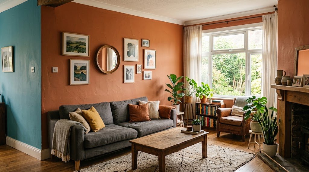
Terracotta used to belong strictly to bathroom tile, in most people’s minds. That’s shifted. Muted rust and burnt-orange tones are turning up on full living room walls now, paired with warm timber and brass hardware, and somehow the combination works better than it sounds written down.
Restraint matters here. A full wall of loud terracotta can swallow a smaller room whole, so plenty of people are limiting it to a single wall or reaching for a duller, less saturated version instead of the straight-from-the-can intensity most living room wall colors in this family come in.
Living Room Wall Colors For Rooms That Barely See Sun
A gray-based color and a dim room rarely get along — gray leans on light to look purposeful, and without it, the wall just goes flat and dull. Warmer neutrals, or something with a soft blush cast, tend to hold their shape far better once natural light drops out of the picture.
Light reflectance value ends up mattering more than whatever poetic name sits on the paint can. A color’s real personality only surfaces once you know how much light it’s actually working with — two shades sharing a similar name can behave like total strangers depending on that one number.
The Beige Argument, Finally Put To Rest
Beige takes a beating online constantly, and fair enough — pick the wrong beige under the wrong light and it does look tired. Still, a carefully chosen beige with a decent undertone ranks among the most forgiving living room wall colors available, especially for a rental or a room you’ll redecorate again soon.
Anyone drawn toward this family should glance at beige wallpaper options — texture without locking into one flat, uneventful surface. Worth a look before beige gets crossed off the list entirely.
What actually sinks a beige room usually isn’t the paint at all — it’s beige furniture piled on top of beige walls with nothing to break it up. Add contrast through artwork, dark wood, or a patterned rug and the exact same wall suddenly reads intentional.
When Pattern Wins Over Flat Color
Paint isn’t always the right tool, and that’s coming from someone who reaches for it first almost every time. A textured or patterned wallpaper pulls off something flat color physically can’t — real depth, without needing a pile of extra decor to fill the gaps.
There’s a genuinely broad stretch of classy wallpaper designs that land closer to sophisticated than busy, which is the exact line most people worry about crossing when trying pattern over flat living room wall colors. One wall first, always — the rest of the room can wait.
Cost and patience both factor in here. Wallpaper takes longer to hang and runs pricier per square foot than paint, though it does a much better job hiding minor wall flaws that flat color puts on full display.
Accent Walls That Actually Earn Their Keep
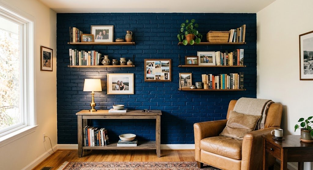
Plenty of accent walls don’t deserve the extra can of paint. The ones that do tend to follow a wall that already had a job — behind the sofa, framing a fireplace, or whichever wall your eyes land on first walking through the door.
Anyone torn between paint and something with more texture should check the accent wall ideas breakdown covering both paths side by side. Choose the wall before the color — that order gets overlooked more often than it should when people go hunting for living room wall colors.
Splitting A Wall Into Two Tones
Painting the lower half of a wall a different shade than the top isn’t a new trick, but it’s resurfacing in a cleaner, less fussy version — usually a deeper color low, a warm neutral above, minus the chair-rail molding that used to come attached to it.
It’s a more demanding project than one flat coat, no question, and it won’t suit every room. But in a living room with tall ceilings, splitting living room wall colors into two tones chops up all that leftover vertical space in a way a single solid shade rarely manages on its own.
Sample Testing Done Properly
Buy the small pots. Paint an actual poster-board square — not the wall directly — and carry it around the room across one full day. Morning light and evening light will hand you two noticeably different colors, and both deserve a look before anything gets decided.
I’ve watched people skip that step and repaint within the month. Learning it the hard way isn’t a fun way to spend a weekend — especially with living room wall colors, since a full room takes real time and real money to redo.
Hold the board near the couch, the rug, whatever art already hangs there. A shade that looks fine floating on its own can turn completely wrong the second it sits beside your actual belongings.
Lighting Rewrites The Whole Color Story
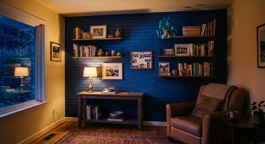
Warm bulbs, somewhere around 2700K, coax out the cozy side of nearly any shade. Cooler bulbs at 4000K and above can flip that same wall sterile, sometimes even faintly greenish — not exactly the mood most living rooms are chasing.
Fixtures pull their own weight too. A well-placed set of wall sconces does more for how living room wall colors read after dark than most people give it credit for, since the light washes straight across the wall instead of dropping down from the ceiling.
Relying only on overhead lighting is an underrated reason a wall color falls flat. It flattens the whole surface and leaves the upper portion dim while the floor soaks up whatever light there is. One lamp or sconce at eye level changes that completely.
Small Mistakes That Wreck A Big Effort
Skipping the two-lighting-condition test sits at the top of the list. Right behind it: forgetting the ceiling, which caps a room visually and can leave even the best living room wall colors looking half-finished if it’s left stark white by default.
A quieter mistake, but a frequent one — trim matched too closely to the wall. Even a subtle contrast gives the room shape it otherwise loses.
Then there’s the impulse-buy mistake: a full gallon ordered off one glance at a chip in the store aisle. It happens more than anyone likes to admit, and it’s almost always followed by a second trip back to the paint counter a few weeks later.
The Wall Behind Your TV Plays By Different Rules
That particular wall doesn’t follow the same logic as the rest of the room. Too dark, and the screen turns into a black hole during daytime viewing. Too light, and glare becomes a genuine nuisance once the lights go down.
Mid-tone shades tend to split the difference well, and there’s a dedicated TV wall ideas guide for anyone stuck specifically on that wall. Regular living room wall colors don’t always work the same way behind a screen, so it deserves its own separate answer.
FAQ,s
What’s the most popular living room wall color right now?
Warm neutrals and soft greens are out front, with muted blues and deep charcoals close behind for anyone chasing more contrast in the room.
Should every wall match, or is one accent wall smarter?
Depends on whether the room already has a natural focal point. A fireplace or built-in shelving usually looks better paired with one accent wall instead of four matching ones.
How can I tell if a color will read too dark?
Check the LRV before buying. Anything under 25 shows up as genuinely dark in most rooms, even ones with decent daylight coming in.
Does the ceiling have to match the walls?
Not required, but leaving it stark white while the walls go warm or dark can leave the room looking unfinished. A soft white, or a lightened version of the wall color, usually reads more deliberate.
Can the same color carry through an open living room and kitchen?
Yes, and it usually looks more cohesive than switching shades at some invisible line. Just double-check how the color holds up under a kitchen’s typically brighter, cooler lighting too.
Final Thoughts
Landing on living room wall colors was never really about chasing the “correct” trend. It’s about finding whichever shade survives your actual lighting, your actual furniture, and the actual life happening in that room daily. Even annual color forecasts are a starting point, not a script to follow exactly.
Grab the big samples, watch them survive a full day, and don’t feel bad admitting a color that looked perfect on Pinterest just doesn’t work in your actual space. That’s not a failure — that’s just how paint behaves in the real world. Pick a couple of shades from this list, get real samples on the wall, and give them an honest 48 hours before a single gallon gets ordered. Your living room will thank you for the patience.