

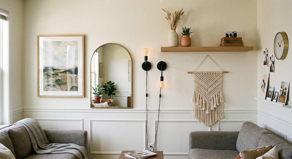
Most people picture framed prints when they think wall decorations for living room spaces. That’s a narrow view these days. Step inside almost any recently updated home and the wall isn’t just holding art anymore — a leaning mirror, a pair of sconces, a floating shelf stacked with objects, a woven hanging with visible knots. All of it counts now. Molding does the job too, in rooms where nobody wanted to hang anything at all.
Rough categories worth knowing before you shop:
- Art — canvas prints, original paintings, photography, unframed pieces pinned or clipped
- Mirrors — round, arched, oversized and leaning against the wall rather than mounted
- Functional pieces — sconces, shelving units, wall-mounted clocks
- Texture-driven pieces — woven hangings, tapestry, ceramic wall sculptures
- Architectural touches — picture-frame molding, wood paneling, narrow picture ledges
My early mistake was treating wall decorations for living room walls like a single project with one finish line. It isn’t. It’s a stack of small, separate calls — and once that clicked for me, the whole thing stopped feeling so heavy.
There’s a broader breakdown of these categories linked here, if you’d rather browse options before settling on a direction: wall decor guide.
How High Should You Hang Art Above the Sofa?
This question comes up more than any other, and the answer trips people up almost every time. Galleries settle on roughly 57 inches from the floor to the middle of a piece — not because it’s arbitrary, but because it lands close to where most adults’ eyes naturally sit when they’re standing and looking straight ahead. Apartment Therapy has written about this at length, and their explanation of the 57-inch hanging rule is one I still reference.
Living rooms complicate that number a little, though, because there’s usually a sofa sitting under the wall you’re trying to decorate. Once furniture enters the equation, the furniture becomes the new reference point — not the floor. Somewhere around 6 to 12 inches between the sofa back and the bottom edge of the frame keeps the two pieces reading as a set instead of two unrelated objects, based on Chairish’s designer hanging guide.
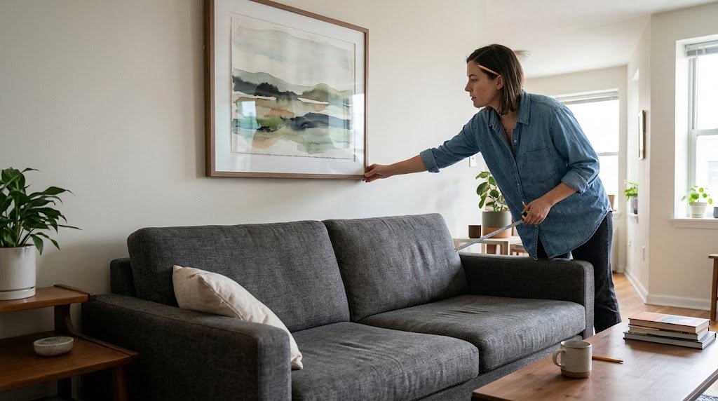
A quick reference for wall decorations for living room seating zones:
| Location | Where to center it | Notes |
| Open wall, no furniture | ~57″ from floor | Roughly average standing eye level |
| Above a sofa | 6–12″ above the backrest | Anchors the piece to the furniture below |
| Above a console table | 6–8″ above the surface | Leave breathing room |
| Above a fireplace mantel | 4–8″ above mantel | Mantel functions like a shelf |
| Gallery wall grouping | Center the whole cluster, not each frame | Keep 2–4″ between individual pieces |
My own first attempt broke this rule badly. I hung a gallery arrangement a full 14 inches too high above my sectional, and for weeks I couldn’t figure out why the room felt off — turned out the sofa and the art simply weren’t talking to each other anymore, spatially. Once I lowered everything, it clicked instantly.
Filling a Big Blank Wall Without Blowing the Budget
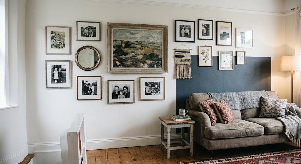
Large walls have a way of feeling like they demand something dramatic and expensive. Mostly, that’s just a story people tell themselves before they’ve actually tried anything.
What actually fills the space without draining your account:
- One oversized piece. A single large canvas, even a mid-range one blown up in size, reads as deliberate. Scale wins over quantity here, every time.
- A gallery wall pulled from stuff you already own. Thrifted frames mixed with a couple of real prints and maybe a small mirror. Cohesion comes from a shared color, not matching frames.
- Wallpaper on one section only. A papered panel behind the sofa costs a fraction of papering the whole room and still makes the statement you’re after.
- Woven or textured hangings. Usually cheaper than framed art, and they add a kind of depth flat prints just can’t manage.
Prices vary a lot depending on where you shop and how big you’re going. Small framed pieces from budget retailers can run somewhere in the $45–$75 range, larger statement prints from specialty shops often land closer to $250–$400, and full gallery-style setups with proper hanging hardware can climb past $600.
Honestly? I think people overspend on the one “hero” piece and underspend on everything surrounding it. A $300 print sitting completely alone on a wall looks lonelier than a $150 print with two smaller pieces and a shelf keeping it company.
Matching Wall Decorations for Living Room Style to the Room Itself
Not every living room wants the same treatment. Pretending otherwise is where a lot of decorating advice quietly falls apart.
Modern, minimalist rooms want restraint — one or two large pieces, mostly neutral, with real negative space left untouched. Resist filling every gap just because it’s there.
Traditional or transitional rooms can absorb a lot more — layered gallery walls, ornate mirrors, molding. More genuinely works here, as long as one color thread runs through it all.
Boho spaces lean on texture. Macrame, rattan-framed mirrors, mismatched finishes. This is probably the easiest style to get “wrong” in a way that somehow still looks right — which I find kind of freeing, honestly.
Coastal or farmhouse rooms, on the other hand, tend to pull back from framed art almost entirely. Shiplap panels do the visual work instead. A floating shelf holding two or three objects, or a basket mounted flat against the wall, often says more than a print would in that kind of space.
Wall color underneath all of this changes more than most people expect. Black-and-white photography practically vanishes against a pale wall, but set the same pieces against deep green or navy and suddenly they hold their own. If the wall color’s still undecided, that’s worth locking down before a single frame gets bought.
Three Mistakes I Made (So You Don’t Have To)
Mistake one: buying the art before measuring the wall. I fell for a gorgeous print sized 24×36, pictured it filling the space beautifully — and once it went up on a ten-foot wall, it looked almost comically small. Measure the wall first. There’s no getting around this one.
Mistake two: matching everything too precisely. My first gallery wall leaned on identical black frames arranged in a perfectly even grid. It read less like a living room and more like a hotel hallway. Frames with slightly different sizes and finishes, oddly enough, end up looking more like they were gathered over time — even when they weren’t.
Mistake three: not accounting for ceiling height. Tall ceilings can make the standard 57-inch mark backfire, leaving art stranded beneath a huge stretch of untouched wall. Going bigger, or stacking two pieces on top of each other, tends to solve that better than any fixed height rule.
A smaller thing, but worth saying anyway: don’t skip the level. Nothing gets noticed faster than a crooked frame — faster, even, than a layout mistake.
Lighting as Decoration, Not Just Function
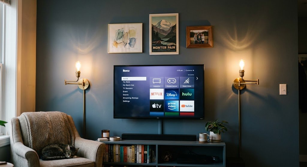
Most guides on wall decorations for living room spaces skip this part entirely, which never made sense to me, because lighting reshapes how everything else on the wall gets read. A picture light, a pair of sconces, even a floor lamp angled up toward the ceiling — any of these can turn a flat gallery wall into something with real dimension once the sun goes down.
Sconces earn their keep twice over here: decorative on their own, and genuinely useful for lighting whatever art hangs near them. There’s a deeper look at sconce styles and placement worth reading if that’s the direction you’re leaning toward.
I put two brass sconces up flanking my TV wall last spring — mostly on a whim, because the wall felt dull once it got dark. It changed the room more than any art piece I’d bought before it. That one caught me off guard.
Gallery Walls: Spacing That Actually Works
Gallery walls are where a lot of wall decorations for living room plans quietly fall apart, and spacing is almost always the culprit. Somewhere between 3 and 6 inches of gap between individual frames tends to let each piece stand on its own, rather than blurring into one crowded block of frames.
A few things trial and error taught me:
- Lay the whole arrangement out on the floor first. Every time. No shortcuts.
- Trace outlines with painter’s tape on the wall before touching a hammer to anything.
- Keep the visual center of the entire cluster near that 57-inch mark — not each individual frame.
- Skip forced symmetry if the frame sizes don’t match naturally. A loose, organic cluster often reads as more intentional than a rigid grid ever does.
Can Wall Decorations for Living Room Walls Coexist With a TV Wall?
Yes — and most guides dodge this by pretending the television simply isn’t part of the wall. It is. Usually it’s the single largest rectangle in the entire room.
Rather than fighting that, work around it. Narrow shelving or small sconces flanking the TV visually shrink that black rectangle and make the whole wall feel planned instead of accidental. There’s a closer look at exactly this kind of layout linked here, if your living room revolves around a media wall — which, at this point, most do.
FAQs
Do wall decorations for living room spaces need to match the sofa color?
No — matching too closely usually flattens the whole look. One shared color note goes further than an exact match ever does.
How many pieces should go on one wall?
It depends on the wall’s size and whatever furniture sits beneath it. Rough guide: one large piece per 6–8 feet of open wall, or a cluster of 3–7 pieces for a gallery layout.
Is it fine to leave a wall completely bare?
Yes. Negative space counts as a choice, not a gap that needs filling. Minimalist rooms especially benefit from leaving at least one wall untouched.
What’s the cheapest way to fill a large wall?
Peel-and-stick wallpaper on one section, paired with a couple of inexpensive framed prints, generally beats spending everything on one large statement piece.
Does lighting actually count as decor?
It does. Sconces and picture lights change how the rest of the wall reads, especially after dark — and they’re usually the thing people forget until the wall already feels finished.
Final Thoughts
Getting wall decorations for living room spaces right almost never happens on the first attempt — mine certainly didn’t. What matters more than any single rule is simply starting: measure the wall, choose one anchor piece, build outward instead of trying to solve the whole room in a single weekend.
Get the height roughly in the right zone, give each piece room to breathe, and don’t shy away from mixing things that didn’t all come from one store trip. That’s really the whole trick.