

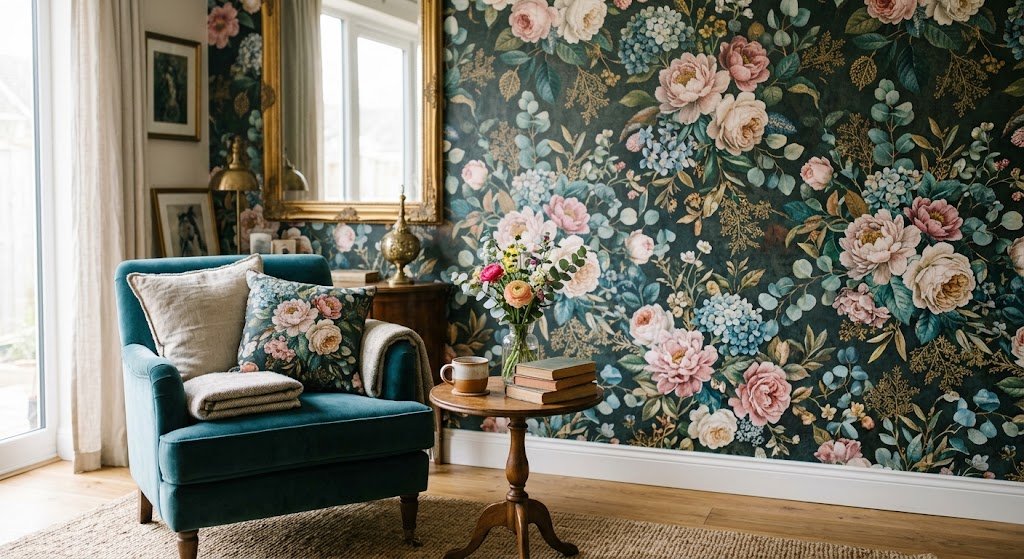
My neighbor went through three different paint colors in her hallway last year before she threw in the towel and rang me up. “Just tell me what goes on this wall,” she said, paint chips scattered across the floor around her like she’d lost a card game she didn’t know she was playing. I suggested floral background wallpaper. She laughed — the kind of laugh that means absolutely not — and then, six weeks later, sent me a photo of the finished hallway with the caption “why didn’t you make me do this sooner.”
That’s floral background wallpaper in a nutshell. Everyone resists it until they don’t.
Something I’ve clocked after years of this: people write off floral prints as dated without actually checking what’s being made now. Whatever image sits in your head of a rosebud-covered wall from decades back, that’s not what’s on the shelves anymore. Some of it’s downright moody. Some of it borders on strange, in the best way.
What follows isn’t a sales pitch. It’s the stuff I actually tell clients — including the parts where floral background wallpaper is the wrong call.
Why Floral Background Wallpaper Never Really Fades Out

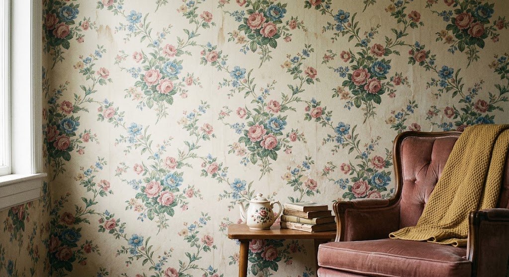
Trends burn through fast. Geometric prints had their moment. So did those oversized leafy jungle murals a couple years back — half my clients wanted one, then half of them wanted it gone within twelve months. Floral background wallpaper just keeps looping back, dressed a little differently each round.
My theory? Flowers don’t scream “trend.” They scream garden, memory, something my aunt kept in a drawer. That emotional pull is hard to manufacture with a chevron pattern.
Homes & Gardens covers trailing floral wallpaper as one of the patterns that keeps outlasting whatever’s currently fashionable, largely because it drags a bit of the outdoors inside in a way flat paint never manages. Matches what I’ve watched happen with clients too — the same people who’d never pick a bold color scheme will greenlight florals almost immediately.
Cameras love it too, for what it’s worth. Flat paint photographs flat. A wall full of blooms gives a room texture and depth the second a phone camera points at it — which is probably why every rental listing with decent photos has one floral wall hiding somewhere.
Getting Floral Background Wallpaper Scale Right
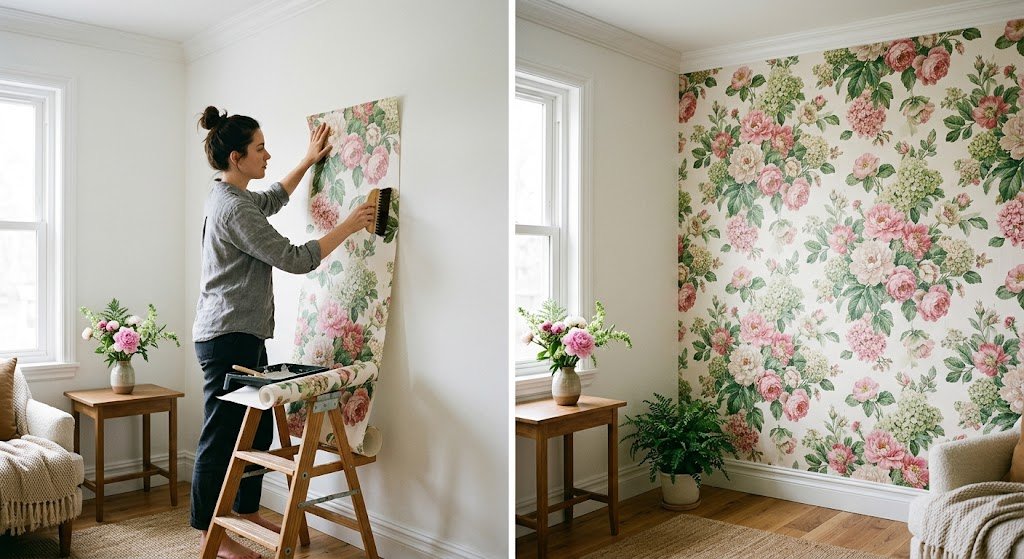
Out of every misstep on this list, this is the one I see the most. Someone spots a huge, showy bloom print online, buys it without pausing to think, then stands in their bedroom days later puzzled about why the room suddenly feels narrower on both sides.
Scale beats color every time. A tiny room can absolutely handle a bold, saturated floral — as long as the individual flowers aren’t enormous. Keep the oversized blooms reserved for hallways, dining feature walls, wherever there’s enough open air around them.
Rough way I’d sort it:
- Small, boxed-in rooms: go with modest prints, tighter spacing between blooms
- Average-sized rooms: mid-size blooms, some open space between them
- Big open walls: now the oversized stuff actually earns its keep
Tape a printed sample straight onto the wall before placing any order. Every occasion I’ve skipped that step, it’s cost me later.
When Dark Florals Make More Sense Than People Expect
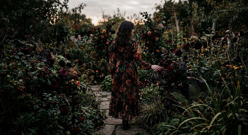
Say “dark floral” and most people’s minds jump straight to something funereal. Understandable reaction, but it misses the actual effect — these patterns pull a room in closer, make it feel intimate instead of like a hollow box.
Deep navy or near-black floral background wallpaper has ended up in more than one of my dining room projects, and it never fails to shift the mood toward long dinners and conversations that run late. Anyone drawn to that direction should look through a collection of dark floral wallpaper before ruling it out.
One catch, though — cool white bulbs murder this look completely. Dark florals need warm light to feel alive rather than muddy. Swap the bulbs first, judge the wallpaper second.
Pink Florals Have Grown Up
There’s an old belief that pink automatically reads as childish, or nursery-only, or too saccharine. That belief hasn’t kept up with reality. Dusty rose and blush shades have landed in home offices, primary bedrooms, and one particularly moody powder room I wrapped up last spring.
The trick is grounding it. Pair pink florals with black frames, walnut furniture, brass hardware — anything with a bit of weight to it. That balance keeps the whole thing from tipping into overly precious territory. Nervous about committing? A pink floral wallpaper collection is a low-stakes place to start looking.
Blue Sits in the Safe Middle Ground
If pink feels too soft for your taste and black feels too intense, blue florals land somewhere comfortably in between. Calming without drifting into boring — that’s the sweet spot.
I point undecided clients toward blue more often than any other color family, mostly because it’s forgiving. Get the room wrong somehow, and blue florals still read as intentional rather than accidental. Plenty of options exist in a range of blue floral wallpaper if this sounds like your speed.
Black Backgrounds, for the People Who Want Drama
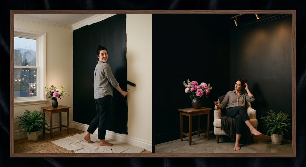
Black floral wallpaper isn’t trying to please everyone, and it shouldn’t have to. It’s for someone chasing a room that feels theatrical — a little unexpected, a little bold.
First time a client asked for it in her entryway, I’ll admit I hesitated. It ended up being one of the strongest spaces I’ve ever finished. Guests stop in the doorway every time. Chasing that kind of reaction? Browse through the full black floral wallpaper selection before deciding to commit an entire room to it.
Going all-in isn’t required, either. Even just a single accent wall, or the inside surface of a closet door, brings most of that drama without taking over the whole space.
Renting? Peel-and-Stick Solves Most of the Hesitation
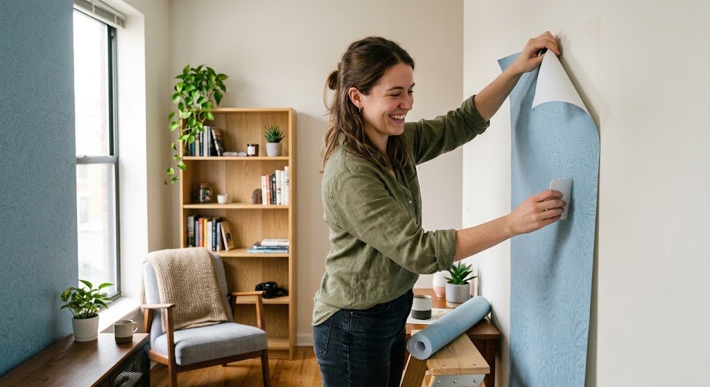
If commitment’s the issue — you’re renting, or just not sure — peel-and-stick floral background wallpaper removes almost all the risk. Skip the paste entirely, skip any risk to the wall underneath, and if a strip goes on crooked, fixing it takes a few seconds rather than wrecking your whole afternoon.
If nerves are the issue, ease into it. A closet door. A small bathroom wall. Something under 50 square feet you can live with for a few weeks before deciding whether florals belong somewhere bigger in your home. There’s a solid range of floral peel and stick wallpaper built exactly for this kind of low-stakes test run.
Mixing Floral Background Wallpaper With Other Patterns
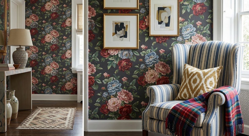
Can floral background wallpaper share a room with stripes, or plaid, or another busy pattern? Yes, but only if one pattern clearly leads and the other plays backup.
My usual move: pull one color out of the floral print and echo it in a smaller secondary pattern somewhere else — a lampshade, a throw pillow, curtain fabric. It ties the room together instead of turning it into visual static.
A plain-colored sofa or rug pulls its weight here as well. It hands the eye a resting point, and oddly enough, that’s what makes the floral wall read as a deliberate choice rather than a happy accident.
How Finish Changes Floral Background Wallpaper
Matte or glossy — this decision gets skipped constantly while everyone obsesses over the print itself, and that’s a mistake.
Going matte smooths out the overall impression and camouflages small dings in the wall, which is exactly why intricate, busy floral prints get that recommendation from me most often. A satin or glossy option, on the other hand, gives petals an almost dewy shine under good lighting — stunning in a bathroom, but it’ll show off every texture flaw or old patch underneath just as clearly.
I ask one question before recommending either: how good is the wall, honestly? Rough or uneven walls hide better under matte. A wall that’s already been smoothed out recently can take on shine without any issue.
Anywhere close to a kitchen or a playroom full of kids, bring up washable coating options with the supplier. It bumps the price slightly, but it spares you from smudge marks that never fully come off down the line.
Light Direction Matters More Than People Think
A room facing north deals with cooler, flatter daylight all day long, and that can wash out certain floral palettes — cool pinks, some blue tones — by the time afternoon rolls around. Rooms facing south soak up warmer, golden light instead, which flatters nearly any floral choice without you having to think about it.
If your room happens to sit on the cooler side, tilt the color palette warmer to compensate — coral, warm pink, golden yellow. It’s a minor tweak, but it shifts how the wallpaper actually feels once you’re living with it daily, not just under showroom lighting.
Committing to a Single Wall vs the Whole Space
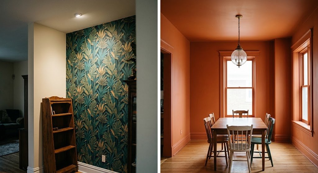
Comes up on nearly every project I take on. My honest answer: start with a single wall unless you’re genuinely certain about going all-in. One accent wall delivers most of the visual payoff without the cost — or the risk of tiring of a full room’s worth of pattern.
Full-room floral treatments work best in small, enclosed spaces — powder rooms, closets, tiny reading nooks — where the pattern wraps around you instead of overwhelming everything. In bigger, open rooms, a full floral treatment can start feeling busy fast, especially once furniture and art crowd in.
What This Actually Costs You
Nobody likes the money talk, but skipping it just means a bigger surprise later. Floral background wallpaper prices swing wildly — anywhere from $2 a square foot for a mass-produced peel-and-stick roll to well over $20 for something with a custom or designer print run behind it.
My rule of thumb for clients on a budget: spend the extra money on the room people actually see every day — an entryway, a dining wall — and save the cheaper rolls for closets or smaller accent spots. Nobody’s judging your closet door’s price point.
Always add roughly 10% extra to whatever square footage you measure. Pattern matching eats material faster than people expect, and running short mid-install is a special kind of frustrating.
Vetting Where You Actually Buy It From
Not every wallpaper seller is equal, and I learned this one the annoying way. Some shops nail color accuracy but ship material that peels at the edges within a year. Others print gorgeous, durable rolls but take a month longer than promised to arrive.
Before ordering a full room’s worth, always request a sample swatch first — never trust a screen preview alone. Check a few reviews specifically mentioning color accuracy and material durability, not just overall star ratings, since those two things matter more than anything else once the wallpaper’s actually on your wall.
Where Floral Background Wallpaper Actually Belongs in a House
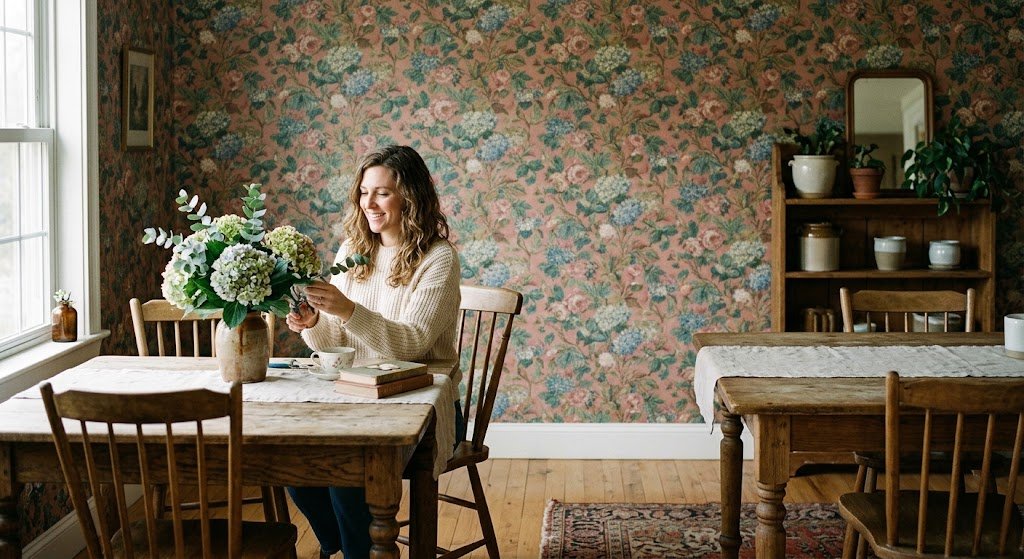
Not every wall needs flowers on it, and I say that as someone who genuinely likes this pattern category more than most. Bathrooms, bedrooms, and dining rooms are the strongest fits — spaces where a bit of softness or drama feels earned rather than distracting.
Home offices give me more pause. A loud floral pattern sitting behind your desk during video calls pulls focus in ways you don’t want mid-meeting. Love the look but work from home daily? Put the floral wall behind you instead of in your camera’s direct line.
Does the Season Dictate the Right Floral Pattern?
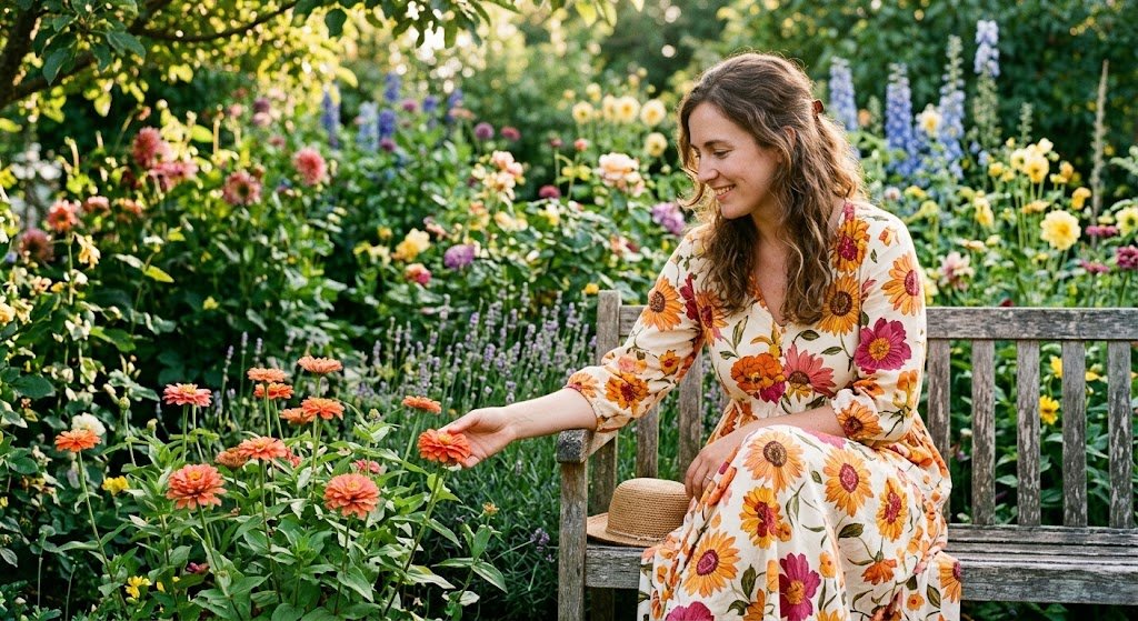
I get asked this all the time, usually by someone worried they’ll grow tired of a print after one summer passes. My real answer: a floral background rarely needs to feel tied to a season at all, provided you steer clear of overly literal imagery.
Blooms rendered in an abstract or watercolor style tend to stay timeless no matter the month on the calendar. Highly realistic, brightly saturated botanical photo-prints are the ones that start feeling out of place come November. Worth remembering before you fall for the first pretty pattern you see online.
Staying On Top of Maintenance After Install
Almost nobody considers upkeep until a smudge appears on the wall and just sits there staring back. Floral backgrounds, especially lighter ones, show dust and fingerprints faster than plain paint ever does.
There’s a solid breakdown from Apartment Therapy on how to clean wallpaper properly, sorting out which materials can handle a damp cloth and which ones need to stay completely dry — genuinely useful before you touch anything with water. One thing I’d tack onto that advice: try any cleaning method on an out-of-sight corner first, given that a detailed floral design smudges much faster than a plain solid color would.
Running a soft microfiber cloth over the surface now and then, especially near doorways and hallway traffic, keeps a pattern looking sharp for years rather than fading into a dull haze.
Mistakes I Keep Watching People Make
A handful of these repeat constantly, and I’ve been guilty of at least one myself.
Folks choose swatches under bad lighting and get caught off guard afterward. A pattern that looks soft and muted under a phone’s flashlight can look entirely different once real daylight hits it. Hold any sample up to a window before making a final call.
People forget that floral patterns need to repeat cleanly across strips. A mismatched seam wrecks the whole effect, and it’s usually invisible until the wallpaper’s already up and you’re standing back to look at it properly.
And here’s my own contribution to this list: I once chose a pattern purely because I loved it on its own, without considering the furniture already sitting in the room. It clashed harder than I expected, and I should’ve known better. Bring a fabric swatch or paint chip into the decision every time.
One more, while I’m at it — don’t rush the first strip. Everything after it inherits the same alignment, crooked or not. Slow down, trust a level over your eyes, and save yourself the headache.
Small closing tip: hold onto whatever’s left of the roll, scraps included. Floral designs get pulled from production more often than plain colors do, and a stashed leftover strip has bailed out more than one client when a section got damaged years afterward with no matching replacement to be found anywhere.
Final Thoughts
This whole decision doesn’t need to spiral into overthinking, though a bit of patience does pay off. Match your floral background wallpaper’s scale to the size of your room, land on a palette that fits the mood you’re actually after, and keep it small at first if the whole thing has you second-guessing.
Some of my favorite finished rooms belonged to clients who swore up and down they’d hate florals. Give it a genuine shot before writing it off completely — my neighbor certainly did.
Got a wall you’ve been staring at with frustration for months now? Order a sample, hold it up under actual daylight, and see how it genuinely feels in your space before making the call for good.
Frequently Asked Questions
Does floral background wallpaper work in small rooms?
Yes, as long as the pattern’s scale stays modest — oversized blooms tend to overwhelm tight spaces rather than complement them.
Is dark floral wallpaper too heavy for a bedroom?
Not with warm lighting. Dark florals usually make bedrooms feel cozier and more intentional rather than cramped.
Can renters use floral background wallpaper safely?
Yes. Peel-and-stick floral options remove cleanly without damaging paint or drywall, which makes them ideal for rentals.
How do I clean floral wallpaper without ruining it?
Dust regularly with a soft cloth and test any cleaning solution in a hidden spot first, since detailed prints smudge more easily than solids.
Should I mix floral wallpaper with other patterns?
You can, as long as one pattern clearly leads and the other stays in a smaller, supporting role.