

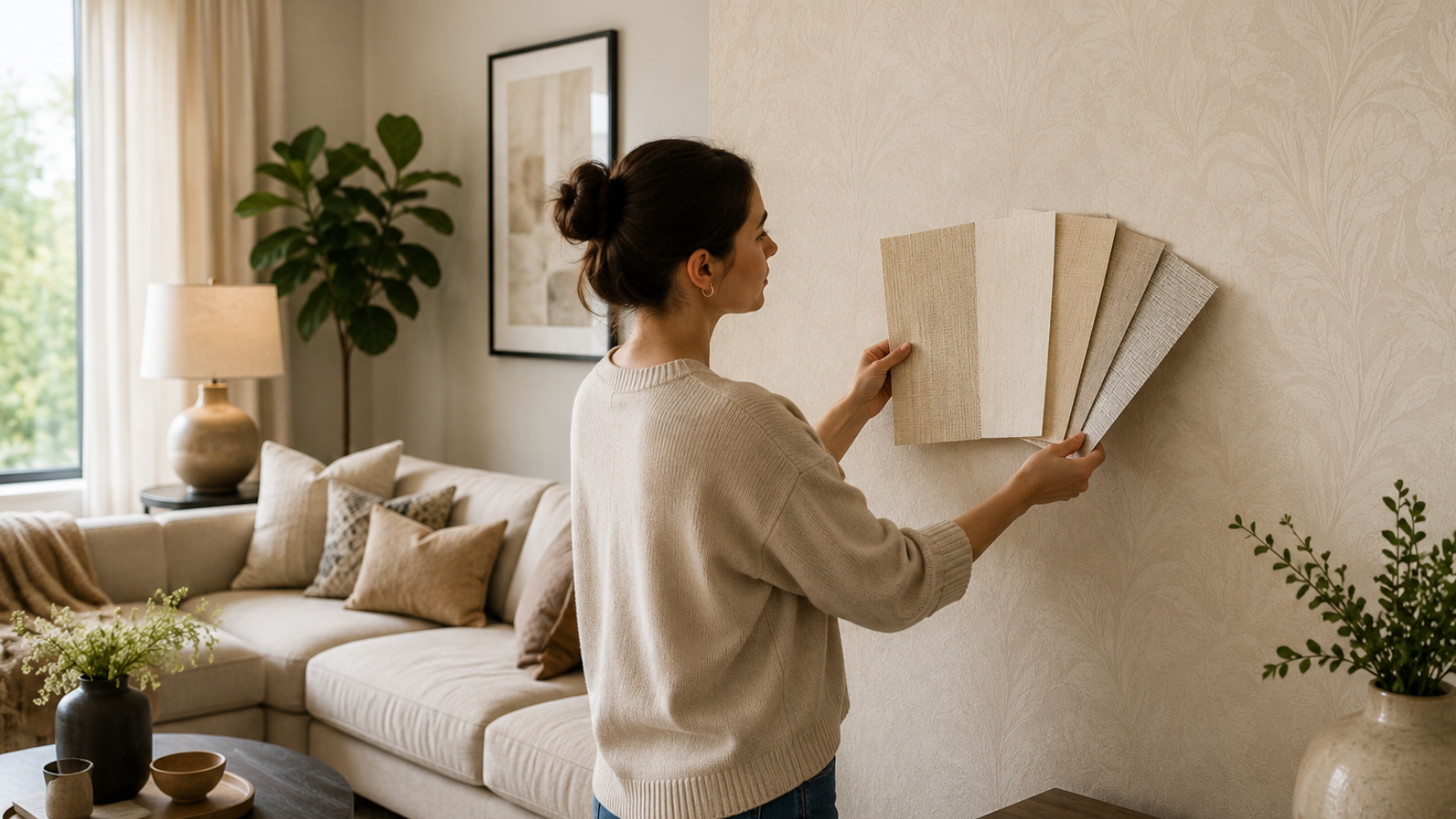
Not all living room beige wallpaper reads the same in real light. Here’s how to pick the shade, texture, and pattern that actually works. The first time a client asked me to help pick living room beige wallpaper, we ended up taping three swatches straight onto the wall and just… waiting. Not testing them under a store light or holding them up next to a paint chip. Actual wall, actual weekend. By Friday evening the flat, slightly gray sample looked tired under the lamps.
The honey-warm one glowed at night but turned almost orange by noon. Only the third one, a muted greige with a bit of linen texture, held its color from morning straight through to dinner, and that’s the one we hung. That weekend taught me more about undertones than any color chart could. If you’re only doing one wall instead of the whole room, this wallpaper accent wall guide is worth a look too.
Beige gets called boring more than any other neutral out there, and honestly, most of that reputation comes from bad lighting choices, not the color itself. Get it right and it’s one of the most forgiving backdrops a living room can have.
What Is Living Room Beige Wallpaper?
It’s a neutral wall covering that sits somewhere between pale sand and deeper taupe, added mainly to bring warmth and texture without the heaviness of a bold color. Think of it as the middle ground between stark white and full earth tones. That’s exactly why it fits into so many different homes without a fight. Unlike paint, wallpaper in this range usually has some kind of surface interest built in, a soft weave, a faint print, a linen look, so the wall feels layered instead of just painted over.
That texture is doing more work than people give it credit for. A plain beige paint job can go flat and dull fast, but a textured beige wallpaper catches light and shadow in a way that makes the whole wall feel finished.
Why Homeowners Choose Beige Wallpaper for Their Living Room
Some of this is practical. Some of it’s just about how the room makes you feel walking into it, and both reasons matter when you’re the one living with the wall every single day.
- Works with almost any furniture color, so you’re not boxed into one design direction
- Hides scuffs and small wall imperfections better than pure white or dark tones do
- Photographs well for listing photos, since neutral rooms tend to appeal to more buyers
- Creates a calm, settled feeling that brighter colors can’t always pull off
- Ages well, so you’re less likely to feel done with it after two years
- Plays nicely with rotating decor, meaning new pillows or art won’t suddenly clash
That last one gets overlooked a lot. Plenty of people repaint or re-paper simply because their accent pieces stopped matching the wall. Beige mostly sidesteps that problem.
Types, Finishes, and Variations Worth Knowing
Not every beige behaves the same way, and the undertone is really what changes how a room feels.
Warm Beige leans slightly yellow or orange, and it brings a cozy, sun-touched feeling, especially nice in rooms that already get good natural light or tend to run a bit cold.
Cool Beige carries a gray or taupe undertone. Works well in more modern spaces where you want a neutral wall without any yellow creeping in.
Greige is basically gray and beige meeting in the middle, and it’s become the default pick for people who can’t decide between warm and cool.
Textured Grasscloth Beige uses natural woven fibers for an almost spa-like feel, and it hides wall flaws exceptionally well, though it takes a bit more care to keep clean.
Metallic-Flecked Beige adds a subtle shimmer that picks up lamp light at night. A quiet wall suddenly gets a bit of glamour without shouting for attention.
Printed Beige Pattern brings in soft florals, geometric shapes, or damask motifs, all in tonal beige-on-beige, so you get pattern without any real jump in color intensity.
How Lighting and Room Size Change the Way Beige Reads
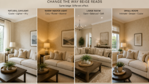
Here’s the part most people skip, and it’s the part that actually decides whether you’ll love the wall or regret it within a month. Beige is a chameleon. A swatch that looks soft and neutral under warm bulbs can suddenly look flat, even slightly pink, under daylight-balanced LEDs.
Same swatch, completely different result depending on whether your room faces north or south. According to 26 Painting’s guide on lighting and color perception, most American living spaces run on warm bulbs in the 2,700K to 3,000K range, while workspaces tend to sit in cooler 4,000K to 6,500K territory, and that gap alone is enough to shift how a neutral tone reads once it’s actually on the wall. It’s exactly why professionals rarely commit to a shade without watching it in the real room at different times of day first.
Room size plays a role too, maybe more than people expect. In a smaller Living Room Beige Wallpaper, a lighter, less textured beige helps keep things feeling open. A deeper or heavily textured beige, on the other hand, can make a small room feel closer and more intimate, and that’s not automatically a bad thing if that’s the vibe you’re after. Bigger rooms can handle a richer, more textured beige without any trouble, since large flat expanses of pale color tend to feel sterile without something to break them up a little.
Design Styles That Pair Beautifully with Beige
Modern living rooms use beige as a quiet backdrop, letting clean-lined furniture and a couple of statement pieces do most of the talking.
Scandinavian interiors lean on beige alongside light wood and white accents to keep the whole space feeling airy and calm.
Farmhouse rooms pair textured beige wallpaper with shiplap trim, woven baskets, and warm wood furniture for something that feels lived-in and welcoming.
Transitional spaces use beige as the bridge between older furniture shapes and newer lighting or hardware choices.
Bohemian living rooms let a printed or textured beige wallpaper ground an otherwise eclectic mix of patterns, plants, and layered textiles.
Concrete Benefits of Choosing Beige Wallpaper
- Longer design lifespan than trend-driven colors that date fast
- Easier to coordinate with rentals or staging, since it appeals broadly
- Hides minor wall flaws better than glossy paint does
- More forgiving as your decor tastes shift over the years
- Softer transition between rooms painted different colors
- Reads as higher craftsmanship than a flat painted wall, even at similar cost
Step-by-Step Guide to Choosing and Installing Beige Wallpaper
- Order two or three swatches in different undertones before buying a full roll
- Tape each one to the actual wall you’re covering, not some random spot near a window
- Watch the swatches morning, midday, and evening, over at least two days
- Measure wall height and width, then add ten percent extra for pattern matching and waste
- Go pre-pasted if you’re doing this yourself, it makes the whole job easier
- Clean and prime the wall so the surface is smooth and free of old residue
- Start in the least visible corner, so any small mismatches stay hidden
- Smooth each strip with a wallpaper brush, working from center outward to clear air bubbles
- Trim excess at ceiling and baseboard with a sharp blade for a clean line
- Let it cure for the manufacturer’s recommended time before hanging anything heavy nearby
A Real-Life Styling Example

Picture a rectangular living room, one big window on the north wall, a deep navy sectional facing it. The homeowner went with a warm beige grasscloth behind the sofa, which balanced out the cool light from that window and made the navy fabric feel richer instead of heavy.
One thing worth mentioning honestly: the grasscloth showed a faint seam line where two panels met near the window, something the installer hadn’t fully planned for given the angle of the light. Not a dealbreaker at all, but a good reminder that even a well-thought-out room can have a small flaw that only shows up under certain conditions.
Expert Tips for Getting Beige Right
- Test swatches against your actual sofa fabric, not just the bare wall
- Skip buying wallpaper under store fluorescent lighting, it distorts warm and cool tones badly
- Layer in at least two textures, like a woven rug against a smooth wallpaper, so the beige doesn’t go flat
- I’ve noticed one dark object, a black-framed mirror or a dark wood shelf, keeps an all-beige room from feeling monotonous
- Keep trim a shade lighter or darker than the wallpaper instead of matching it exactly, so the architecture still stands out
Common Mistakes to Avoid
- Picking a shade off a tiny swatch instead of testing it at full wall scale
- Ignoring how your bulbs’ color temperature will shift the tone
- Pairing beige wallpaper with beige furniture and beige flooring, which flattens the whole room
- Skipping primer, which leads to uneven absorption and visible seams later
- Forgetting to order extra rolls from the same dye lot for future repairs
Room-Size Specific Styling Ideas
Small Living Rooms do best with a lighter, low-contrast beige and not much pattern, since busy texture can make walls feel closer than they actually are.
Medium Living Rooms have room to play a bit, a textured or subtly patterned beige on one feature wall, with the rest painted a coordinating solid.
Large Living Rooms can carry a richer, more textured beige across the whole space, especially with varied furniture heights and layered lighting so the room doesn’t read as one flat plane.
Maintenance and Care
Vinyl-coated beige wallpapers can usually be wiped down with a damp microfiber cloth and a little mild soap, which makes them practical for living rooms that see daily traffic. Textured options like grasscloth need gentler handling, mostly just a soft brush attachment on the vacuum to lift dust out of the weave rather than any wet cleaning.
Keep it away from direct, prolonged sun where you can, since UV rays will fade even a stable neutral over a few years. And if a seam lifts or a small tear shows up, deal with it quickly with wallpaper adhesive rather than waiting; moisture and dust turn small problems into bigger ones fast.
FAQs
Does beige wallpaper make a room look smaller?
Not really. A light, low-contrast beige actually opens a room up, while a darker, heavily textured beige can make it feel cozier instead. It comes down more to shade depth and texture than the color category itself.
What colors pair well with beige wallpaper?
Navy, forest green, and terracotta all work nicely as accents, adding warmth or contrast without fighting the neutral base. Black accents help too, keeping an all-beige room from going flat.
Is beige wallpaper outdated?
It goes through style cycles, sure, but the textured and tonal versions have stuck around because they act as a backdrop rather than a trend statement. The flat, glossy beige from decades ago is what feels dated, not beige as a whole.
How much does living room beige wallpaper cost to install?
It varies a lot by texture and whether you hire someone, but grasscloth or metallic-flecked options usually cost noticeably more than standard printed rolls. Labor tends to cost more than the material itself for a single accent wall.
Conclusion
Picking living room beige wallpaper was never really about flipping through a swatch book and pointing at a color. It’s about knowing how that color actually behaves in your room, under your light, next to your furniture. That three-swatch test from the start of this article still holds up as the simplest way to avoid regret: tape samples to the real wall, watch them through a full day, and let the room decide which undertone belongs there. Warm beige suits a room that needs coziness.
Cool beige suits one chasing something more modern. Greige splits the difference if you genuinely can’t decide between the two. Texture matters almost as much as tone here, since a flat beige can look dull while a woven or subtly patterned one adds depth without adding noise. Room size and light direction should guide how bold or subtle you go, and pairing the wall with at least one contrasting object keeps things from tipping into monotony.
None of this needs a big budget or a full renovation, even one accent wall can shift how an entire living room feels. So as you go through samples or plan the install, trust the actual testing over the marketing photos. Your room’s light is really the only opinion that matters in the end.